Spend a few minutes scrolling and a pattern is hard to miss: beige, off-white, gray, black, brown, sand, softer earthy shades, more natural skin tones, minimalist scenes. On many profiles, the aesthetic feels “clean,” calm, and polished—almost as if everyone agreed on the same visual language. That leads to the exact question behind this article’s main idea: why everyone uses neutral tones.
The answer isn’t just “because it looks nice.” Neutral tones became a visual shortcut for communicating order, elegance, and consistency. They also perform well on small screens, under different lighting conditions, and across multiple formats (photo, carousel, and video). In this post, you’ll understand why everyone uses neutral tones on social platforms, what’s behind that preference, when it truly makes sense, and how to apply it in an authentic way—without blending into the crowd.
What neutral tones are (in a simple, practical way)
Neutral tones are colors with lower saturation and a quieter presence, meaning they don’t “shout” inside a frame. They usually include:
Classic neutrals
- White, black, gray, off-white
Earthy neutrals
- Beige, sand, brown, caramel, soft terracotta
Cool, modern neutrals
- Bluish grays, graphite, concrete-like tones
The core point is that neutrals behave like a base layer: they let content breathe and make combinations easier. And that’s one of the biggest reasons why everyone uses neutral tones to build a visual identity that’s easy to maintain.
Why everyone uses neutral tones
This trend exists because it solves real problems for people who create content and for people who consume it. Below are the strongest reasons—and you’ll probably recognize several in your own experience.
They “organize” the chaos of the feed
Social media is noisy: strong colors, ads, loud covers, fast transitions. Neutral tones act like “visual silence,” and that quietness stands out precisely because it feels calmer. A neutral-heavy profile often looks more planned, which reinforces the perception of quality.
That contrast with visual overload is a major part of why everyone uses neutral tones: neutrals create breathing room in the middle of constant stimulation.
Neutrals signal sophistication and trust
Without turning this into a magic formula, there’s a cultural reality: minimalism and neutral palettes are associated with design, architecture, fashion, and premium brands. When someone uses neutrals, audiences often interpret it as “good taste,” “care,” and “consistency.”
This helps explain why everyone uses neutral tones in lifestyle visual, aesthetics, productivity, and even educational profiles: color becomes a language of credibility.
They work well across lighting and devices
The same photo can look different depending on screens and brightness settings. Highly saturated colors vary more and can clip, overshoot, or shift oddly on certain devices. Neutrals are more predictable and “safer,” especially for people editing on a phone.
If you’ve ever posted a vibrant image and later thought it looked too intense on another screen, you’ve felt first-hand why everyone uses neutral tones.
They make consistency easier without extreme effort
Consistency is hard. That’s why many creators choose neutrals: they match almost anything. Neutral outfits, light walls, wood textures, natural light, simple props—you can build a repeatable pattern without rare locations or complicated setups.
This is a direct, practical reason why everyone uses neutral tones: it’s a high-reward aesthetic with relatively low maintenance.
The “trend” side: digital culture and aesthetic cycles
Neutral tones didn’t become popular by accident. They spread the way trends spread online.
The look is easy to replicate
Neutrals are easy to reproduce because references are everywhere: cafés, homes, basic clothing, décor objects, and window-light scenes. The easier something is to recreate, the faster it becomes a trend.
That replication effect is a big part of why everyone uses neutral tones: when something is simple to do and looks “nice,” it becomes the default.
Algorithms reward what holds attention
Visually pleasing, clean-looking content often holds attention longer—especially in carousels, where people swipe slowly. Neutrals reduce distractions and increase a sense of smoothness.
It’s not that the algorithm “loves beige.” It’s that a neutral visual experience can improve watch time, saves, and overall retention—which reinforces why everyone uses neutral tones.
Neutrals fit aspirational lifestyle storytelling
Social platforms often run on desire: a curated life, organized routines, beautiful spaces, intentional aesthetics. Neutral tones became the visual dialect of that narrative.
This cultural association also supports why everyone uses neutral tones: they match the idea of “calm elegance” and “a well-designed daily life.”
Color psychology: why neutrals feel calming
Color impacts perception and emotion. Neutrals typically reduce overload.
Less stimulation, more comfort
Strong colors demand more attention. Neutrals let the brain relax and focus on the subject (a face, text, a product, an environment). That’s why many people describe neutral feeds as “pleasant” or “easy to look at.”
That comfort is part of why everyone uses neutral tones: the aesthetic becomes friendlier for long sessions of browsing.
Neutrals highlight the content, not the color
When the palette is subtle, the spotlight shifts to story, composition, and message. That’s powerful for creators who want people to notice what they’re communicating—not just the color impact.
When neutral tones can work against you
There are trade-offs. If neutrals become a blind rule, they can weaken identity.
Risk of looking generic
If you adopt a neutral look without personal elements (angles, themes, textures, a recognizable editing signature), your profile can feel like “just another one.” This often happens when someone treats why everyone uses neutral tones as a ready-made recipe instead of adapting it.
Low energy for certain niches
Kids content, sports, parties, bold pop culture, or highly expressive visual arts can lose impact if you neutralize everything. In some categories, color is part of the personality.
Neutrals don’t replace intention
A neutral feed with confusing photos is still confusing. Neutrals help—but they can’t compensate for a lack of story or clarity.
Understanding this is also part of why everyone uses neutral tones—and how to use them without limiting yourself.
How to adopt neutral tones without erasing your personality
Now we move into the practical side: how to bring this aesthetic into a Digital Culture + Visual Lifestyle profile with authenticity.
Step-by-step: build a consistent neutral palette
Step 1) Pick your “base neutral”
Decide which neutral will dominate:
- Off-white/cream (bright and light)
- Gray (modern and urban)
- Beige/sand (cozy and natural)
- Black/graphite (dramatic and sophisticated)
This choice sets direction and makes why everyone uses neutral tones feel like a system, not improvisation.
Step 2) Choose two supporting neutrals
Examples:
- Base: off-white → Supports: light brown + warm gray
- Base: gray → Supports: black + cool beige
Step 3) Select one subtle accent color
A “signature” accent prevents a generic look:
- Olive green
- Soft petrol blue
- Light terracotta
- Deep muted wine
Use it in small details: clothing, carousel cover elements, props, or a recurring scene detail. That way, you understand why everyone uses neutral tones, but you create your own version.
Tip
If color feels risky, start with texture
Wood, linen, concrete, paper, ceramic—texture adds personality without yelling.
Step 4) Build a quick moodboard
Save 12 images that represent your direction (not to copy, but to map your taste):
- 4 environment shots
- 4 people/routine shots
- 4 detail shots (hands, objects, close-ups)
This moodboard becomes your compass for why everyone uses neutral tones with consistency.
How to shoot photos so neutrals look rich
Neutral aesthetics rely more on light and composition than on “a filter.”
Prioritize soft natural light
Window light, open shade, late afternoon. Harsh midday light creates aggressive contrast that makes soft neutrals harder to achieve.
Simplify the background
Neutrals shine when the background doesn’t compete. Light walls, fabric, wood, sky, concrete.
Use smart repetition
A mug, a notebook, a plant, a specific tabletop—repetition creates a visual signature and strengthens why everyone uses neutral tones as an identity strategy.
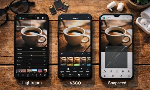
How to edit neutral tones on your phone without making them dull
Editing is where many people miss the mark: either they wash everything out or they turn it gray and lifeless.
Adjustments that usually work (in order)
- Exposure: small move toward natural light
- Highlights: lower slightly to recover bright areas
- Shadows: raise carefully so you don’t flatten the image
- Contrast: moderate to keep depth
- Temperature: neutral or slightly warm (for cozy)
- Saturation: reduce a bit if colors feel loud
- Sharpening: subtle
Tip
Beautiful neutrals aren’t “no color”—they’re controlled color
The goal isn’t to erase everything. It’s to reduce excess and keep coherence. That’s a core reason why everyone uses neutral tones: the look feels intentional.
Three neutral styles for social media
To apply this quickly, choose one style and stick with it for 30 days.
Clean neutral (light and airy)
- Lots of off-white
- Fewer heavy shadows
- Soft contrast
- Great for routine content, desk setups, and “fresh” minimal aesthetics
Urban neutral (modern and minimalist)
- Grays, graphite, concrete tones
- More visible shadows
- Great for city content, tech, outfits, architecture
Cozy neutral (warm lifestyle)
- Beige, caramel, wood textures
- Warm, soft light
- Great for cafés, home moments, routines, and gentle lifestyle visuals
These models show, in practice, why everyone uses neutral tones: they become “templates” that are easy to sustain.
How to stay consistent without getting bored
Vary the framing
Alternate:
- Wide shots (environment)
- Mid shots (you/objects)
- Close-ups (details)
Mix materials and surfaces
Linen + wood + ceramic + paper. The feed stays rich without needing loud color.
Create “wildcard” posts
Neutral photos of sky, walls, tables, and nature textures help you maintain flow when you want to post something outside your plan. This is especially useful when you’re applying why everyone uses neutral tones as a method.
Quick pre-post checklist
Key questions
- Does this image fit the last 9 posts?
- Does the tone match my references?
- Is a strong color stealing attention?
- Is the background clean enough?
- Does the edit feel natural?
This checklist protects your pattern and reinforces why everyone uses neutral tones: consistency becomes a habit.
The future of neutral tones: will they go out of style?
Trends change, but neutrals have an advantage: they don’t depend on a “color of the year.” They rely on design principles—simplicity, harmony, quick readability. Even when brighter waves come in, neutrals remain a base for many creators.
What will likely evolve is the approach: more texture, more intentional imperfection, more personality. In other words, understanding why everyone uses neutral tones is only the beginning—the next step is making it feel like you.
Turning neutrals into identity, not just a trend
If you want a genuinely strong profile, your aesthetic needs to communicate something about you. Neutrals work because they organize, calm, and make consistency easier—but the magic happens when you add an author detail: a subtle accent color, a recurring texture, a signature way of shooting, a clear theme, a rhythm in the grid.
Try this simple challenge: choose one of the three styles (clean, urban, or cozy), pull 20 photos from your camera roll, edit 9 using the same rules, and assemble a grid. When you see the set together, you’ll understand with your eyes—not just theory—why everyone uses neutral tones and how this can elevate your profile without trapping you.


