The rule of thirds is one of the most well-known composition techniques in photography — and also one of the most effective. Simple to understand and powerful when used with intention, this rule can completely transform the way you photograph interior spaces, especially small ones with limited natural lighting.
In this article, you’ll learn how to apply the rule of thirds smartly and creatively in interior settings with restricted natural light, increasing the visual impact of your photos, creating balance in composition, and making the most of the light you have available.
What Is the Rule of Thirds?
The rule of thirds consists of dividing the image into nine equal parts by drawing two vertical and two horizontal lines — creating a sort of imaginary grid over the photo.
The four points where these lines intersect are called points of interest. The main idea is to place the most important elements of the scene near these points or along the lines, instead of centering everything.
This small adjustment in placement brings more dynamism, visual balance, and a natural flow to the viewer’s gaze.
Why the Rule of Thirds Works So Well in Low-Light Interiors
Rooms with limited natural light require extra attention to:
- How light enters and spreads;
- Shadow control;
- Composition that avoids overly dark or unbalanced areas.
By applying the rule of thirds in these contexts, you make better use of the available light, avoid unnecessary centralization that flattens the image, and guide the viewer’s eye more fluidly.
Additionally, using the rule of thirds in small and darker interiors helps balance visual elements (like windows, furniture, and décor), optimizing limited space without overwhelming the composition.
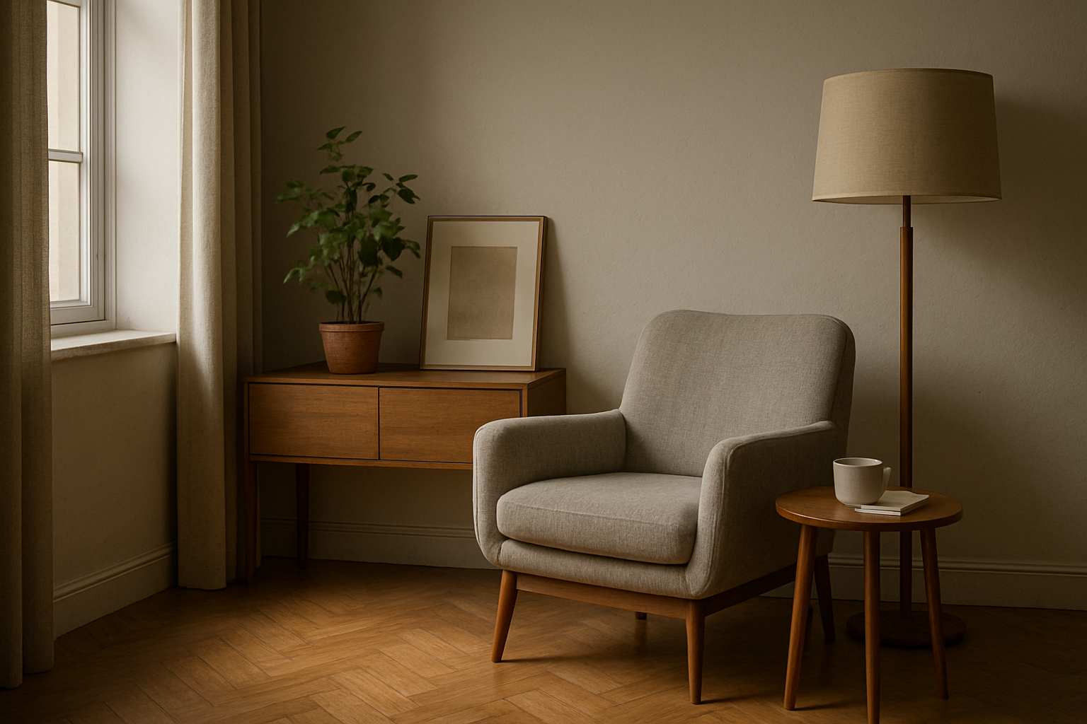
1. Position the Light Source Along One of the Thirds
A powerful tip is to use one of the vertical lines of the rule of thirds grid to place the natural light source, such as a window or glass door.
This allows light to enter the frame from the side, creating soft shadows and enhancing textures in walls and objects — ideal for adding depth and subtle detail.
Practical example: if you’re photographing a living room with a side window, position the camera so that the window sits on the left or right third of the frame. This allows the light to gently fill the rest of the composition with balance.
2. Use the Points of Interest to Highlight Key Objects
In a small space, less is more. That’s why it’s important to intentionally choose which elements to highlight in the image.
Apply the rule of thirds by placing important objects — like a reading chair, plant, lamp, or artwork — on the intersection points of the grid. This helps the object stand out, adds visual harmony, and gives the viewer a clear focal point.
Important: Avoid placing your main subject in the center unless the composition is perfectly symmetrical. An off-center placement — when done intentionally — adds movement and a more natural feel.
3. Align Horizontal Elements with the Grid for Better Balance
Floor lines, wall divisions, or furniture height lines can be used as visual guides. Aligning them with the horizontal lines of the rule of thirds helps better organize space within the image.
Tip: use the bottom horizontal line to align the top of a couch or sideboard. This creates room for the upper part of the photo to “breathe,” especially when soft daylight is entering from above.
You can do the same with shelves, curtains, and wall art — aligning these with thirds results in a more aesthetically pleasing proportion.
4. Balance Light and Shadow Using the Grid
When natural light is limited, managing contrast between light and shadow becomes even more important. The rule of thirds can help you balance these areas intentionally.
For example:
- Use two-thirds of the frame for the lit portion of the room;
- Let the remaining third show a darker or shadowed area.
This split doesn’t have to be exact, but it prevents the photo from feeling heavy or unbalanced. It also helps you avoid overexposed areas that might appear if the brightest part of the scene is centered.
5. Apply the Rule in Close-Ups and Detail Shots
The rule of thirds isn’t just for wide-angle shots of full rooms — it also works great for close-ups and smaller compositions.
If you’re photographing a tabletop scene, a bookshelf, or a decorative corner, use the grid’s intersection points to arrange the key elements. Even simple setups can feel elegant and professional with this rule.
Example: place a coffee mug on the lower left third, and a small plant on the upper right. This kind of placement creates a balanced and harmonious feel.
6. Avoid Forced Symmetry in Asymmetrical Spaces
Trying to force symmetry in spaces where it doesn’t exist can result in awkward visuals. In interiors with side lighting or irregular layouts, this can also create unintentional imbalance between light and shadow.
Using the rule of thirds allows for a more natural, flowing composition — especially useful in small rooms with a single light source or an uneven layout.
Instead of trying to fake balance, use the rule to guide the eye to where the visual weight belongs.
7. Use the Rule as a Guide, Not a Limitation
The rule of thirds is a guideline, not a rule set in stone. It should be used mindfully, not rigidly.
There are moments when centering an object makes more sense — for example, when the composition is perfectly symmetrical or when you want to create dramatic tension.
Tip: try both approaches. Take one photo using the rule of thirds and another using a centered composition. Compare the results. Over time, your eye will develop the ability to know when to follow the rule and when to break it.
Tools to Apply the Rule of Thirds in Real Time
Today, most cameras and smartphones offer an option to activate a grid overlay on the screen — showing the rule of thirds as you frame your shot.
Tip: turn this grid on permanently. It helps train your eye, and with time, applying the rule becomes second nature.
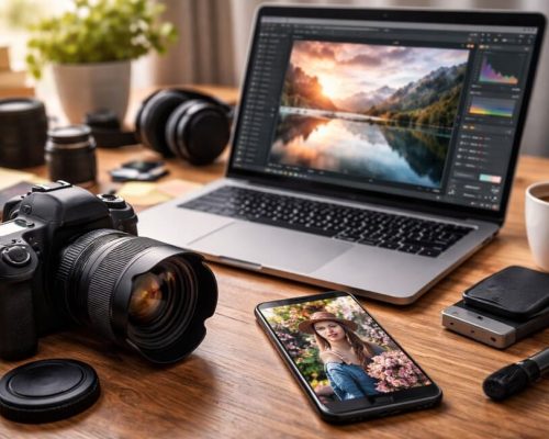
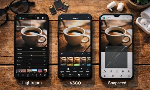
Even during post-processing, the rule of thirds can be applied during cropping. Editing tools like Lightroom, Photoshop, and even mobile apps allow you to adjust your composition after the photo is taken.
Conclusion: Light, Composition, and Intention
In spaces with limited natural light, every decision matters. The angle, the timing, the placement of objects, and the distribution of light and shadow all play a key role in creating a strong image.
The rule of thirds is one of the simplest and most powerful tools for achieving this balance. It brings clarity to the composition, makes the space feel well-planned, and creates a pleasant viewing experience — even in dark or small rooms.
Photographing interiors is not just about documenting objects. It’s about telling stories, capturing ambiance, and evoking emotion. When you learn to place elements intentionally — even with limited light — the result can be surprisingly impactful.