Photographing interiors requires sensitivity, technique, and a strong sense of aesthetic strategy. When dealing with small spaces, every visual choice becomes even more important. And one of the most crucial decisions is: should you use light or dark tones?
Choosing between light or dark palettes goes far beyond personal taste. It directly affects the perception of space, lighting, depth, and visual identity in an image. In this article, we’ll explore how each approach behaves in compact environments, their visual, psychological, and practical effects — and how you, as a photographer or content creator, can make the best choice based on your visual goals.
The Importance of Color in Interior Photography
In interior photography, color is more than decoration — it’s visual language. Through color, you can:
- Influence emotion
- Guide the viewer’s gaze
- Create contrast and balance
- Reinforce a brand or personal style
- Shift perceptions of size and depth
In small spaces, these functions are amplified. The intentional use of light or dark tones can transform how spacious, cozy, sophisticated, or vibrant an image feels.
Light Tones: A Sense of Space and Lightness
Key Characteristics:
- Reflect more light, making rooms brighter
- Create a feeling of openness and airiness
- Favor a clean, minimalist, and contemporary aesthetic
- Convey calm, serenity, and organization
When to Use Light Tones:
- Rooms with little natural light: light tones help compensate for lighting deficiencies.
- Low ceilings or shallow layouts: visually expand the space.
- To convey simplicity and lightness: ideal for Scandinavian, Japandi, or minimalist styles.
- Editorial photography with a clean, lifestyle focus
Typical Palette:
White, off-white, beige, light gray, sand, pastel pink, light blue, mint green.
Composition Tip:
Add pops of color with plants, artwork, or books to break monotony. Avoid overly washed-out or sterile images.
Dark Tones: Depth, Sophistication, and Drama
Key Characteristics:
- Absorb more light, creating intimate, moody settings
- Add visual depth, even in small rooms
- Evoke elegance, strength, and personality
- Ideal for highlighting shapes, shadows, and textures
When to Use Dark Tones:
- Spaces with plenty of natural light: the contrast enhances ambiance.
- Layouts with strong architectural elements: avoids feeling cramped.
- To express bold, editorial styles: great for industrial or contemporary aesthetics.
- Rooms with intentional lighting setups
Typical Palette:
Black, charcoal, slate gray, petrol green, wine, navy blue, dark brown.
Composition Tip:
Use accent lighting to highlight elements or create intentional contrast. Balance dark walls or furniture with lighter details or textures.
How Color Affects Spatial Perception
Color greatly influences how space is perceived in images — especially in tight rooms.
| Aspect | Light Tones | Dark Tones |
|---|---|---|
| Light Reflection | High (brighter environments) | Low (absorbs light) |
| Perceived Space | Feels larger, more open | Feels smaller, cozier |
| Visual Sensation | Lightness, calm | Depth, sophistication |
| Focus Distribution | Balanced across the whole room | Focused on select elements |
| Emotional Tone | Tranquility, cleanliness | Mystery, intensity |
Emotional Influence of Color in Small Interiors
Color has a direct emotional impact — especially in small interiors where visual stimuli are concentrated.
Light Tones and Positive Emotions:
Images dominated by light colors tend to:
- Offer visual relief
- Convey order and cleanliness
- Evoke calm and openness
They echo nature in its softest forms — sky, mist, sand — fostering a soothing experience.
Dark Tones and Deep Emotions:
Darker interiors tend to inspire:
- Focus and introspection
- Cozy, enveloping moods
- Elegance and artistic presence
They allow photographers to work with shadows, depth, and a heightened sense of emotion and intimacy.
Design Trends and Color Use
Understanding design trends helps align your style with what audiences expect — or consciously break those patterns to stand out.
Trend: Clean, Airy Spaces
- Dominated by light tones
- Inspired by Scandinavian minimalism
- Commercially appealing and social media–friendly
- Works well with architectural or lifestyle-focused brands
Trend: Moody, Atmospheric Interiors
- Popularized by Instagram and Pinterest aesthetics
- Makes strong use of shadows and contrast
- Appeals to audiences seeking visual drama
- Suitable for editorial, artistic photography
Being aware of these trends helps you position your work more effectively.
Composition Tips to Emphasize Each Style
Shooting Light Interiors:
- Use symmetry and negative space
- Favor diffused natural light (early morning or overcast days)
- Highlight textures: linens, light woods, matte finishes
- Keep compositions uncluttered and airy
Shooting Dark Interiors:
- Use side lighting to create dramatic shadows
- Focus on contrasts between dark walls and light objects
- Play with depth of field for layered compositions
- Enhance textures like leather, velvet, concrete
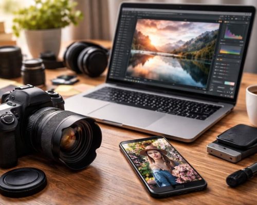
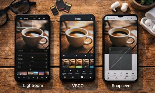
Editing: Reinforcing Your Color Intent
Post-production is where you refine your palette and visual voice.
Editing Light Tones:
- Carefully increase exposure and highlights
- Maintain soft contrast for a clean aesthetic
- Slight desaturation helps with consistency
- Avoid blown-out whites
Editing Dark Tones:
- Deepen shadows while preserving detail
- Use contrast to emphasize shape and texture
- Apply subtle color grading for mood
- Maintain balanced highlights to avoid flattening the image
Which Photographic Styles Match Each Palette?
Minimalist Style
- Pairs best with light tones
- Uses negative space and symmetry
- Promotes clarity and focus
- Ideal for lifestyle and editorial work
Maximalist Style
- Works well with dark tones
- Dense textures and bold elements
- Invites exploration within the frame
- Excellent for storytelling and character-rich spaces
Editorial/Documentary Style
- Can use both approaches depending on the story
- Light tones convey openness and neutrality
- Dark tones highlight mood and tone
- Adapt your palette to the intended emotional impact
Color and Your Visual Identity
Color plays a huge role in defining your personal brand as a photographer. Ask yourself:
- Do your images show a consistent palette across projects?
- Can someone recognize your work at a glance?
- Does your editing reinforce your artistic values?
When the answer is yes, you’re developing a strong, memorable visual identity — a huge asset in growing your brand and attracting clients.
Test Both Styles Without Major Investment
You don’t need elaborate setups to experiment. Try:
- Creating mini sets with light/dark fabrics as backdrops
- Playing with exposure to mimic brightness or mood
- Editing a single image in two different styles
- Using natural window light with sheer curtains
- Arranging simple props to test contrast and storytelling
Testing both styles will help define what feels authentic — and what resonates most with your audience.
How Color Impacts Social Media Performance
Color also influences how your work performs online:
- Light tones: work well in clean, consistent feeds; popular with brands, architecture, and lifestyle niches
- Dark tones: stand out in artistic, bold, and dramatic portfolios
- Consistent palettes: improve viewer retention and brand recognition
- High contrast: often generates more engagement
So yes — color is not just artistic; it’s also strategic.
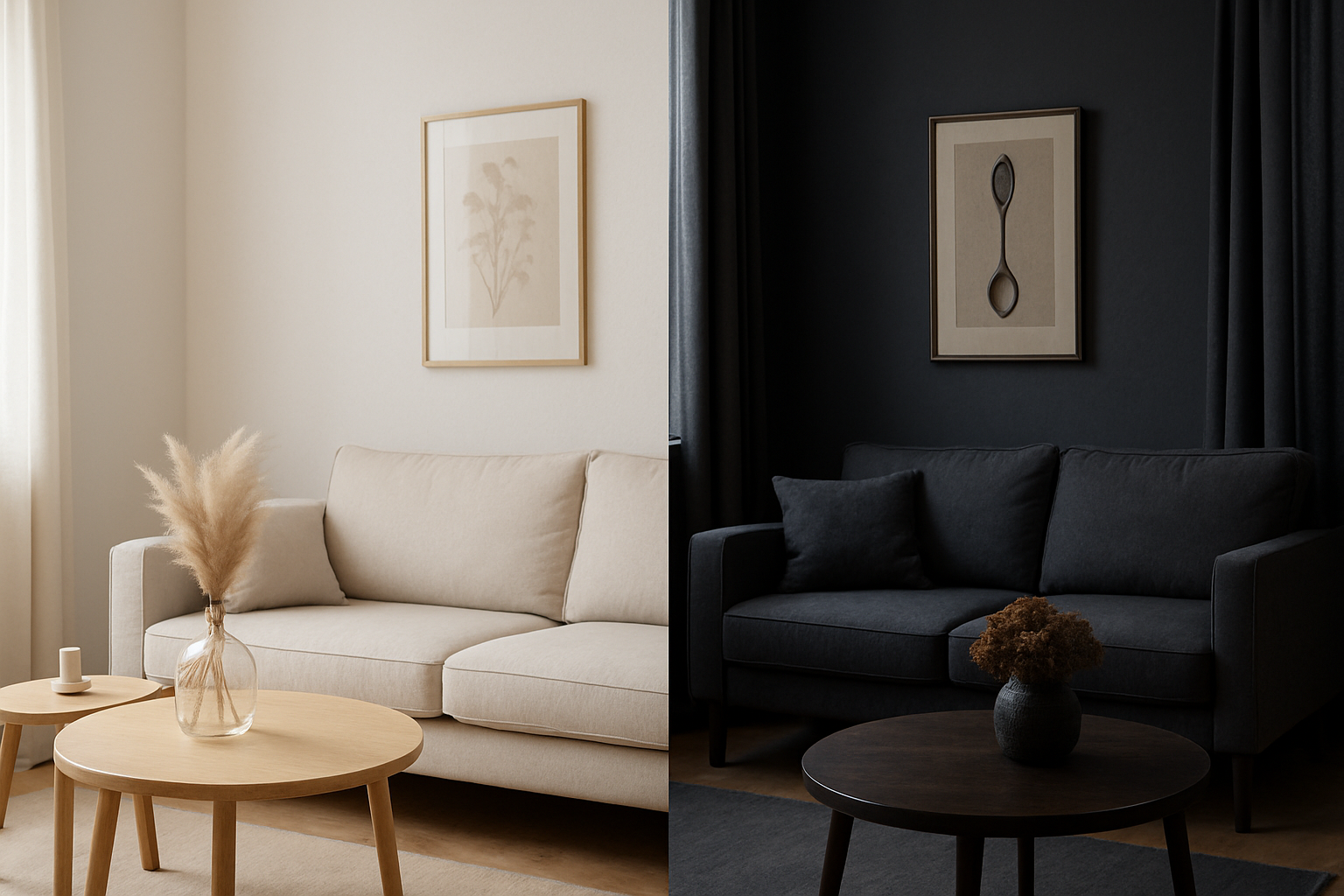
Practical Case Study: Same Room, Two Palettes
Light Version:
- White walls
- Beige sofa
- Natural light and soft shadows
- Results: bright, open, relaxing image
Dark Version:
- Charcoal walls
- Deep blue sofa
- Focused lighting and rich textures
- Results: dramatic, intimate, luxurious atmosphere
Both are valid. The difference is in the story you want to tell.
Checklist: Choosing the Right Palette
Before a photoshoot, ask yourself:
✅ What emotion should the image evoke?
✅ Who is your target audience?
✅ How much natural light is available?
✅ What’s the space’s layout and ceiling height?
✅ What brand/style are you aligning with?
✅ Are you aiming for drama or simplicity?
This checklist turns your color choice into a creative and strategic decision.
Final Thoughts
In small interiors, every detail matters. Choosing between light or dark tones isn’t just about preference — it’s about how you want your work to be perceived.
Light tones expand, calm, and illuminate.
Dark tones focus, captivate, and add depth.
Used intentionally, both can elevate your images from simple photos to powerful visual stories.
As a photographer, your job isn’t just to document — it’s to guide the viewer’s experience. And color is one of your most powerful tools to do that.


