In interior photography, especially when working in small spaces, every visual element must be chosen with intention. Limited space demands smarter compositions, and one of the most powerful tools for this is the use of lines and shapes already present in the environment.
When used effectively, lines and shapes guide the viewer’s eye, help build a harmonious image, and create a sense of depth even in tight rooms. In this article, you’ll learn how to identify and use these elements strategically to enhance your photos in spaces with limited size and natural light.
The Importance of Visual Direction in Interior Photography
The human eye naturally follows lines. When we look at an image, our brain seeks out patterns and directions. If you understand this behavior and intentionally apply visual lines and shapes, you can guide the viewer’s gaze exactly where you want it to go.
This technique is especially useful in:
- Small spaces that tend to look cluttered;
- Rooms with only one natural light source;
- Environments with multiple visual elements (décor, objects, furniture).
With the right composition, you can highlight the essential, eliminate distractions, and transform an ordinary space into a clean, elegant, and impactful photograph.
1. Identify the Room’s Natural Lines
Before positioning your camera, take a moment to observe the space closely, looking for natural lines. These might be found in:
- Floorboards, tiles, or patterns;
- Baseboards and wall moldings;
- Ceilings and light fixtures;
- Curtains, windows, and doors;
- Shelves, countertops, and straight-edged furniture.
These lines are already part of the architecture and layout, and they can be used to create visual direction within the frame.
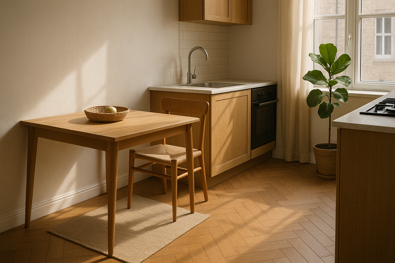
Practical example: floorboards that lead toward a window naturally guide the eye to the light source — which is often the most compelling feature in low-light spaces.
2. Use Horizontal Lines to Convey Stability
Horizontal lines communicate a sense of calm, balance, and stability. In interior photography, they’re useful for grounding your image and creating a strong visual base.
You can align horizontal lines using:
- The top edge of a couch;
- A window sill or trim;
- The line where the wall meets the floor.
Pro tip: keep your camera level with the horizon (use a built-in level or a grid overlay) to ensure horizontal lines remain straight — crooked lines can create visual tension and imbalance.
3. Explore Vertical Lines to Emphasize Height
In small rooms, a sense of verticality can visually expand the space. Vertical lines bring elegance and lead the viewer’s gaze upward, making the room feel taller.
Great vertical elements to use:
- Floor-to-ceiling curtains;
- Tall bookshelves;
- Door frames;
- Floor lamps;
- Upright houseplants.
Best approach: position your camera so these lines appear parallel along the edges of the image, reinforcing structure and order.
4. Diagonal Lines Create Depth and Movement
Diagonal lines are excellent for dynamic compositions. They break the monotony and introduce depth — even in narrow or confined areas.
You’ll often find diagonals in:
- Furniture arranged at angles;
- Walls photographed from a corner;
- Shadows cast by windows;
- Rugs or objects intentionally placed off-axis.
Creative tip: shoot from a room’s corner and let the diagonals formed by walls or furnishings guide the eye toward a focal point (like a chair or window with light).
5. Geometric Shapes Also Guide the Eye
Beyond lines, geometric shapes present in the room can help create visual organization. Squares, rectangles, circles, and triangles in furniture or décor become visual anchors in the composition.
Examples:
- Framed art (rectangles);
- Round mirrors or tables (circles);
- Decorative pillows, angular chairs, or lighting fixtures.
Practical suggestion: frame your shot so shapes either repeat or contrast. This keeps the viewer’s eye engaged and introduces a visual rhythm to the image.
6. Create Composition with Converging Lines
Converging lines are lines that meet at a vanishing point. They’re fantastic for adding depth and perspective, which is especially helpful in small interiors.
Use:
- Floor or ceiling lines;
- Furniture edges in perspective;
- Walls that narrow toward the background.
Technique: place yourself at a spot where two or more lines “point” to the object or space you want to emphasize. This guides the eye and instantly strengthens the composition.
7. Avoid Visual Chaos from Conflicting Lines
A common mistake in photographing small spaces is allowing too many lines to compete in the frame. Misaligned lines or conflicting angles cause visual confusion.
Example of what not to do: photographing a bookshelf from above while the floor appears crooked and the ceiling cuts diagonally through the image.
How to avoid this:
- Level your camera with the room’s geometry;
- Test different compositions before shooting;
- Look out for lines that awkwardly intersect key elements;
- Simplify your scene so primary lines dominate the structure.
8. Use Lines of Light and Shadow in Your Composition
When natural light is limited, shadows themselves become compositional elements. Curtains, blinds, or window frames can cast linear shadows that direct the viewer’s gaze.
Try this: shoot during times when light enters the room at an angle (morning or late afternoon), and use the resulting shadows to create directional lines that lead toward your focal point.
This is particularly effective in minimalist spaces, where light becomes one of the few—but strongest—visual elements.
9. Reinforce Your Visual Style with Repetition of Shapes
Repeating similar shapes within the same scene is a powerful way to create harmony and visual flow. Repetition builds rhythm and cohesion.
Practical examples:
- Three aligned picture frames;
- Matching square pillows on a rectangular couch;
- Round stools in front of a circular table.
This repetition helps the viewer navigate the photo smoothly, with a sense of balance and structure.
10. Combine Lines and Shapes with the Rule of Thirds
If you’re already familiar with the rule of thirds, you can supercharge your compositions by combining it with lines and shapes. Position major lines along the rule of thirds grid and place key shapes at points of interest.
Example setup:
- A window positioned in the left third of the frame;
- A tall plant forming a vertical line;
- A rug with diagonal patterns pointing toward the center.
This combo creates a visually strong and intentional image, making your interior photography both technical and artistic.
Guiding the Eye Is About Telling a Story Precisely
Using lines and shapes to guide the viewer’s eye in small interiors goes far beyond aesthetics — it’s a way to visually narrate the essence of the space. You emphasize what matters, suggest visual paths, and eliminate distractions.
Small spaces demand intelligent composition. It’s not just about documenting the room — it’s about composing with purpose, considering how each visual element influences perception.
When you master lines and shapes, even the smallest room can become a bold, professional, and memorable photograph.