Developing your own photographic style is one of the greatest achievements for any photographer. However, capturing images with a consistent aesthetic means little if the editing process doesn’t uphold this standard. Post‑production is where your visual identity is cemented or lost — and knowing how to edit while staying true to your style is essential for conveying coherence, professionalism, and personality in your portfolio.
In this article, you’ll learn how editing influences the consolidation of your style, which elements you should monitor to keep your aesthetic intact, how to create efficient workflows, and most importantly, how to edit without getting lost in trends and filters that do not represent you as a photographer.
Why Editing Is an Essential Part of Your Style
Photo editing is far more than technical adjustment. It’s a creative step, where you reaffirm the visual choices made at capture time: light, color, composition, atmosphere. That is why editing intentionally is just as important as composing a strong image.
Here’s what editing can define:
- Your brand’s color palette
- Emotional contrast of the image (soft vs. intense)
- Perceived texture and sharpness
- The feeling of light and shadow
- Overall mood of the photograph: warm, cool, vibrant, soft, dramatic…
If you want to build a recognizable visual signature, you must treat editing as part of the creative process — not just a correction after the fact.
First Steps: Define Your Photographic Style
Before opening any editing software, ask yourself:
- What mood predominates in my photos?
- Do I like vibrant or desaturated colors?
- Do I lean toward warm or cool tones?
- Are my images clean and minimalist or rich and complex?
- Do I use soft natural light or strong shadows with dramatic light?
- Does my editing emphasize texture or smooth surfaces?
Answering these questions helps you understand which visual language you want to maintain through editing. From there, it becomes easier to make technical and creative edits with purpose.
Choose a Consistent Color Palette
Color is one of the most immediately noticed elements in an image. A coherent color palette creates visual unity, even when you shoot different subjects and locations.
Tips to maintain your palette:
- Identify tones that already appear regularly in your photos: light wood, concrete gray, plant greens, white, blue, etc.
- In editing, reinforce these with HSL (Hue, Saturation, Luminance) adjustments.
- Avoid dramatic shifts in color from one project to another.
- Keep consistent white balance settings across shoots.
- If you shoot with natural light, keep the tones realistic — avoid filters that distort the scene.
A strong palette creates a powerful signature — and helps your audience recognize your work at a glance.
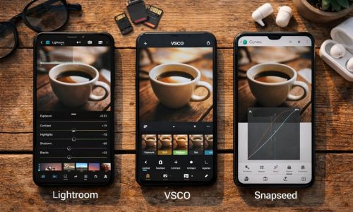
Create Your Own Presets (or Editing Profiles)
Using custom presets is one of the best ways to ensure consistency, save time, and reinforce your style.
How to create them:
- Select a photo that represents your style.
- Edit it comprehensively: color, light, shadows, contrast, grain, tone curves, etc.
- When it embodies your aesthetic, save it as a preset in Lightroom (or your software of choice).
- Apply this preset across other photos and fine‑tune only what’s necessary.
You might develop variations of your presets for different lighting conditions (e.g., “Soft Natural Light”, “Backlight Interior”, “Low‑Light Mood”).
Avoid over‑reliance on presets purchased from others unless you fully customize them — they can dilute your visual identity.
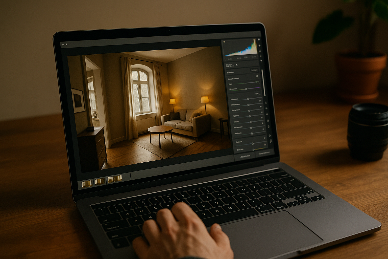
Control Exposure, Contrast and Shadows
These three elements radically transform an image’s aesthetic.
- Exposure: Is your signature bright and airy, or slightly under‑exposed for a more artistic vibe?
- Contrast: High contrast yields drama; low contrast gives calm.
- Shadows/Blacks: Do you prefer dense shadows or open, detail‑rich dark areas?
The key is to keep consistency across your images. Sudden shifts in these values from one image to the next can break visual identity.
Sharpness and Texture: Be Consistent
How you handle sharpness and texture contributes significantly to your style.
- High sharpness and defined detail convey clarity and strength.
- Soft textures and subtle detail evoke delicacy, timelessness, and lightness.
- The use of grain can add a vintage or artistic feel — but must be applied consistently.
Whichever style you adopt, apply it consistently across a series of images.
Avoid Overused Filters and Excessive Saturation
A frequent mistake is attempting to “fix” an image with heavy filters or extreme saturation — which can in fact mask your true visual identity.
- Avoid saturating all colors equally.
- Prefer emphasizing only specific colors that serve the image.
- Preset filters from social‑media apps often generate visual chaos and inconsistency.
- Run editing with intention and purpose, rather than following algorithms.
Use Tone Curves with Personality
Tone curves are a powerful tool to shape an image’s mood.
- A strong “S” curve increases contrast and impact.
- A more linear curve keeps the image neutral and clean.
- Lifting the blacks creates a faded look, often used in vintage or minimalist styles.
- Custom curves can create unique looks — for instance blue‑shadow tones or warm highlights.
Choose a curve that supports your style rather than overwriting it. Test, save variations, and apply.
Local Editing: Micro Adjustments with Macro Impact
Beyond global edits, local adjustments allow you to reinforce your visual intention:
- Use brushes to darken edges and guide the eye inward.
- Gradient filters to tame bright windows or skies in interior shots.
- Masks to brighten key objects or soften certain areas.
- Selective highlight adjustments on whites or skin tones.
These should be subtle — but if well applied, they reinforce your visual intent and keep the aesthetics aligned.
Post‑Production Is Not Transformation — It’s Refinement
Maintaining your style means thinking of editing not as changing the image, but as revealing what is already there. Good editing respects the scene you captured, enhances the authentic, and removes distraction.
Avoid using editing as a crutch for poorly composed or exposed images. The better you build your shot in camera, the simpler the edit — and the more genuine the result.
How to Know If You’re Staying True to Your Style
Ask yourself:
✅ Does this edit represent my style or am I just chasing a trend?
✅ Could this photo be part of my portfolio?
✅ Would someone recognize my work based solely on this image?
✅ Do all photos in this project visually relate to one another?
✅ Am I editing with intention or on autopilot?
If you answer “yes” to most of these, you’re on the right path.
Bonus Tip: Create a Mood Board of Your Style
Assemble a board of 15–20 images that illustrate your ideal style. They can be your own work or references you admire.
Keep this board visible during editing. It acts as a guide to preserve coherence, avoid excess, and remember what belongs — and what doesn’t — in your aesthetic.
Conclusion: Your Editing Is Your Signature
Staying true to your style in editing is one of the greatest challenges — and greatest powers — of auteur photography. It’s not about repeating formulas but creating a visual standard that expresses who you are, what you feel, and how you see the world.
Your style may evolve, but at each phase, it must be intentional, consistent, and authentic.
When in doubt, less is more. The best filter is the one that reveals the essence of your photograph — not hides it.