Interior design projects that use dark environments as a base offer a noble opportunity to create sophisticated, cozy, and dramatic atmospheres. However, when working with low-light aesthetics, it is essential to have a well-structured visual palette to prevent the space from appearing monotonous, heavy, or lifeless. This detailed guide will help you, whether you’re a professional or an enthusiast of photography and design, understand how to define a coherent and effective visual palette for dark interior projects.
Why Is the Visual Palette So Important in Dark Environments?
The visual palette is the set of colors, textures, and materials that give identity to a visual project. In dark environments, it plays an even more crucial role due to the following factors:
- Spatial perception control: Dark colors tend to shrink the boundaries of the environment, making it more intimate or smaller.
- Light sensitivity: The way light interacts with colors and surfaces becomes a central feature.
- Style and emotion: Dark palettes convey elegance, mystery, or coziness, depending on the compositions.
Furthermore, for those working with photography, these environments require even more attention to visual planning, as the way colors are captured by the lens can drastically change the final perception.
Step 1: Understand the Purpose of the Space
Before defining any color, it is essential to understand the functional and emotional objective of the space. Ask yourself:
- Will this environment be used for relaxation or work?
- Do I want it to convey comfort, sophistication, drama, or minimalism?
- What is the profile of the people who will use the space?
For example, a dark home office can convey focus and professionalism, while a dark living room can offer comfort and elegance. These elements define not only the color palette but also the choice of furniture, textures, and lighting.
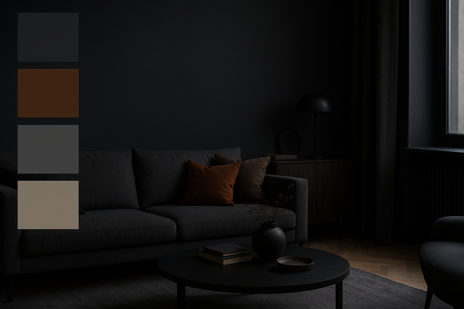
Step 2: Choose the Dark Base Color
The base color will be the foundation of the project. It is applied to major surfaces, such as walls, large furniture, or rugs. Some popular options include:
- Matte black: For a dramatic and modern style.
- Graphite gray: More versatile and less visually aggressive.
- Deep moss green: Ideal for environments with natural elements.
- Navy blue: Elegant and great for combining with gold or wooden details.
- Chocolate brown: Conveys warmth and coziness.
Beyond the color choice itself, consider the finish (matte, satin, textured) as this directly influences the absorption of light and the tactile sensation of the space.
Step 3: Create Contrast with Supporting Colors
A well-structured dark palette needs supporting colors to avoid monotony. These colors complement the base and appear in smaller details, such as cushions, decorative objects, or wall art.
Examples of good combinations:
- Navy blue + off-white + bronze
- Graphite + light beige + natural wood
- Dark green + gold + cream
- Black + earthy tones + burnt cement
Use the 60-30-10 rule:
- 60% of the dominant color (dark base)
- 30% of a lighter secondary color
- 10% of a highlight tone (metallic, vibrant, or contrasting)
Supporting colors help guide the eye, highlight focal points, and make the space more welcoming.
Step 4: The Importance of Textures
In dark environments, texture variety is essential to create visual depth. Similar colors can look flat if applied to homogeneous surfaces.
Recommended textures include:
- Wood (rustic or varnished)
- Fabrics such as linen, velvet, or leather
- Brushed metals (copper, bronze, matte black)
- Smoked or frosted glass
- Walls with cement finishes or textured paint
The tactile diversity creates a rich atmosphere, where lighting can interact dynamically with surfaces, revealing different nuances throughout the day.
Step 5: Lighting and How It Affects the Palette
No visual palette survives a poorly planned lighting project, especially in dark environments. Here are the key points:
- Direct lighting: To highlight specific elements (e.g., spotlights on paintings or shelves)
- Diffuse lighting: Creates a cozy ambiance (LED strips, lamps with opaque shades)
- Color temperature: Warm tones (2700K to 3000K) work best to preserve the cozy mood of dark colors.
The same navy blue tone can look cold and dull under cool white light or deep and sophisticated under warm, indirect light. Additionally, choosing light fixtures with harmonious design reinforces the space’s aesthetic cohesion.
Step 6: Visual Palette for Photography of Dark Interiors
For those working with interior photography, choosing a suitable palette also improves the photo results:
- Avoid excessive reflections by choosing matte finish materials.
- Use controlled contrasts to facilitate exposure and white balance.
- Prioritize visible textures that enrich the photographic narrative.
- Consider natural light: In spaces with low sunlight, dark tones should be used more moderately.
Also, think of the composition as a photographic frame: the dark background can enhance lighter objects, creating a visual interplay that adds artistic value to the image.
Step 7: Inspiring Chromatic References
Getting inspiration from professional palettes helps develop your eye. Some classic references for dark environments include:
- Dark Scandinavian style: Grays, blacks, and browns with light wood and neutral fabrics
- Industrial style: Cement gray, black, rust, raw metals
- Sophisticated classic style: Deep blue, off-white, gold, velvet
- Chic bohemian style: Dark green, mustard, wine, artisanal elements
Create visual boards with these references and analyze how professionals balance colors, lights, and materials. This serves as an excellent starting point for authorial projects.
Step 8: Test on a Small Scale
Before committing to a large-scale palette, test:
- Paint samples on the walls
- Fabrics on sofas or temporary curtains
- Photos taken at different times of the day
These tests help prevent regrets and expensive adjustments later. You can check how the color behaves under natural, artificial light, and in photographs.
Step 9: Visual Composition with Artistic Elements
Incorporating artworks, paintings, sculptures, or authorial photography also helps enrich the palette.
- Black and white photography adds sophistication
- Colorful abstract art can serve as a vibrant focal point
- Wooden, copper, or black frames complement elegantly
Art should not just fill empty spaces but integrate with the aesthetic narrative of the environment.
Step 10: Visual Palette Coherent with the Entire Residence
Even if only one room is dark, it is important that it connects with the other spaces in the house. Maintain common elements:
- Repetition of supporting colors
- Continuity of materials (woods, metals, fabrics)
- Harmonious lighting
This coherence helps create a visual flow between rooms and reinforces the sense of unity and sophistication throughout the home.
Extra Tip: Digital Tools to Simulate Palettes
Today, there are several digital tools that allow you to test palettes before applying them in the real environment:
- Coolors.co: To create harmonious combinations.
- Canva Palettes: Useful for image-based inspiration.
- Adobe Color: For a more technical and professional analysis.
- Paint brand AR apps: Test colors directly on walls via mobile.
Using these tools can save time and reduce errors, in addition to facilitating communication with clients or project partners.
Finishing with Elegance
Defining a visual palette for dark environments requires sensitivity, planning, and experimentation. It’s a creative journey that can transform ordinary spaces into true cinematic scenarios. When well applied, the combination of colors, lights, and textures results in environments full of identity and personality.
If you’re a photography professional, chromatic harmony not only enhances the on-site experience but also elevates the quality of the images captured. Be bold, explore, and refine your creative eye to craft environments that are memorable both in person and in photographs.