You can have a strong idea, great copy, and a clean layout—but if the image doesn’t communicate quality, the post loses power before anyone even reads a line. In Digital Culture + Visual Lifestyle, the image is the first hook: it sets the tone of professionalism, determines whether someone stops scrolling, and even shapes how trustworthy your message feels.
That’s exactly why this guide exists: How to choose the ideal stock image library isn’t just “where to find pretty photos.” It’s about building a visual foundation that matches your style, respects usage rights, offers variety, has strong search tools, and helps you stay consistent without looking generic.
In the next minutes, you’ll learn How to choose the ideal stock image library with clear criteria, a practical step-by-step, and a repeatable method to create posts that look more polished—without making your workflow complicated.
What a Stock Image Library Is and Why It Matters
A stock image library is a platform that provides photos, videos, vectors, illustrations, and other visual assets for use in creative projects. Some are free, some are paid, and many are hybrid (a free catalog plus premium options).
The key point: a stock library isn’t only a “gallery.” It influences:
- the perceived quality of your visuals
- the aesthetic you can maintain over time
- the legal safety of what you publish
- the speed and consistency of your content production
That’s why learning How to choose the ideal stock image library is not a minor technical decision—it’s part of your content strategy.
Why the Right Stock Library Changes the Impact of Your Posts
First Impressions Happen in Seconds
On social platforms, the image often decides whether the content is consumed. A coherent, well-selected visual communicates professionalism without you saying a word. If you want people to take your content seriously, How to choose the ideal stock image library becomes a direct lever for credibility.
Visual Consistency Creates Recognition
When your visuals share similar lighting, composition, color mood, and texture, your profile starts to feel like a “brand.” That recognition increases the chances of people remembering you—and noticing your posts again later. A good process for How to choose the ideal stock image library makes consistency easier to sustain.
Credibility and Legal Safety
Using visuals without the right license can lead to content removals, copyright notices, or disputes—especially if you monetize, run ads, or work with clients. How to choose the ideal stock image library includes understanding licensing basics so your content stays safe and stable.
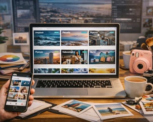
Types of Stock Image Libraries and When Each One Makes Sense
Free Libraries
Great for starting and testing styles. But they can come with:
- overused images (less originality)
- smaller variety in specific niches
- limitations for video, vectors, and premium collections
Paid Libraries (Subscriptions)
Worth it if you publish frequently. They typically offer:
- larger, more curated catalogs
- better search filters and “similar image” features
- cohesive collections (matching sets)
- clearer licensing and support
Hybrid Libraries (Freemium)
A mix of free and paid assets. Good if you want to:
- start without cost
- upgrade later as your content grows
- use premium assets for special posts and campaigns
Knowing the difference helps you make smarter decisions in How to choose the ideal stock image library without paying for what you don’t need.
The Criteria That Truly Matter When Choosing
This is the heart of the topic: the criteria that separate “random images” from a professional visual base. A great platform doesn’t just provide pretty pictures—it helps you build a repeatable system for quality, identity, and speed.
The fastest way to evaluate any library is to look at four pillars:
- technical quality,
- aesthetic coherence,
- search and workflow efficiency,
- licensing clarity.
If one of these pillars is weak, you’ll feel it later—through wasted time, inconsistent visuals, or legal uncertainty.
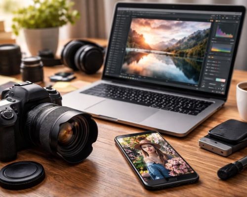
Technical Quality of the Catalog
Resolution and Clarity
For professional-looking posts, choose images with high resolution. That keeps detail intact when you crop, zoom, or adapt for different formats. A strong rule in How to choose the ideal stock image library is to prioritize assets that stay sharp across platforms.
Variety of Formats
If you create content for:
- square feeds
- 4:5 posts
- Stories/Reels in 9:16
you need images that survive different crops without losing their focal point. Look for photos with clear subject placement and enough margin around the main elements.
Video and Motion Assets
If you publish Reels, Shorts, or animated backgrounds, check whether the library offers video clips with the same aesthetic as the photos. How to choose the ideal stock image library is also about matching your photo style to your motion style.
Style and Aesthetic Coherence
A common mistake is choosing a library only because the catalog is huge. What matters is: does it fit your identity? In lifestyle visual content, the “feel” of an image often matters more than the object inside it.
Practical Questions to Ask
- Do the photos feel natural or overly staged?
- Is the lighting lifestyle-real or studio-perfect?
- Do colors lean neutral, vibrant, pastel, or urban?
- Do the images match the mood you want your audience to feel?
For Digital Culture + Visual Lifestyle, aesthetics are not “extra.” They’re part of the message. That’s why How to choose the ideal stock image library should always include evaluating the visual direction.
Pick a Library That Supports Your Style, Not One That Forces You to Change
If your brand is warm neutrals and window light, a library dominated by high-saturation studio shots will create extra editing work and inconsistency. The best choice is the one that naturally “fits” your intended mood.
Search and Filters That Save Hours
Weak libraries cost time. Strong libraries save time and help you publish more consistently. Search quality is often the difference between a platform you love and one you abandon after a week.
Filters That Are Truly Valuable
- orientation (horizontal/vertical)
- dominant color
- asset type (photo, vector, illustration, video)
- people / no people
- negative space (perfect for text overlays)
- collections and “similar images” suggestions
If search isn’t good, your workflow suffers. That’s why, in How to choose the ideal stock image library, search quality is a major deciding factor.
Licenses and Usage Rights You Must Understand
You don’t need legal jargon—you need practical clarity. The “ideal” library is one that makes rights understandable, accessible, and consistent.
What to Check
- Is commercial use allowed?
- Is attribution required?
- Can you edit the image and create derivatives?
- Are there restrictions for ads or sponsored content?
- Is usage allowed in products (templates, ebooks, print items)?
People often skip this because they’re in a hurry. But How to choose the ideal stock image library must include license verification, especially if you’re building a monetized blog or professional profile.
Build a Simple Habit
Before downloading, open the license page and confirm “commercial use” and whether attribution is required for your intended use. This single habit prevents the most common headaches later.
Originality and the “Stock Photo Look” Risk
You’ve seen them: perfect-but-generic images that look like ads. That can weaken your content because it feels impersonal—like a template anyone could post.
How to Reduce the Generic Look
- prefer images with real texture and slight imperfections
- choose natural compositions over staged poses
- crop differently instead of using the “default hero shot”
- mix stock with your own phone photos
This balance is essential in How to choose the ideal stock image library if you want impact and identity—not just pretty visuals.
How to Choose the Ideal Stock Image Library Step by Step
Here’s a method you can apply today—simple enough for beginners, strong enough for professional workflows.
Step 1) Define Your Content Goals
Do you need images for:
- educational carousels?
- Reel covers?
- lifestyle posts?
- blog headers and Pinterest pins?
- ads and promos?
Your goal determines what “ideal” means. That clarity is the first step in How to choose the ideal stock image library.
Step 2) Define Your Aesthetic in Three Words
Examples:
- “clean, neutral, modern”
- “cozy, warm, everyday”
- “urban, minimal, contrast”
These words guide your search and make How to choose the ideal stock image library much faster.
Step 3) Test Three Libraries Using the Same Search List
Create 10 search terms you always need (for example: “desk setup,” “coffee shop,” “smartphone,” “minimal background,” “flat lay notebook,” “city night,” “hands typing”). Run the same searches in each platform and compare:
- result quality
- filtering speed
- aesthetic consistency
- variety within your niche
Step 4) Verify the License on Three Assets
Check if it clearly states:
- what you can do
- what you can’t do
- whether credit is required
If it’s confusing, that’s a red flag. Clarity matters in How to choose the ideal stock image library.
Step 5) Download a Coherent “Kit” of 30 Assets
Instead of downloading one-by-one, build a mini-library:
- 10 backgrounds (clean, negative space)
- 10 lifestyle images (routine, environments)
- 10 detail shots (objects, hands, textures)
This kit makes consistency easier—one of the biggest wins of How to choose the ideal stock image library.
Step 6) Organize Assets by Function
Suggested folders:
- Covers / Backgrounds
- Lifestyle
- Details
- Tech
- City / Travel
- Textures
Organization saves time and keeps your style consistent across weeks.
How to Use Stock Images to Create Brand-Level Posts
You don’t just want pretty images—you want visuals that feel like they belong to you. That feeling comes from repeated decisions: consistent light, consistent color behavior, consistent composition logic.
A stock library becomes powerful when it serves as raw material for your identity—not a shortcut that makes everything look the same as everyone else.
Three Techniques That Work Extremely Well
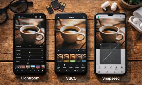
Technique 1) Standardize Your Editing Logic
Even stock images can feel authored if you consistently:
- adjust temperature in the same direction
- keep saturation under control
- maintain similar contrast
- use similar sharpness and clarity settings
This is a powerful extension of How to choose the ideal stock image library because it makes mixed sources look unified.
Technique 2) Choose Images With Negative Space
For text-heavy posts (carousels, covers, hooks), negative space makes typography cleaner and more readable, instantly upgrading perceived quality.
Technique 3) Repeat Visual Elements With Intention
Examples:
- light wood + neutral tones
- window-light shadows
- recurring digital objects (phone, laptop, headphones)
Repetition creates a recognizable signature.
The Best Combo: Stock Plus Your Own Photos (Even Simple Ones)
If you want to avoid the generic feel, mixing is the most effective strategy. Stock fills gaps; your own photos create authenticity.
What to Shoot With Your Phone (Easy and Useful)
- your workspace
- coffee + laptop scenes
- hands typing or holding a phone
- details of your environment
- textures (wall, fabric, shadow patterns)
Use stock to fill conceptual needs (abstract scenes, travel visuals, niche situations) and use your own photos to keep the content grounded and personal. That’s a real “pro” outcome of How to choose the ideal stock image library.
Quick Checklist Before Publishing to Avoid Headaches
Quality and Aesthetics
- Is the image sharp and well-lit?
- Does it match your last 9 posts visually?
- Does it have space for text if needed?
Safety and Licensing
- Is it allowed for your use case (commercial, blog, social)?
- Does it require attribution?
- Are there restrictions for ads or products?
Consistency
- Does the mood match your references?
- Are you using an image that’s extremely overused?
This checklist completes How to choose the ideal stock image library with professionalism and responsibility.
When Paying for a Stock Library Is Worth It
You don’t need to pay at the start. But it often becomes worth it when:
- you publish several times a week
- you want more exclusive-looking assets
- you need video + cohesive collections
- you create content for clients and need legal clarity
In many cases, the value comes from time saved and stronger perceived quality—two outcomes directly tied to How to choose the ideal stock image library.
What Truly Makes a Post Look Professional
In the end, it’s not only the photo—it’s the system:
- a visual that matches your identity
- a clean layout and strong hierarchy
- clear copy and purposeful composition
- consistency across weeks, not just one post
Learning How to choose the ideal stock image library puts you in control of your visuals. You stop “hunting for images” and start building a strategic library that speeds up creation and upgrades your positioning.
If you apply the step-by-step and build your 30-asset kit, you’ll feel the difference immediately: content creation gets faster, your posts look more aligned, and your feed starts communicating professionalism before anyone reads the caption. That’s the kind of invisible detail that turns a normal profile into a memorable one.