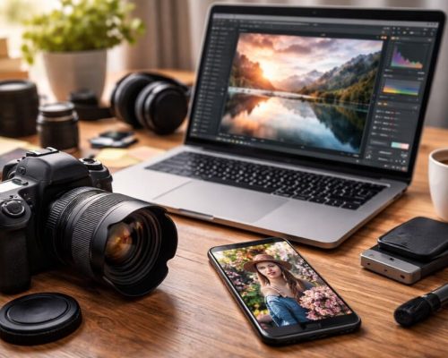
Small spaces demand a trained and careful eye. A single misplaced object can compromise the entire composition of a photo. When space is limited, every element that enters the frame must have a purpose and contribute visually. That’s why avoiding visual clutter is one of the most valuable skills for anyone photographing interiors with natural light.
In this article, you’ll learn practical and creative techniques to eliminate excess, organize the environment visually, and compose cleaner, more elegant, and impactful images — even in the tightest of spaces.
What Is Visual Clutter in Interior Photography?
Visual clutter occurs when too many elements compete for the viewer’s attention within a single image. This can include:
- Unnecessary objects;
- Strong or clashing colors;
- Unwanted reflections;
- Misaligned items;
- Too much visual information overall.
The result is a confusing image, with no clear focus, which leads to visual fatigue and reduces the image’s impact — even if the room itself is beautifully decorated.
Why Are Small Spaces More Prone to This Problem?
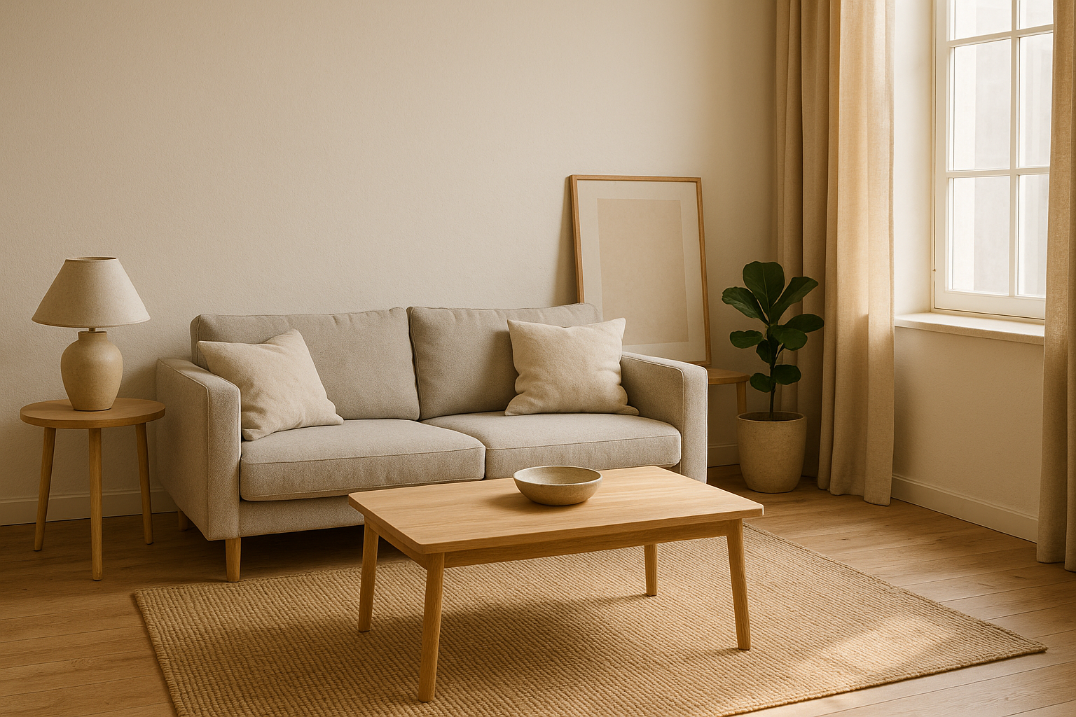
Tight environments leave less room to breathe. One extra piece of furniture, a pillow out of place, or a poorly positioned plant is enough to throw the whole image off balance.
Additionally, when using natural light, the contrast between light and shadow can accentuate visual chaos if elements aren’t organized. That’s why a clean composition is essential for highlighting the right details and conveying a sense of order.
1. Start by Removing Before Adding
The first step in avoiding visual clutter is to remove everything that doesn’t serve the photo. Before thinking about framing or lighting, look at the space with a critical eye and ask:
Does this contribute visually, or is it just here out of habit?
Remove:
- Personal items (keys, bags, remote controls);
- Out-of-context objects (clothes, toys, loose cables);
- Minor clutter that goes unnoticed in daily life.
Start with a minimalist space, and only add items that genuinely enhance the scene.
2. Organize the Scene by Color and Shape
A simple yet effective visual technique is to organize objects by color and shape. This creates harmony and prevents the eye from becoming overwhelmed.
Practical tips:
- Use neutral tones or variations of a single color;
- Avoid mixing very different shapes in the same plane;
- Group similar objects to create visual unity.
Repetition and visual patterns help tame chaos. Three similar vases have more impact than five random ones.
3. Watch the Edges of the Frame
Visual clutter often sneaks in at the edges of the image, where objects are unintentionally cut off or appear without context.
Avoid:
- Furniture edges that serve no purpose;
- Half a lamp or a mirror clipped by the frame;
- Exposed wires or wall sockets on the sides.
Pro tip: before pressing the shutter, scan the frame’s edges. Adjust the camera or the elements until everything that appears in the image is intentional, not accidental.
4. Use Negative Space Wisely
Negative space is the “empty” area in a photo — walls, floors, or surfaces without objects. It’s essential for creating visual breathing room, especially in tight spaces.
Don’t fear the empty areas. They:
- Highlight the focal point;
- Balance visual information;
- Convey a sense of calm and order.
Ask yourself:
Does this photo give the viewer room to rest their eyes?
If not, it may be time to reduce or reposition some elements.
5. Limit the Number of Points of Interest
Don’t try to show everything at once. Choose a single focal point per photo, and allow supporting elements to play a secondary role.
Examples of strong focal points:
- A cozy armchair lit by natural light;
- A well-composed table centerpiece;
- A framed artwork on the wall.
Photos with multiple points of interest confuse the viewer. Simplicity is often more powerful and more effective in small spaces.
6. Control Depth of Field
Using a shallower depth of field (blurring the background) can isolate the subject and soften any excess visual information.
You can do this by:
- Choosing a wide aperture (f/1.8, f/2.8);
- Creating distance between the subject and the background;
- Manually selecting the focal point.
This technique helps draw attention directly to what matters and is especially useful in cluttered or compact environments.
7. Choose the Best Angle to Avoid Overlapping Elements
Shooting straight on isn’t always the best choice. Trying other angles can help you:
- Hide visual clutter;
- Control the background more effectively;
- Create greater depth.
Try photographing from a corner, from above, or at a diagonal. These angles often help simplify the frame and reduce the number of elements competing for attention.
8. Use Natural Light to Organize the Scene
Light can be a powerful tool in composition. With it, you can:
- Illuminate only part of the scene (leaving the rest in soft shadow);
- Create lines or separation using light and shade;
- Highlight specific objects while softening others.
Light direction matters too. Side lighting adds depth and separates the subject from the background. Frontal lighting tends to flatten the scene, so use it sparingly.
Tip: Take advantage of early morning or late afternoon when light is softer and more directional. Diffused light enhances textures without creating harsh contrast.
9. Don’t Ignore the Floor and Ceiling
In small rooms, the floor and ceiling often appear in your image. If overlooked, they can distract or ruin your composition.
On the floor:
- Hide loose wires or misplaced rugs;
- Remove unnecessary or misaligned items;
- Position rugs or floor patterns with intention.
On the ceiling:
- Make sure light fixtures are centered and clean;
- Avoid chopping ceiling fans or creating strange angles;
- Hide exposed cables or visually messy details.
These may seem minor, but they make a big difference in visual cleanliness.
10. Review Before and After Shooting
Interior photography is an exercise in attention to detail. Even after staging the scene, it’s worth reviewing before clicking:
- Are there any unwanted reflections?
- Is the composition balanced?
- Are any objects awkwardly cropped?
- Does the background support or distract?
After shooting, review the image carefully. Often, clutter only becomes obvious when viewed on a large screen. Don’t hesitate to make adjustments or reshoot — this final review step is what separates amateur shots from polished, professional work.
11. Work with Visual Themes
One powerful strategy to reduce visual clutter is to define a theme for the photo. This can be a dominant color, a texture, a furniture style, or even a concept like “coziness” or “urban minimalism.”
Having a theme helps eliminate what doesn’t belong and reinforces the image’s identity. This makes your composition more coherent and visually strong — even in limited spaces.
Less Is More: The Strength of Simple Composition
Avoiding visual clutter isn’t about limiting creativity — it’s about refining your visual message. In tight spaces, a clean composition is what allows the room to shine, light to be appreciated, and details to take center stage.
When the viewer steps into a clean, well-composed image with a clear focus, they stay longer, observe more, and connect deeply with the scene. And that is the ultimate goal of interior photography: to visually communicate with clarity and emotion.