Photographing small interiors may seem like a challenge at first, but with the right framing techniques, it’s possible to transform a compact room into an image that conveys spaciousness, lightness, and functionality. When used strategically, framing allows the photographer to guide the viewer’s eye, add depth to the scene, and highlight the best features of the space—even when it’s very limited.
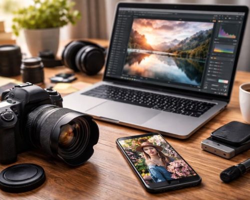
In this article, you’ll discover professional and creative framing techniques to visually expand small interiors using only what you already have: natural light, your camera (or smartphone), the room’s décor, and—of course—an attentive eye.
What Is Framing and Why Does It Matter?
Framing is how you define the boundaries of an image—what you include or leave out, and how you organize the elements within the rectangle of the photo. It’s a crucial tool to create a sense of space, depth, and visual balance.
In small rooms, framing becomes even more important, because a poorly chosen frame can flatten, “compress,” or visually clutter the scene. When done well, framing transforms an ordinary space into an elegant composition that enhances both the décor and architectural design.
1. Use Leading Lines to Create Depth
Leading lines are imaginary lines that guide the viewer’s eye toward a focal point in the image. They create the illusion of depth, even in short or narrow spaces.
You can use:
- Floor patterns (especially herringbone or plank flooring);
- Edges of furniture (like tables or shelves);
- Wall, baseboard, or ceiling lines;
- Architectural details (beams, frames, windows).
Practical tip: Position yourself so that these lines enter the image diagonally, leading from the sides toward the center or background. This makes the space appear deeper than it really is.
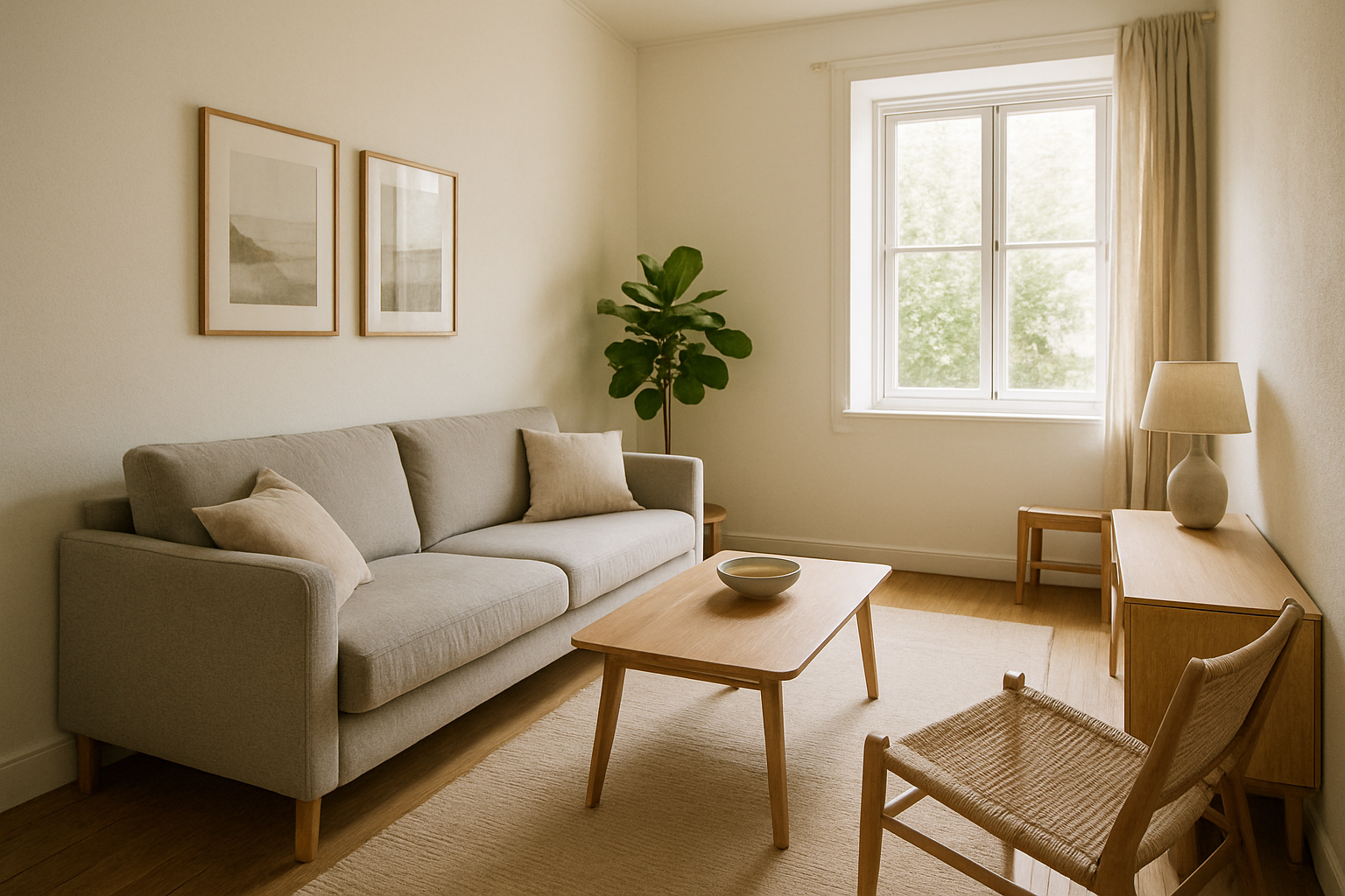
2. Diagonal Framing: The Small Space’s Best Friend
The most common way to photograph a room is straight-on, centering the opposite wall. However, in small spaces, this can flatten the scene and remove dimensionality.
Switching to diagonal framing allows you to capture at least two walls and often includes a natural light source. This creates more visual layers, increases the feeling of three-dimensionality, and provides a more engaging perspective of the room.
Try this: Stand in one corner of the room and point your camera toward the opposite diagonal. Adjust your angle to include parts of the ceiling and floor, reinforcing the room’s visual volume.
3. Use Foreground Elements with Intention
Many people avoid placing objects close to the lens, but intentionally using foreground elements is a powerful trick for creating depth.
For example, photographing a plant near the camera and a couch in the background creates a layered scene that tricks the eye into perceiving a larger space. The key is ensuring the foreground element doesn’t block the rest of the scene but enhances it.
Suggestion: Place an object in the bottom corner of the frame—such as a lamp, vase, or chair—to create this sense of depth.
4. Vertical Framing to Highlight Room Height
Although horizontal framing is the most common in interior photography, vertical framing (portrait mode) can be a secret weapon to highlight ceiling height.
Small rooms with high ceilings benefit greatly from vertical photos. This format allows you to show the base and top of the space while emphasizing features like tall curtains, shelving, light fixtures, or wall art.
Bonus tip: Combine vertical framing with a low perspective—shoot from a lower angle upward. This enhances both the sense of height and depth.
5. Embrace Negative Space
In a world where we often try to show “everything all the time,” negative space—the empty areas in a photo—can offer a valuable visual pause.
By intentionally leaving parts of the image empty (like a plain wall or visible floor), you highlight the elements that are present, create elegance, and convey openness. It gives the image room to breathe and makes the space appear larger.
Important: Use negative space thoughtfully. It shouldn’t feel like an accidental blank spot but rather an intentional part of your composition.
6. Avoid Unintentional Cropping at the Edges
A common mistake in interior photos is accidentally cropping objects along the edges, which can create visual discomfort and a sense of imbalance.
Avoid framing in a way that cuts furniture “in half” unless it’s a deliberate stylistic choice. Either include the full object or crop in a way that respects the visual logic of the scene.
Practical rule: Before clicking, scan the edges of your frame. Look out for chair legs, half cushions, or decor items that seem like they’re “escaping” the photo.
7. Use Mirrors to Double the Space
Mirrors are incredible elements for small space photography. When placed strategically, they reflect light and visually double the room, creating a sense of continuity and openness.
You can use mirrors as part of the composition (photographing the reflection) or as a background tool (reflecting windows, for instance).
Essential precautions:
- Don’t appear in the reflection;
- Be mindful of what’s being reflected—avoid clutter or unwanted distractions.
8. Center Your Frame Only with Symmetry
Centering the frame can work well, but only when there’s true symmetry in the scene—like two identical lamps, twin artwork, or a bed with matching nightstands.
If the scene isn’t symmetrical, central framing often feels visually confusing. In such cases, it’s better to use the rule of thirds or a purposeful asymmetric composition.
Tip: To convey calm and order, use symmetry. For a dynamic and modern feel, go for asymmetry.
9. Shoot in Series: Variations on One Corner
One of the best ways to discover the ideal frame is to photograph the same corner or area from multiple angles. This helps you test what works best in terms of light, depth, and visual balance.
Experiment by changing:
- The camera’s distance from the subject;
- Height (low, medium, or high);
- Tilt (upward or downward);
- The number of elements included.
Later, compare your images and evaluate which one best conveys the sense of spaciousness you’re after.
10. Use Light as Part of the Frame
Natural light doesn’t just illuminate—it should be part of the composition. Framing in a way that includes light from the side or background can soften the image and visually expand the scene.
Take advantage of times when the light enters the room in a diffused way (early morning or late afternoon) and position yourself so that it creates gentle shadows, textures, and highlights.
Avoid: Shooting directly against bright windows without control—this can result in overexposed or dark areas. Use sheer curtains to soften harsh light if needed.
Conclusion: Framing Is a Way of Telling Stories
Framing techniques are more than technical tools—they’re creative strategies that shape how the viewer perceives a space. In small rooms, every choice counts: the angle, the visual crop, and the balance between fullness and emptiness.
With the strategies you’ve learned in this article, you can transform compact interiors into images that feel rich, open, and inviting. Even without expensive gear or major staging, the right framing can work visual miracles.
The true magic lies in looking carefully, experimenting patiently, and composing with intention.