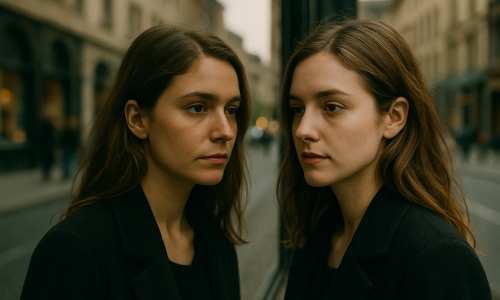
Maintaining a cohesive aesthetic while photographing different rooms can seem like a challenge — especially when each space has its own purpose, lighting, and decor. However, for professional photographers and content creators looking to build a strong visual identity, consistency is key. In this article, you’ll understand why visual cohesion matters in interior photography, how to achieve it even in contrasting spaces, and which visual elements can connect your shots — even when the rooms are entirely different from one another. Why Does Visual Cohesion Matter? A consistent aesthetic makes your photos feel like part of a whole, even when they show very different locations. This results in: Different rooms don’t need completely different styles — you can build a connected photo narrative using consistent choices in lighting, color, composition, and editing. 1. Define Your Photographic Identity Before considering how to photograph the rooms, it’s important to clarify who you are as a photographer. Your visual identity will be the thread that ties all images together. Ask yourself: Once you define your style, it starts to guide all your photographic decisions — from lens selection to post-production. 2. Choose a Base Color Palette Color is one of the most noticeable elements in photography. Using a consistent color palette helps you visually connect separate spaces. Tips for Application: You can absolutely photograph different styles — but if the core colors complement each other, your aesthetic will remain cohesive. 3. Lighting: The Great Unifier The way light is used in your photos has a huge impact on overall aesthetics. Even very different rooms can look like part of the same “universe” if photographed under similar lighting conditions. Lighting Strategies for Cohesion: Light doesn’t just reveal a space — it sets the mood. Standardizing your lighting approach is one of the most effective ways to create visual cohesion. 4. Use the Same Equipment and Settings Your lens, sensor, and camera settings affect the final aesthetic of each image. To Maintain Consistency: This technical consistency supports your visual identity even when layouts or room purposes vary. 5. Composition: Repeat Visual Patterns Repetition of lines, framing, and compositional structure is a powerful way to generate unity across images. Examples of Compositional Consistency: Even if the environment changes, your photographic eye remains steady — and that’s what creates a strong connection across your photo series. 6. Editing Style: The Final Touch Editing is one of the most decisive steps in unifying different photographs. This is where you harmonize color, contrast, light, texture, and mood. Tips for Consistent Editing: Editing should enhance the style you defined at the beginning. With a unified post-production approach, even kitchens and bathrooms can feel like part of the same artistic series. 7. Build a Visual Story Beyond technical consistency, you can build cohesion through visual storytelling. Think of your set of images as a chapter of a story. How to Do It: This creates a visual sequence that flows naturally — as if the viewer were walking through the space. 8. Inspiration: Photographers Who Master Cohesive Aesthetics Nicole Franzen Editorial style with soft natural light and neutral tones. Her consistent visual signature appears in every room she photographs. Pia Ulin A balance of rustic and modern, with clean, elegant compositions. Her subtle editing creates visual harmony across varied projects. Line Klein Scandinavian minimalism with focus on light and detail. Her consistency lies in composition choices and refined post-production. Studying photographers like these shows how to apply cohesion even in diverse portfolios. 9. Create Thematic Photo Series One practical way to ensure unity is by creating series with clear visual themes. For example: These series build a strong visual narrative and help maintain cohesion even when the rooms themselves differ in purpose or decor. 10. Checklist: Ensuring Visual Cohesion Across Spaces ✅ Have you defined your visual identity?✅ Did you choose a base color palette?✅ Are you using consistent lighting setups?✅ Is your framing style the same across rooms?✅ Did you apply the same editing logic?✅ Are you thinking about photo sequence as a narrative?✅ Do all rooms feel like they “belong” in the same world? If most of these answers are yes, you’re well on your way to a cohesive and professional photography portfolio. Final Thoughts: Consistency Is Style Creating a cohesive aesthetic across different rooms doesn’t mean making everything look the same — it means making everything feel like it’s part of the same visual world. True visual identity comes from intention, repetition of smart choices, and attention to detail. You can explore a range of styles, colors, and spatial purposes — as long as you maintain a consistent eye, thoughtful editing, and clear narrative flow. In a world flooded with images, visual cohesion is what turns a photographer into a visual author. And being recognized for your style is one of the greatest accomplishments you can achieve in the creative industry.

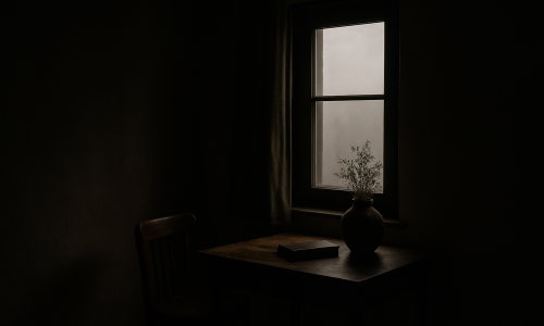
Light or Dark Tones? How to Choose a Style for Small Interiors
Photographing interiors requires sensitivity, technique, and a strong sense of aesthetic strategy. When dealing with small spaces, every visual choice becomes even more important. And one of the most crucial decisions is: should you use light or dark tones? Choosing between light or dark palettes goes far beyond personal taste. It directly affects the perception of space, lighting, depth, and visual identity in an image. In this article, we’ll explore how each approach behaves in compact environments, their visual, psychological, and practical effects — and how you, as a photographer or content creator, can make the best choice based on your visual goals. The Importance of Color in Interior Photography In interior photography, color is more than decoration — it’s visual language. Through color, you can: In small spaces, these functions are amplified. The intentional use of light or dark tones can transform how spacious, cozy, sophisticated, or vibrant an image feels. Light Tones: A Sense of Space and Lightness Key Characteristics: When to Use Light Tones: Typical Palette: White, off-white, beige, light gray, sand, pastel pink, light blue, mint green. Composition Tip: Add pops of color with plants, artwork, or books to break monotony. Avoid overly washed-out or sterile images. Dark Tones: Depth, Sophistication, and Drama Key Characteristics: When to Use Dark Tones: Typical Palette: Black, charcoal, slate gray, petrol green, wine, navy blue, dark brown. Composition Tip: Use accent lighting to highlight elements or create intentional contrast. Balance dark walls or furniture with lighter details or textures. How Color Affects Spatial Perception Color greatly influences how space is perceived in images — especially in tight rooms. Aspect Light Tones Dark Tones Light Reflection High (brighter environments) Low (absorbs light) Perceived Space Feels larger, more open Feels smaller, cozier Visual Sensation Lightness, calm Depth, sophistication Focus Distribution Balanced across the whole room Focused on select elements Emotional Tone Tranquility, cleanliness Mystery, intensity Emotional Influence of Color in Small Interiors Color has a direct emotional impact — especially in small interiors where visual stimuli are concentrated. Light Tones and Positive Emotions: Images dominated by light colors tend to: They echo nature in its softest forms — sky, mist, sand — fostering a soothing experience. Dark Tones and Deep Emotions: Darker interiors tend to inspire: They allow photographers to work with shadows, depth, and a heightened sense of emotion and intimacy. Design Trends and Color Use Understanding design trends helps align your style with what audiences expect — or consciously break those patterns to stand out. Trend: Clean, Airy Spaces Trend: Moody, Atmospheric Interiors Being aware of these trends helps you position your work more effectively. Composition Tips to Emphasize Each Style Shooting Light Interiors: Shooting Dark Interiors: Editing: Reinforcing Your Color Intent Post-production is where you refine your palette and visual voice. Editing Light Tones: Editing Dark Tones: Which Photographic Styles Match Each Palette? Minimalist Style Maximalist Style Editorial/Documentary Style Color and Your Visual Identity Color plays a huge role in defining your personal brand as a photographer. Ask yourself: When the answer is yes, you’re developing a strong, memorable visual identity — a huge asset in growing your brand and attracting clients. Test Both Styles Without Major Investment You don’t need elaborate setups to experiment. Try: Testing both styles will help define what feels authentic — and what resonates most with your audience. How Color Impacts Social Media Performance Color also influences how your work performs online: So yes — color is not just artistic; it’s also strategic. Practical Case Study: Same Room, Two Palettes Light Version: Dark Version: Both are valid. The difference is in the story you want to tell. Checklist: Choosing the Right Palette Before a photoshoot, ask yourself: ✅ What emotion should the image evoke?✅ Who is your target audience?✅ How much natural light is available?✅ What’s the space’s layout and ceiling height?✅ What brand/style are you aligning with?✅ Are you aiming for drama or simplicity? This checklist turns your color choice into a creative and strategic decision. Final Thoughts In small interiors, every detail matters. Choosing between light or dark tones isn’t just about preference — it’s about how you want your work to be perceived. Light tones expand, calm, and illuminate.Dark tones focus, captivate, and add depth.Used intentionally, both can elevate your images from simple photos to powerful visual stories. As a photographer, your job isn’t just to document — it’s to guide the viewer’s experience. And color is one of your most powerful tools to do that.

How Color Shapes Your Visual Identity in Interior Photography
In interior photography, light, composition, and ambiance are essential for creating attractive images. But there’s one element that’s often underestimated — yet it has the power to completely transform the perception of a photograph: color. More than just an aesthetic component, color is a strategic tool in building your visual identity. It communicates emotion, guides the viewer’s eye, creates harmony or contrast, and most importantly, helps photographers stand out. In this article, you’ll learn how color works in interior photography, how to use it intentionally to strengthen your visual brand, and what to keep in mind to ensure that your style is authentic and recognizable. Color as a Visual Language In photography, every color carries symbolic, emotional, and cultural meaning. Once you understand these meanings, you can begin using them intentionally — not just for aesthetics. Color Psychology in Interior Spaces Here are some common associations: These meanings aren’t rigid — you should always adapt your color choices based on the story you want your image to tell. Color as a Signature of Your Visual Identity A photographer’s visual identity includes elements like composition, lighting, directing scenes, and editing — but also recurring use of color. If you look at the portfolios of well-known photographers, you’ll often notice a dominant or consistent color palette. This helps create: You can shape your color palette either intuitively (by noticing which colors naturally attract you) or strategically (by consciously choosing tones that reflect your message or niche). Defining Your Palette: Where to Begin? If you want to use color as a visual signature, start with the following steps: 1. Review Your Portfolio Gather your favorite interior photos and observe: This analysis reveals unconscious patterns that may already define your visual language. 2. Choose a Direction Based on your findings, you can lean toward: The key is to stay consistent, even when natural variations occur between locations. 3. Use Palette Tools Platforms like Adobe Color, Coolors, or Canva Palette Generator allow you to create color palettes based on images or emotional concepts. These tools help you maintain editing coherence across projects. How Light Affects Color Color never exists in isolation. It’s deeply influenced by lighting conditions. Examples: So, when using color as part of your message, always consider the direction and temperature of natural light at the time of shooting. Using Color in Composition: Creating Balance Beyond symbolism, color is also a compositional tool. It directs the viewer’s gaze, defines depth, and creates visual hierarchy. Compositional Techniques with Color: These strategies help your work look intentional rather than accidental, giving your images a professional edge. Color in Post-Processing: Reinforcing Your Identity Editing is your chance to refine the presence of color and shape your photographic voice — but balance is essential. Tips for Effective Color Editing: The goal isn’t to change the space, but rather to enhance what’s already there and reinforce your visual narrative. Case Studies: How Color Reflects Style Scandinavian Style Boho Style Industrial Style Editorial / Lifestyle Style This type of style-color pairing helps you define your aesthetic direction more clearly. Developing Your Color Language with Purpose If you want to strengthen your visual identity, try these practical exercises: 1. Monochrome Project Choose one color (e.g., green) and shoot multiple interior scenes that include variations of that tone. This builds awareness of harmony and visual control. 2. Color Journal For one week, photograph indoor scenes that reflect a chosen emotion or theme (e.g., “calm” = blue). This helps you associate mood with color use. 3. Limited Palette Challenge Set a palette of 4–5 colors and stick to it across several photo sessions. Then assess how this affects your visual identity as a whole. Conclusion: Color Is Identity, Not Just Aesthetic In interior photography, color isn’t just a decorative layer — it’s a strategic tool of visual communication. When used intentionally, color is one of the strongest assets in building a professional, cohesive, and memorable photographic style. Understanding color — emotionally, symbolically, and compositionally — allows you to shoot with greater intentionality. And shooting with intention is what transforms good photos into unforgettable visual experiences. So don’t be afraid to experiment, make bold choices, and let color be your creative ally. It’s one of the most powerful elements in your journey as a photographer.

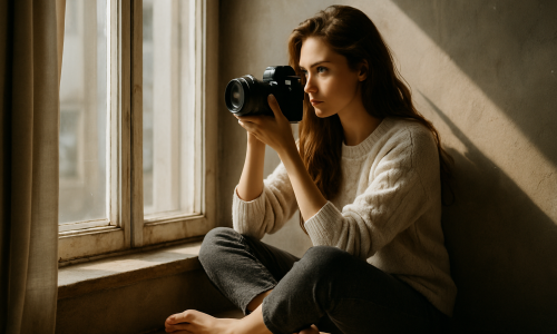
10 Style Inspirations for Interior Photography Using Natural Light
Photographing interiors goes far beyond capturing rooms — it’s about conveying atmosphere, highlighting personality, and evoking emotion. And when natural light becomes the main source of illumination, the results can be stunning — if you shoot with intention and an artistic eye. In this article, you’ll explore 10 style inspirations for shooting interior photography using natural light, covering visual approaches, emotional tone, and compositional techniques. Each style brings its own characteristics and can be a great foundation to develop your unique visual identity. 1. Scandinavian Minimalism Scandinavian style is known for its elegant simplicity, bright spaces, and smart use of natural light. It’s perfect for images that communicate: Visual Characteristics: How to Apply It: Use soft, diffused natural light for an even fill. Work with centered or symmetrical compositions and allow gentle shadows to subtly outline objects. 2. Cozy Boho Style Boho style is defined by layers, earthy colors, and a cozy, lived-in feel. Natural light enhances the texture and personality of the scene. Key Elements: How to Apply It: Let natural light come in from the side to highlight textures. Use shadows cast by plants or curtains to add interest and intimacy. 3. Industrial Style with a Natural Touch Industrial design celebrates raw materials like concrete, brick, and metal. Natural light helps soften this harshness and create contrast. Aesthetic: How to Apply It: Photograph during times of strong natural light to accentuate highlights and shadows. Use diagonal angles for more visual dynamism. 4. Romantic and Vintage This style evokes nostalgia and softness. Natural light is essential for creating a dreamy and emotional atmosphere. Common Features: How to Apply It: Shoot through sheer curtains during early morning or golden hour for soft, warm light. Use shallow depth of field to blur the background and reinforce the romantic aesthetic. 5. Clean Contemporary Ideal for those who seek modern, organized visuals with a touch of sophistication. Natural light helps highlight clean surfaces and geometry. Characteristics: How to Apply It: Use soft, even natural light from the side or front. Keep the composition clean and let shadows define form rather than dominate it. 6. Rustic and Naturalistic This style highlights organic materials and a connection to nature. Natural light enhances textures like wood grain, linen, and stone. Visual Elements: How to Apply It: Photograph during sunrise or sunset to get warm, soft lighting. Let sunlight filter through gaps for highlights and texture. Embrace the “imperfect” as part of the scene. 7. Artistic and Conceptual Rather than simply capturing a room, this style seeks to communicate emotion, idea, or mood. Light is used creatively, not realistically. Possibilities: How to Apply It: Break the rules. Shoot against the light. Let objects fall into shadow or highlight just a portion of the scene. Turn light into a narrative tool, not just illumination. 8. Tropical and Bright This style is vibrant, energetic, and ideal for regions with intense sun. Natural light here is abundant and helps celebrate color. Visual Elements: How to Apply It: Use light generously, but balance it. Avoid overexposure and use reflectors (like white walls) to soften harsh shadows. Focus on color harmony and natural brightness. 9. Dark and Moody Unlike the other styles, dark and moody photography embraces shadow, mystery, and contrast — but natural light still plays a central role. Aesthetic: How to Apply It: Use thick curtains or narrow windows to control light entry. Let light fall on just a small part of the room, leaving the rest in soft darkness. Master light-to-dark transitions (chiaroscuro). 10. Editorial Lifestyle Popular in magazines and branded content, this style reflects an “effortlessly styled” space — as if someone had just left the room. Core Elements: How to Apply It: Shoot during times of diffused light — cloudy days or early afternoon. Ensure every object contributes to the scene’s story. Keep things real, yet intentional. How to Choose a Style? With so many options, it can be overwhelming. Here’s how to find your visual voice: Style is a journey, not a destination. Natural Light as a Visual Identity Tool Natural light is more than illumination — it’s a visual language. Its direction, intensity, and quality shape the emotion of your photos. Mastering light is key to building a unique signature, especially in interior photography where every beam of light tells a story. Composition: The Silent Backbone of Style Even with great lighting and decor, composition makes or breaks an image. Use techniques like: These strategies transform simple rooms into compelling visual narratives. Editing: Consistency Seals the Style Post-production is where you refine your style — not by overprocessing, but by enhancing what’s already there. Great editing supports your vision without overpowering it. Practical Projects to Explore Each Style Want to practice? Try these: These exercises help you recognize what feels natural to you, revealing your own photographic voice. Final Thoughts: Style is Built, Light is Language Interior photography using natural light is about more than just showcasing a space — it’s about telling stories through shadow, texture, color, and light. These 10 styles offer rich visual paths. Explore them, blend them, or use them as stepping stones to create your own voice. The more you observe, shoot with intention, and edit consistently, the more your style will become a reflection of who you are — not just as a photographer, but as a visual storyteller.

How to Develop Your Own Photography Style in Low-Light Interiors
Developing a unique photographic style is a major milestone for any photographer. It not only defines your visual identity, but also brings consistency and recognition to your work. But what happens when the challenge is shooting in low-light environments? Is it still possible to build your own aesthetic and evolve technically? The answer is yes. Shooting in dark or dimly lit interiors doesn’t have to limit your creativity — on the contrary, it might be just the push you need to shape a distinct and memorable photographic style. In this article, you’ll learn how to create an authorial visual identity even under lighting limitations by using available light sources, camera settings, composition techniques, and post-production — all aligned with your creative vision. What is a photography style and why does it matter? A photography style is a set of visual and conceptual choices that make your work instantly recognizable. It goes far beyond editing or filters — it includes composition, color palette, lighting choices, recurring themes, conveyed emotions, and even how you interact with the space. Developing a personal style is important because it: In low-light interiors, technical mastery combined with aesthetic intentionality can transform limitations into a creative signature. Understanding the challenges — and advantages — of low light Low-light environments present a number of technical challenges: But they also provide unique artistic opportunities, such as: When well-explored, these conditions become the foundation of a powerful personal style. Choose the emotion you want to convey Every image carries emotional weight. When working in low light, ask yourself: Your emotional intent will guide all creative decisions — from composition to how you use the available light. Master low-light camera settings To create consistent and intentional photos in low light, you need to control your gear effectively. ISO Aperture Shutter Speed Manual Focus Use existing light sources as compositional tools A major part of building a personal style in dark environments is learning to embrace available light as part of the story. Types of light you can use: Instead of correcting the light, try to compose around it. Let it guide the viewer’s eye and set the mood of the scene. Keep your editing consistent Editing is a powerful tool to refine and reinforce your visual identity. Here’s how to use it to your advantage: Color palette Contrast and shadows Grain and texture Compose with intention In low-light scenes, minimalism often works best. Every compositional element must be intentional: Your style is also defined by what you choose not to reveal. Create visual series and personal projects Repetition is key to building a recognizable style. A series of photos with similar lighting, colors, and themes will strengthen your aesthetic identity. Project ideas: These kinds of projects show intention and visual consistency, making your style stand out. Get inspired — but don’t copy Study other photographers and how they use light in dark settings. Look for: You’re not looking to imitate — you’re aiming to understand how light tells a story, and how you can shape your own way of doing it. Embrace the unpredictable Low-light environments are often unpredictable. A reflection, a sudden shadow, or a misplaced light source can ruin — or enrich — a composition. An authentic photographer embraces imperfections and sometimes even turns them into stylistic elements. Use gear as an extension of your creativity While style isn’t defined by gear, using the right tools helps you maintain consistency. Useful tools for low-light photography: That said, the best tool is always your understanding of the light you already have. Understand color psychology in low light Color matters — especially in dim settings: Choosing a color direction helps anchor your visual identity. Use post-production to reinforce your style Post-processing is where your emotional intent gets its finishing touch. Tools to explore: Your editing choices become a visual signature over time. Think like a storyteller Low light lends itself to quiet, emotional storytelling. Think beyond technical perfection and ask: Often, it’s the story, not the technique, that gives your work meaning — and builds your style. Develop your style using self-portraits and familiar spaces You don’t need exotic locations or models to define a style. Start with what you have: The more often you create, the more your natural visual preferences will become clear. Style is also what you leave out Mature style often stems from what you choose not to show: These choices define your creative fingerprint. Be patient — style takes time Don’t rush the process. Your visual identity will emerge through practice, reflection, and repetition. In time, you won’t need to define your style — your style will define you. Final Thoughts: Low Light as a Path to Creative Identity Developing your photographic style is a deeply personal journey. Low-light environments, far from being a limitation, can actually accelerate this process — by encouraging conscious decisions, removing distractions, and highlighting the essentials. Scarce light isn’t a problem. It’s a creative element. It shapes stories, reveals intimacy, and builds powerful emotional resonance. By mastering technique, trusting your vision, and repeating choices that align with your inner world, you’ll not only take better photos — you’ll photograph as your true self.

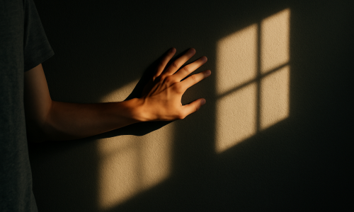
Smart Composition: Make Small Spaces Look Bigger with Natural Light
The art of photographing small spaces requires more than just good equipment. It takes sensitivity, technical vision, and a visual strategy that highlights every centimeter available. One of the photographer’s greatest allies in this challenge is natural light, which can transform tight rooms into bright, spacious-looking environments. In this article, you’ll learn how to use natural light intelligently to create the illusion of spaciousness in small areas. We’ll explore composition techniques, camera positioning, exposure control, and much more. By the end, you’ll have a complete guide to unlocking the full potential of compact spaces. Why is natural light so powerful? Natural light has unique qualities: it’s soft, organic, dynamic, and free. When used correctly, it can: In small spaces, natural light helps eliminate visual heaviness caused by harsh shadows and excessive contrast, supporting a light, flowing composition. This directly contributes to making a room feel larger. First step: Understand the light source Before even picking up your camera, analyze how the light enters the room: This observation is crucial. Shooting against the light can flatten a scene if not well controlled. On the other hand, side natural light tends to enhance volume, create soft shadows, and reinforce the sense of three-dimensionality. Choose the best time of day to shoot The quality of natural light changes throughout the day. For small rooms, the best times are: Avoid shooting under strong direct sunlight (around noon), which may cause overexposed highlights and unbalanced scenes. Camera positioning: What affects the perception of space A key secret to making a space appear larger is the angle of capture. Here are some effective strategies: Shoot from corners Positioning the camera in a corner lets you capture two walls at once, creating leading lines that guide the eye and expand visual space. Use mid-level height Avoid extremely high or low angles. Shooting from about 1.3 to 1.5 meters off the ground offers a balanced perspective — similar to natural eye level. Try diagonal angles Diagonal shots add depth and visual dynamism to the scene. Combine this with natural light direction to reinforce the sense of spaciousness. Take advantage of reflective surfaces Mirrors, glass, glossy doors, and even polished floors can reflect natural light and visually expand a room. When positioned thoughtfully, these reflections: Pro tip: Place mirrors near light sources but outside the camera’s direct field to reflect the space without catching unwanted reflections. Exposure and white balance control Even with plenty of natural light, proper camera settings are essential: Exposure White balance Composition elements that enhance the feeling of spaciousness Besides lighting, some elements can help create a sense of space. When combined with good lighting, they have a strong visual impact. Vertical lines Use full-length curtains, tall bookshelves, or vertical plants to enhance the sense of height in the room. Light colors Walls and furniture in soft, neutral tones reflect more natural light, which helps create a bright, open feeling. Soft textures Avoid cluttered patterns or heavy textures. Light fabrics, pale wood, and glass encourage light diffusion and enhance the atmosphere. Create depth with natural light Work in layers Compose your shot with elements in the foreground, middle ground, and background. Natural light can enhance these layers, adding dimension and depth. Example: A chair by the window (sharp focus), a shelf in the background (slightly blurred), and a sunlit rug on the floor. Each element in its layer, shaped by natural light. Use shadows creatively Soft shadows created by diffused natural light add dimension without overwhelming the scene. They help the viewer distinguish volumes and distance between objects. Guide the viewer’s eye Side lighting can be used to lead the viewer’s gaze through the scene. Place furniture or plants along the light path to reinforce continuity and depth. Integrate the space with the outdoors If natural light enters through a window, try including a glimpse of the outside — a tree, balcony, or garden. This creates a visual connection to the outside world, adding depth and a sense of openness. Just be sure the outside view isn’t overexposed — adjust your exposure to balance interior and exterior light. Photographing details: Natural light and focus In small rooms, photographing details helps tell the story and highlight the environment. Try capturing: These close-ups, when naturally lit, bring warmth and elegance to the space. What if there isn’t much natural light? Not every room is naturally well-lit. In these cases: Common mistakes when using natural light in small spaces Post-processing: Subtle edits to enhance the light In editing, you can enhance natural light effects without overprocessing: Final thoughts: The power of natural light in smart composition Natural light is more than an ally — it’s a central character in interior photography, especially in compact rooms. It can highlight volume, expand visual space, enhance color realism, and tell stories with softness and elegance. With the right composition techniques and lighting control, you can transform something simple into something sophisticated — all without expensive gear or artificial effects. If you want to master the art of making small spaces look bigger, natural light should always be your starting point.

How to Create Depth in Photos of Narrow Spaces
Photographing narrow spaces is one of the biggest challenges for those working with interior composition, architecture, or even lifestyle in compact apartments. In these situations, limited space can result in flat images, lacking the dimensionality that makes a photo visually engaging. However, with the right techniques, it’s possible to create depth and turn these constrained scenes into rich and expressive compositions. In this article, you’ll learn how to create depth in photos of small spaces using composition principles, camera settings, lens choices, light control, and visual tricks that expand the perception of space. Let’s dive in. Why Depth Is Essential in Interior Photography Depth in an image has the power to draw the viewer in. It conveys the sensation that the scene goes beyond the flat surface of the photo, leading the observer through different layers within the image. In narrow spaces, this effect is even more valuable, as it helps avoid the “flat” appearance typical of small rooms. When depth is well executed, even the smallest space can feel larger, more inviting, and full of character. This is especially important for photographers working with interior design, real estate, architecture, or lifestyle-focused social media in compact homes. Understanding the Illusion of Depth Photography is a two-dimensional medium. However, the illusion of depth can be created using several techniques that manipulate perspective, layering, lighting, and focus. When well applied, these techniques help the viewer perceive layers within the scene, making the image more dynamic and engaging. Composition Techniques to Create Depth Converging Lines Use architectural lines or elements of the space (like floors, walls, windows, or furniture) to guide the eye toward a vanishing point. Converging lines create a sense of distance and depth, even in very tight spaces. Example: A photo taken from the corner of a hallway, with walls and flooring leading the eye toward a door in the distance. Foreground, Middleground, and Background Layers Create three distinct planes in your composition: This technique helps visually organize the space and gives the photo a clear sense of spatial depth. Object Overlap Include partially overlapping objects. When viewers see one object blocking part of another, their brain naturally perceives distance between them — a simple yet powerful way to suggest depth. Natural Framing Use doorways, windows, mirrors, or architectural features to create internal frames. These frames add layers to your composition and guide the viewer’s eye through the image. Choosing the Right Lenses Wide-Angle Lenses Wide-angle lenses (14mm–24mm on full-frame cameras) are ideal for small spaces because they capture more of the scene and enhance perspective lines. However, be cautious of distortion, especially around the edges. Pro tip: Keep the camera level to avoid exaggerated vertical distortion, often seen in tight interior shots. Moderate Aperture Use apertures around f/4 to f/8 to maintain a good depth of field and ensure sharpness across multiple elements in the scene. This keeps more of the space in focus and supports the layered composition. Light Control: A Key to Perceived Depth Use Side Lighting Side lighting is excellent for highlighting textures and creating soft shadows. It helps define volume, especially in furniture and decor, contributing to the image’s three-dimensional look. Add Accent Lights Support lighting — like lamps, floor lights, or LED strips — can help create zones of light and shadow, adding contrast and enhancing depth. Avoid flat, even lighting, which can reduce dimensionality. Composition and Eye Movement Strategic Angles Avoid shooting directly into walls, which flattens the scene. Instead, favor diagonal angles, which increase the sense of perspective. Position yourself in corners or use furniture lines to lead the viewer’s eye into the space. Include Human Elements Having a person in the shot — sitting, walking, or interacting with the space — helps the viewer gauge scale and creates a point of interest that adds visual depth. Color and Texture as Subtle Depth Tools Contrast Between Planes Use contrasting colors between foreground and background. Lighter tones in the back and darker ones in the front (or vice versa) can emphasize spatial distance. Variety of Textures Mix materials like wood, fabric, glass, and metal to stimulate visual layering. Texture adds complexity and prevents the scene from appearing flat. Post-Production for Depth Local Contrast and Clarity In Lightroom or Photoshop, boost clarity and local contrast selectively to bring volume to certain elements and separate them from the background. Soft Vignetting Apply a subtle vignette to darken the image’s edges, guiding the viewer’s eye toward the center — where most layers typically are. Use this technique carefully to maintain a natural look. Selective Blur In editing, you can simulate depth of field with gradual blur from front to back. This should be done subtly and realistically to mimic real lens behavior. Use Bokeh Strategically With a wide aperture (f/1.8 or f/2.8), you can focus on a foreground element while softly blurring the background. This contrast helps isolate the subject and gives the image a layered effect. In interior photography, use this effect with care so you don’t lose important context in the background. Mirrors: More Than Just Reflection Well-placed mirrors reflect light, simulate continuity, and add dimension. Avoid placing them directly in front of the camera. Instead, shoot from angles where the mirror reflects parts of the room not visible in the frame. Design Elements That Help Build Depth Creative Techniques to Reinforce Depth Tripod + Long Exposure In low-light small spaces, using a tripod with long exposure and low ISO helps you capture more detail across the frame and improves sharpness between layers. Focus Stacking Take multiple shots focused on different planes (foreground, middle, background) and blend them. The result is an ultra-sharp image with strong depth perception. Warm vs. Cool Light Contrast Introduce warm tones in the foreground and cooler tones in the background (or vice versa) to separate planes through color temperature. This adds depth and mood to the scene. Case Study: Photographing a Narrow Bathroom Imagine a 1.5m x 2m bathroom with no window. Use a wide-angle lens (18mm), soft

What Not to Do: 6 Common Mistakes When Composing in Small Spaces
Photographing small interiors demands more than just technical skill — it requires sensitivity and attention to detail. In limited spaces, every object, line, and ray of light matters. Small mistakes, which might go unnoticed in larger rooms, are amplified and can compromise the entire composition. To compose well in small environments, it’s not just about knowing what to do — it’s also about knowing what to avoid. In this article, you’ll discover the 6 most common composition mistakes made when photographing small rooms with natural light — and how to avoid them with simple, effective solutions. By the end, you’ll have a sharper and more professional eye, ready to bring out the best in even the smallest spaces. 1. Trying to Show Everything in a Single Shot One of the most frequent mistakes is trying to capture every detail in one photo. The intention might be good — to showcase everything the room has to offer — but the result is often the opposite: a cluttered, unfocused image that feels overwhelming. Why this happens: How to avoid it: Remember: a clear intention creates stronger, more engaging compositions. 2. Ignoring the Background In small spaces, everything in the frame matters — especially the background. A common mistake is focusing only on the foreground and forgetting that the background communicates just as much. Examples of problematic backgrounds: How to fix it: A well-thought-out background enhances your subject. A distracting one can ruin the photo. 3. Cutting Objects Unintentionally Cropping is part of photography — but in small rooms, accidental or unbalanced cuts are very common, and they hurt your composition more than you think. Common issues: How to avoid: Pro tip: avoid cropping where the viewer’s eyes naturally land — it causes instant discomfort. 4. Misusing Natural Light Natural light is powerful — but when uncontrolled, it becomes your worst enemy. In small spaces, its intensity, direction, and temperature directly impact the image quality. Frequent problems: How to improve: Light isn’t just technical — it’s part of your composition. Control it at the moment of the shot, not just in post-production. 5. Using Unflattering Angles and Heights Camera position is everything. In small rooms, a slight mistake in height or angle can distort furniture, flatten depth, or create a sense of imbalance. Common mistakes: How to fix it: Remember: the right angle enhances depth and harmony. A bad one makes the room feel chaotic. 6. Relying on Editing to Fix Everything Editing can improve a photo — but it won’t save a poorly composed one. Many photographers assume that Lightroom or Photoshop will fix everything, but editing only enhances what’s already working. Why overediting is a mistake: What to do instead: Editing is your assistant — not your safety net. Bonus: 2 Extra Mistakes to Avoid 7. Ignoring the Room’s Style Every room has a story. Whether it’s minimalist, rustic, or modern, it carries a visual identity — and your photo should respect that. Adjust your visual approach to match the space’s personality. 8. Forgetting the Photo’s Purpose Who is the photo for? What is its goal? If you don’t know this, you’re shooting in the dark. Define the purpose — and let that guide your composition. Final Thoughts: Smart Composition Starts with Avoiding Mistakes Small interiors challenge photographers to make smart choices. There’s no room — literally — for clutter, distractions, or poorly thought-out visuals. That’s why good composition begins with knowing what not to do. Avoiding these mistakes helps you: As you develop your eye and your workflow, these adjustments become second nature. And that’s where the real evolution begins — when every photo is intentional, clean, and confidently composed.

How to Avoid Visual Clutter When Composing Tight Spaces
Small spaces demand a trained and careful eye. A single misplaced object can compromise the entire composition of a photo. When space is limited, every element that enters the frame must have a purpose and contribute visually. That’s why avoiding visual clutter is one of the most valuable skills for anyone photographing interiors with natural light. In this article, you’ll learn practical and creative techniques to eliminate excess, organize the environment visually, and compose cleaner, more elegant, and impactful images — even in the tightest of spaces. What Is Visual Clutter in Interior Photography? Visual clutter occurs when too many elements compete for the viewer’s attention within a single image. This can include: The result is a confusing image, with no clear focus, which leads to visual fatigue and reduces the image’s impact — even if the room itself is beautifully decorated. Why Are Small Spaces More Prone to This Problem? Tight environments leave less room to breathe. One extra piece of furniture, a pillow out of place, or a poorly positioned plant is enough to throw the whole image off balance. Additionally, when using natural light, the contrast between light and shadow can accentuate visual chaos if elements aren’t organized. That’s why a clean composition is essential for highlighting the right details and conveying a sense of order. 1. Start by Removing Before Adding The first step in avoiding visual clutter is to remove everything that doesn’t serve the photo. Before thinking about framing or lighting, look at the space with a critical eye and ask: Does this contribute visually, or is it just here out of habit? Remove: Start with a minimalist space, and only add items that genuinely enhance the scene. 2. Organize the Scene by Color and Shape A simple yet effective visual technique is to organize objects by color and shape. This creates harmony and prevents the eye from becoming overwhelmed. Practical tips: Repetition and visual patterns help tame chaos. Three similar vases have more impact than five random ones. 3. Watch the Edges of the Frame Visual clutter often sneaks in at the edges of the image, where objects are unintentionally cut off or appear without context. Avoid: Pro tip: before pressing the shutter, scan the frame’s edges. Adjust the camera or the elements until everything that appears in the image is intentional, not accidental. 4. Use Negative Space Wisely Negative space is the “empty” area in a photo — walls, floors, or surfaces without objects. It’s essential for creating visual breathing room, especially in tight spaces. Don’t fear the empty areas. They: Ask yourself: Does this photo give the viewer room to rest their eyes? If not, it may be time to reduce or reposition some elements. 5. Limit the Number of Points of Interest Don’t try to show everything at once. Choose a single focal point per photo, and allow supporting elements to play a secondary role. Examples of strong focal points: Photos with multiple points of interest confuse the viewer. Simplicity is often more powerful and more effective in small spaces. 6. Control Depth of Field Using a shallower depth of field (blurring the background) can isolate the subject and soften any excess visual information. You can do this by: This technique helps draw attention directly to what matters and is especially useful in cluttered or compact environments. 7. Choose the Best Angle to Avoid Overlapping Elements Shooting straight on isn’t always the best choice. Trying other angles can help you: Try photographing from a corner, from above, or at a diagonal. These angles often help simplify the frame and reduce the number of elements competing for attention. 8. Use Natural Light to Organize the Scene Light can be a powerful tool in composition. With it, you can: Light direction matters too. Side lighting adds depth and separates the subject from the background. Frontal lighting tends to flatten the scene, so use it sparingly. Tip: Take advantage of early morning or late afternoon when light is softer and more directional. Diffused light enhances textures without creating harsh contrast. 9. Don’t Ignore the Floor and Ceiling In small rooms, the floor and ceiling often appear in your image. If overlooked, they can distract or ruin your composition. On the floor: On the ceiling: These may seem minor, but they make a big difference in visual cleanliness. 10. Review Before and After Shooting Interior photography is an exercise in attention to detail. Even after staging the scene, it’s worth reviewing before clicking: After shooting, review the image carefully. Often, clutter only becomes obvious when viewed on a large screen. Don’t hesitate to make adjustments or reshoot — this final review step is what separates amateur shots from polished, professional work. 11. Work with Visual Themes One powerful strategy to reduce visual clutter is to define a theme for the photo. This can be a dominant color, a texture, a furniture style, or even a concept like “coziness” or “urban minimalism.” Having a theme helps eliminate what doesn’t belong and reinforces the image’s identity. This makes your composition more coherent and visually strong — even in limited spaces. Less Is More: The Strength of Simple Composition Avoiding visual clutter isn’t about limiting creativity — it’s about refining your visual message. In tight spaces, a clean composition is what allows the room to shine, light to be appreciated, and details to take center stage. When the viewer steps into a clean, well-composed image with a clear focus, they stay longer, observe more, and connect deeply with the scene. And that is the ultimate goal of interior photography: to visually communicate with clarity and emotion.

The Complete Composition Guide for Those Who Photograph with Natural Light
Composition is the soul of photography. When it comes to indoor spaces — especially small ones where natural light is the primary (or only) source of illumination — mastering composition techniques makes all the difference between a simple snapshot and a visually impactful image. This complete guide will show you how to compose your interior photos using natural light, creating balance, depth, visual interest, and directing the viewer’s attention. All of this without using flashes, reflectors, or advanced equipment. Just you, your camera (or smartphone), the space, and real light. Why Good Composition Matters More Than Expensive Equipment It’s common to think that expensive gear is what produces great photos. But in small rooms with limited natural light, those who understand composition can work wonders with what they have. Knowing how to compose allows you to: Beginner photographers often underestimate the power of composition and focus only on exposure or sharpness. But the visual structure of the image is what truly makes it stand out — and that’s exactly what you’ll learn here. Furthermore, strong composition increases the viewer’s time spent on the image, which — in terms of digital presence — translates to more engagement and greater impact. 1. Understand How Natural Light Interacts with the Space Before picking up your camera, observe how light behaves throughout the day. Look for: Direct light creates hard shadows and contrast. Diffused light (like on cloudy days or through sheer curtains) creates softness and balance. Composing with natural light requires patience, since the light is constantly changing. You can even use a notebook to track how light behaves in each room, noting what changes from morning to afternoon. This kind of mapping helps you plan your photos more strategically. 2. Define a Clear Focal Point for Each Photo Every strong composition has a clear subject or point of interest. It could be a piece of furniture, a decorative object, a window, or even a shadow. Before you press the shutter, ask yourself: What do I want the viewer to see first? Once the focal point is defined, use composition to guide the eye toward it, avoiding elements that distract or compete with it. In small spaces, this is even more crucial, as too many visual elements can easily overwhelm the image and dilute its impact. 3. Apply the Rule of Thirds This classic rule works perfectly for interiors using natural light. Mentally divide the frame into 9 equal parts (two vertical and two horizontal lines). The points where the lines intersect are ideal spots to place your subject. Practical example: A chair illuminated by a window can be placed in the lower-right third of the frame, while the window itself enters from the left. This creates instant balance and visual appeal. You can enable this grid on your camera or phone to help visualize it in real-time while shooting. 4. Use Lines and Shapes to Guide the Eye Floorboards, shelves, windows, and moldings can serve as leading lines in your composition. They guide the viewer’s gaze to the focal point and create visual order — even in compact spaces. Additionally, geometric shapes in your décor (squares, circles, triangles) can be repeated or arranged to create rhythm and balance. For example, you could align a series of frames on the wall to guide the eye toward a lamp, or position a rug to lead attention toward a source of light. 5. Work with Layers and Visual Depth A “flat” image, where everything seems to be on the same plane, lacks interest. But an image with visual layers — foreground, midground, and background — holds the viewer’s gaze for longer. How to create this with natural light: Natural light entering from the side helps form these layers using soft shadows, enhancing depth perception. You can also create depth by using elements like doors, curtains, or archways to subtly frame the image from the edges. 6. Use Light as a Compositional Element Light isn’t just there to brighten the scene — it can and should be part of the composition. Examples: You can even explore “hot spots” — areas where light is most intense — to draw the eye without adding clutter. 7. Simplify the Scene and Avoid Visual Overload Small spaces can easily become visually cluttered. That’s why your composition should be clean, with few elements and a clear focus. Practical tips: Minimalism is a strong ally in interior photography — it lets the light, shapes, and textures shine through more clearly. 8. Control Camera Height and Shooting Angle The camera’s height drastically affects composition. Shooting from above, below, or at eye level gives very different results. Recommendations: In natural light photography, angle also affects how light and shadow fall. Observe how illumination changes on different surfaces and adjust your shooting position accordingly. 9. Pay Close Attention to the Background The background can enhance or ruin your composition. It should support the focal point without competing with it. Avoid: A clean, well-lit background that’s in harmony with the rest of the scene makes your image look polished and intentional. Before shooting, do a quick “visual sweep” of the space — tuck away cords, adjust cushions, and make minor tweaks to avoid unwanted visual noise. 10. Experiment, Review, and Improve Composing with natural light isn’t a fixed formula — it’s a matter of observation, trial, and refinement. Photograph the same scene with different compositions: Then compare your results. Which one best conveys the story you intended to tell? Over time, your visual intuition will sharpen. You can also study professional interior photographers and analyze how they use natural light and composition — this can fast-track your growth. Composition Is About Choices: What to Include, What to Exclude, What to Emphasize Interior photography with natural light has its challenges, but also offers incredible creative opportunities. And it’s through composition that everything comes together. It’s where you: Mastering composition is empowering. You don’t need expensive equipment or elaborate setups — just the ability to observe and