You can have a strong idea, great copy, and a clean layout—but if the image doesn’t communicate quality, the post loses power before anyone even reads a line. In Digital Culture + Visual Lifestyle, the image is the first hook: it sets the tone of professionalism, determines whether someone stops scrolling, and even shapes how trustworthy your message feels. That’s exactly why this guide exists: How to choose the ideal stock image library isn’t just “where to find pretty photos.” It’s about building a visual foundation that matches your style, respects usage rights, offers variety, has strong search tools, and helps you stay consistent without looking generic. In the next minutes, you’ll learn How to choose the ideal stock image library with clear criteria, a practical step-by-step, and a repeatable method to create posts that look more polished—without making your workflow complicated. What a Stock Image Library Is and Why It Matters A stock image library is a platform that provides photos, videos, vectors, illustrations, and other visual assets for use in creative projects. Some are free, some are paid, and many are hybrid (a free catalog plus premium options). The key point: a stock library isn’t only a “gallery.” It influences: That’s why learning How to choose the ideal stock image library is not a minor technical decision—it’s part of your content strategy. Why the Right Stock Library Changes the Impact of Your Posts First Impressions Happen in Seconds On social platforms, the image often decides whether the content is consumed. A coherent, well-selected visual communicates professionalism without you saying a word. If you want people to take your content seriously, How to choose the ideal stock image library becomes a direct lever for credibility. Visual Consistency Creates Recognition When your visuals share similar lighting, composition, color mood, and texture, your profile starts to feel like a “brand.” That recognition increases the chances of people remembering you—and noticing your posts again later. A good process for How to choose the ideal stock image library makes consistency easier to sustain. Credibility and Legal Safety Using visuals without the right license can lead to content removals, copyright notices, or disputes—especially if you monetize, run ads, or work with clients. How to choose the ideal stock image library includes understanding licensing basics so your content stays safe and stable. Types of Stock Image Libraries and When Each One Makes Sense Free Libraries Great for starting and testing styles. But they can come with: Paid Libraries (Subscriptions) Worth it if you publish frequently. They typically offer: Hybrid Libraries (Freemium) A mix of free and paid assets. Good if you want to: Knowing the difference helps you make smarter decisions in How to choose the ideal stock image library without paying for what you don’t need. The Criteria That Truly Matter When Choosing This is the heart of the topic: the criteria that separate “random images” from a professional visual base. A great platform doesn’t just provide pretty pictures—it helps you build a repeatable system for quality, identity, and speed. The fastest way to evaluate any library is to look at four pillars: If one of these pillars is weak, you’ll feel it later—through wasted time, inconsistent visuals, or legal uncertainty. Technical Quality of the Catalog Resolution and Clarity For professional-looking posts, choose images with high resolution. That keeps detail intact when you crop, zoom, or adapt for different formats. A strong rule in How to choose the ideal stock image library is to prioritize assets that stay sharp across platforms. Variety of Formats If you create content for: Video and Motion Assets If you publish Reels, Shorts, or animated backgrounds, check whether the library offers video clips with the same aesthetic as the photos. How to choose the ideal stock image library is also about matching your photo style to your motion style. Style and Aesthetic Coherence A common mistake is choosing a library only because the catalog is huge. What matters is: does it fit your identity? In lifestyle visual content, the “feel” of an image often matters more than the object inside it. Practical Questions to Ask For Digital Culture + Visual Lifestyle, aesthetics are not “extra.” They’re part of the message. That’s why How to choose the ideal stock image library should always include evaluating the visual direction. Pick a Library That Supports Your Style, Not One That Forces You to Change If your brand is warm neutrals and window light, a library dominated by high-saturation studio shots will create extra editing work and inconsistency. The best choice is the one that naturally “fits” your intended mood. Search and Filters That Save Hours Weak libraries cost time. Strong libraries save time and help you publish more consistently. Search quality is often the difference between a platform you love and one you abandon after a week. Filters That Are Truly Valuable If search isn’t good, your workflow suffers. That’s why, in How to choose the ideal stock image library, search quality is a major deciding factor. Licenses and Usage Rights You Must Understand You don’t need legal jargon—you need practical clarity. The “ideal” library is one that makes rights understandable, accessible, and consistent. What to Check People often skip this because they’re in a hurry. But How to choose the ideal stock image library must include license verification, especially if you’re building a monetized blog or professional profile. Build a Simple Habit Before downloading, open the license page and confirm “commercial use” and whether attribution is required for your intended use. This single habit prevents the most common headaches later. Originality and the “Stock Photo Look” Risk You’ve seen them: perfect-but-generic images that look like ads. That can weaken your content because it feels impersonal—like a template anyone could post. How to Reduce the Generic Look This balance is essential in How to choose the ideal stock image library if you want impact and identity—not just pretty visuals. How to Choose the Ideal Stock Image Library Step by Step Here’s

Why Everyone Uses Neutral Tones on Social Media
Spend a few minutes scrolling and a pattern is hard to miss: beige, off-white, gray, black, brown, sand, softer earthy shades, more natural skin tones, minimalist scenes. On many profiles, the aesthetic feels “clean,” calm, and polished—almost as if everyone agreed on the same visual language. That leads to the exact question behind this article’s main idea: why everyone uses neutral tones. The answer isn’t just “because it looks nice.” Neutral tones became a visual shortcut for communicating order, elegance, and consistency. They also perform well on small screens, under different lighting conditions, and across multiple formats (photo, carousel, and video). In this post, you’ll understand why everyone uses neutral tones on social platforms, what’s behind that preference, when it truly makes sense, and how to apply it in an authentic way—without blending into the crowd. What neutral tones are (in a simple, practical way) Neutral tones are colors with lower saturation and a quieter presence, meaning they don’t “shout” inside a frame. They usually include: Classic neutrals Earthy neutrals Cool, modern neutrals The core point is that neutrals behave like a base layer: they let content breathe and make combinations easier. And that’s one of the biggest reasons why everyone uses neutral tones to build a visual identity that’s easy to maintain. Why everyone uses neutral tones This trend exists because it solves real problems for people who create content and for people who consume it. Below are the strongest reasons—and you’ll probably recognize several in your own experience. They “organize” the chaos of the feed Social media is noisy: strong colors, ads, loud covers, fast transitions. Neutral tones act like “visual silence,” and that quietness stands out precisely because it feels calmer. A neutral-heavy profile often looks more planned, which reinforces the perception of quality. That contrast with visual overload is a major part of why everyone uses neutral tones: neutrals create breathing room in the middle of constant stimulation. Neutrals signal sophistication and trust Without turning this into a magic formula, there’s a cultural reality: minimalism and neutral palettes are associated with design, architecture, fashion, and premium brands. When someone uses neutrals, audiences often interpret it as “good taste,” “care,” and “consistency.” This helps explain why everyone uses neutral tones in lifestyle visual, aesthetics, productivity, and even educational profiles: color becomes a language of credibility. They work well across lighting and devices The same photo can look different depending on screens and brightness settings. Highly saturated colors vary more and can clip, overshoot, or shift oddly on certain devices. Neutrals are more predictable and “safer,” especially for people editing on a phone. If you’ve ever posted a vibrant image and later thought it looked too intense on another screen, you’ve felt first-hand why everyone uses neutral tones. They make consistency easier without extreme effort Consistency is hard. That’s why many creators choose neutrals: they match almost anything. Neutral outfits, light walls, wood textures, natural light, simple props—you can build a repeatable pattern without rare locations or complicated setups. This is a direct, practical reason why everyone uses neutral tones: it’s a high-reward aesthetic with relatively low maintenance. The “trend” side: digital culture and aesthetic cycles Neutral tones didn’t become popular by accident. They spread the way trends spread online. The look is easy to replicate Neutrals are easy to reproduce because references are everywhere: cafés, homes, basic clothing, décor objects, and window-light scenes. The easier something is to recreate, the faster it becomes a trend. That replication effect is a big part of why everyone uses neutral tones: when something is simple to do and looks “nice,” it becomes the default. Algorithms reward what holds attention Visually pleasing, clean-looking content often holds attention longer—especially in carousels, where people swipe slowly. Neutrals reduce distractions and increase a sense of smoothness. It’s not that the algorithm “loves beige.” It’s that a neutral visual experience can improve watch time, saves, and overall retention—which reinforces why everyone uses neutral tones. Neutrals fit aspirational lifestyle storytelling Social platforms often run on desire: a curated life, organized routines, beautiful spaces, intentional aesthetics. Neutral tones became the visual dialect of that narrative. This cultural association also supports why everyone uses neutral tones: they match the idea of “calm elegance” and “a well-designed daily life.” Color psychology: why neutrals feel calming Color impacts perception and emotion. Neutrals typically reduce overload. Less stimulation, more comfort Strong colors demand more attention. Neutrals let the brain relax and focus on the subject (a face, text, a product, an environment). That’s why many people describe neutral feeds as “pleasant” or “easy to look at.” That comfort is part of why everyone uses neutral tones: the aesthetic becomes friendlier for long sessions of browsing. Neutrals highlight the content, not the color When the palette is subtle, the spotlight shifts to story, composition, and message. That’s powerful for creators who want people to notice what they’re communicating—not just the color impact. When neutral tones can work against you There are trade-offs. If neutrals become a blind rule, they can weaken identity. Risk of looking generic If you adopt a neutral look without personal elements (angles, themes, textures, a recognizable editing signature), your profile can feel like “just another one.” This often happens when someone treats why everyone uses neutral tones as a ready-made recipe instead of adapting it. Low energy for certain niches Kids content, sports, parties, bold pop culture, or highly expressive visual arts can lose impact if you neutralize everything. In some categories, color is part of the personality. Neutrals don’t replace intention A neutral feed with confusing photos is still confusing. Neutrals help—but they can’t compensate for a lack of story or clarity. Understanding this is also part of why everyone uses neutral tones—and how to use them without limiting yourself. How to adopt neutral tones without erasing your personality Now we move into the practical side: how to bring this aesthetic into a Digital Culture + Visual Lifestyle profile with authenticity. Step-by-step: build a consistent neutral

How to Organize a Beautiful, Consistent Feed
Have you ever scrolled through your own profile and felt like something is “off,” even though you’re posting good photos? Most of the time, it’s not a quality problem—it’s a system problem. A beautiful feed isn’t luck. It’s the result of simple choices repeated with consistency. And the best part is you don’t need to be a designer, you don’t need a pro camera, and you don’t need to spend hours editing to learn how to organize a feed with a strong visual identity. In this guide, you’ll learn how to organize a feed from scratch using a clear, practical method that works for personal profiles, creators, small brands, and lifestyle projects. The goal is to help every post “talk” to the next, creating harmony, recognition, and that instant “I want to follow this” feeling. What actually makes a feed “beautiful” Before the step-by-step, let’s clarify what “beautiful” really means here. A beautiful feed doesn’t have to be perfect or identical. It usually communicates: Visual coherence Colors, contrast, and mood feel like they belong to the same universe. Topic clarity People instantly understand what your profile is about. Rhythm and breathing room The grid doesn’t feel heavy—there’s a healthy mix of “busy” photos and calmer images with negative space (walls, sky, simple backgrounds). When you learn how to organize a feed, the goal is coherence without losing naturalness. Common mistakes that break consistency Many people try how to organize a feed and give up because they fall into a few patterns: Changing style every week Minimal today, super vibrant tomorrow, then dark cinematic the next. It confuses the eye. Editing every photo differently One post is warm, the next is blue, the next is saturated. The grid becomes a random collage. Posting without looking at the set The photo is good, but it clashes with the last 9 posts. Copying someone else’s feed References are helpful, but copying locks you in. Learning how to organize a feed is about finding a system that fits your content and personality. How to organize a feed: the 7-step method Here’s a workflow that works for beginners and for people who already post regularly. Use it as a fixed checklist. Step 1) Define your profile’s “core theme” To master how to organize a feed with intention, you need an axis. Ask: Core theme examples For Digital Culture + Visual Lifestyle A core theme gives direction. Direction is the foundation of how to organize a feed. Step 2) Choose a simple visual identity You don’t need a complex color palette. You need consistency. Three easy directions: 1) Warm tones Beige, brown, golden light, warmer skin tones, cozy mood. 2) Cool tones Blues, grays, black, modern urban look. 3) Balanced neutral Whites, soft grays, moderate saturation, clean feel. The secret to how to organize a feed is choosing a direction and sticking to it for at least 30 days. Step 3) Create “editing rules” (a mental preset) This is where you define how your images behave. You don’t need technical language—just decisions. Practical editing rules: Once you standardize this, how to organize a feed becomes easier because consistency happens naturally. Tip Edit 3 “reference photos” Pick 3 images that represent your ideal look, edit them until they’re perfect, and keep them as references. Every time you prepare a new post, compare it to those 3. This habit accelerates how to organize a feed dramatically. Step 4) Plan in blocks (without overcomplicating) You don’t need to plan 60 posts. Plan 9 to 12. Why 9? Because that’s the first impression—what people see when they land on your profile. Block structure (example) That balance creates rhythm and makes how to organize a feed feel intentional without being repetitive. Step 5) Define composition patterns Composition is one of the strongest pillars of how to organize a feed that looks “professional.” Simple patterns that work: Tip Have 2 “go-to locations” One spot at home + one outdoor location (coffee shop, street, park). Alternating between two familiar environments helps a lot with how to organize a feed because it creates recognizable visual continuity. Step 6) Build a format mix (photo, carousel, short video) Consistency isn’t only aesthetic—it’s also experience. You can keep harmony while using different formats. Recommended mix for beginners: When you understand how to organize a feed, you realize the visuals hold attention, and the content structure supports growth. Step 7) Publish using a consistency checklist Before you post, ask: This quick check prevents regret and turns how to organize a feed into a habit, not a struggle. How to organize a feed: a practical step-by-step you can apply today Here’s the “do this now” version. Step 1) Audit your profile Open your grid and look at your last 12 posts. Write down: This audit is essential in how to organize a feed because it replaces guessing with clarity. Step 2) Pick one style for your next 9 posts Choose one direction (warm, cool, or neutral) and commit. Step 3) Collect 20 photos in your camera roll Yes—20. You’ll select the strongest later. Step 4) Edit everything in the same mood Use the same rules: similar exposure, contrast, and color intensity. Step 5) Select 9 and organize the order Try to alternate: This alternation is a classic trick in how to organize a feed that instantly raises the “designer” feel. Step 6) Post 3 and observe the grid You don’t need to post 9 in a row. Post 3, observe how they sit in the grid, and adjust the next 6. Three consistent feed models you can copy the logic from This isn’t about copying someone’s style. It’s about copying structure—the healthiest shortcut for how to organize a feed. Model 1) Minimal and clean feed Ideal for lifestyle, productivity, calm aesthetics. Model 2) Urban and modern feed Great for digital culture and creators who enjoy a city vibe. Model 3) Cozy, warm “everyday beauty” feed Perfect if you want closeness and an intimate mood. It helps a lot
 4")
How to Edit Photos on Your Phone Step by Step (Beginner)
You don’t need a professional camera or a powerful computer to turn an ordinary photo into a clean, sharp image with that “social-ready” look. Today, your phone already has excellent editing tools—and with a simple method, any beginner can improve fast without going overboard (like too much saturation or skin that looks unreal). In this guide, you’ll learn how to edit photos on your phone using a clear, repeatable workflow that’s easy to memorize. The goal is that, by the end, you can look at an image and know exactly what to adjust, in what order, and why. What you need before you start To learn how to edit photos on your phone with consistency, the most important thing isn’t the “trendiest app,” but a process. Still, a few basics help: 1) A reliable editing app You can use: The key is to pick one and practice. Switching apps every week slows your progress in how to edit photos on your phone. 2) A “clean” editing environment 3) A clear intention for the photo Ask yourself: Is this for a feed post? A Story? A portfolio? A product shot? Lifestyle content?Your answer influences the style of how to edit photos on your phone: more natural, more vibrant, moodier, cinematic, and so on. Common beginner mistakes when editing on a phone Before the step-by-step, it helps to avoid a few traps that make an edit look “amateur” even if the adjustments are decent: Overdoing saturation Colors that are too intense look artificial and often “break” skin tones. In how to edit photos on your phone, less is usually more. Brightening too much and losing depth When exposure is pushed too far, the photo loses contrast and dimension. The result looks flat and washed out. Too much sharpening Excess sharpness creates harsh edges and reveals noise. The photo can end up looking crunchy or gritty. Using filters without fine-tuning Filters can help, but they rarely work perfectly on their own. Strong results in how to edit photos on your phone come from a filter plus thoughtful adjustments. How to edit photos on your phone step by step (complete workflow) Here’s a method you can use on any photo. This order reduces rework and improves results. Step 1) Choose the best photo (before you edit) In how to edit photos on your phone, editing won’t rescue a photo that’s truly poor—it enhances a good starting point. Quick checklist: If you took several shots, pick 2–3 and edit the best one. This speeds up your learning in how to edit photos on your phone. Step 2) Crop and straighten (composition first) This is one of the most underestimated steps. A good crop can make a photo look “professional” before you touch color. What to do: Practical tip Use the rule of thirds Turn on the grid and place your subject near a third line instead of always centered. This helps a lot when learning how to edit photos on your phone for social content. Step 3) Adjust the light (the heart of editing) If one area transforms everything in how to edit photos on your phone, it’s light. Use this sequence: 3.1 Exposure (overall brightness) Adjust until the photo feels natural. Avoid blowing out bright areas. 3.2 Contrast Contrast adds depth. Increase a little if the photo feels dull, but don’t make it harsh. 3.3 Highlights Lower highlights to recover detail in skies, windows, lamps, and bright reflections. 3.4 Shadows Lift shadows to reveal detail in dark areas, without making the image look “flat.” 3.5 Whites and Blacks This “micro-control” is a big differentiator in how to edit photos on your phone. Step 4) Correct color (without making it fake) Great color isn’t the strongest color. It’s color that matches the scene’s light. 4.1 Temperature (warm/cool) 4.2 Tint (green/magenta) Tint fixes weird color casts, especially under indoor lighting. 4.3 Vibrance vs. Saturation A solid rule in how to edit photos on your phone: adjust vibrance first; use saturation only in small amounts. Step 5) Details: sharpening, texture, and noise reduction This is where you refine the image, but lightly. 5.1 Sharpening Use a small amount. Zoom in to check edges, then zoom out to judge the overall look. 5.2 Texture/Clarity For lifestyle visuals, how to edit photos on your phone often looks best with low to moderate texture and gentle clarity. 5.3 Noise reduction Useful for low-light photos. Don’t remove all noise, or the image can look waxy and “plastic.” Step 6) Selective adjustments (the touch that changes everything) If your editor offers a brush, selective tool, or masks, use it to: Small, targeted edits are where how to edit photos on your phone starts to look polished and intentional. Step 7) Tone curve (optional, but powerful) Curves give you fine control over contrast and style. For beginners: A gentle S-curve How to do it This adds depth and a premium feel. In how to edit photos on your phone, subtle curves usually beat aggressive moves. Step 8) Vignette and grain (with purpose) Use these as seasoning. Good how to edit photos on your phone doesn’t scream “edited”—it makes the photo feel stronger. Step 9) Final check (the reality test) Before saving: This step prevents the most common over-editing issues in how to edit photos on your phone. Two repeatable looks (without relying on filters) Below are two simple “maps” you can reuse. They work across many situations and help beginners build consistency in how to edit photos on your phone. Look 1: Natural and bright (light lifestyle) Best for: daytime, cafés, daily routines, portraits, bright interiors. General direction: This keeps things realistic—an advantage when your goal is how to edit photos on your phone for blogs and social platforms. Look 2: Soft contrast with a subtle “cinematic” mood Best for: street scenes, nighttime, urban environments, moody light. General direction: This feels more authored without becoming a heavy filter. Great for expanding your how to edit photos on your phone style while keeping
 5")
Common Mistakes That Make Your Photos Look Amateur (And How to Avoid Them)
In the world of Digital Culture and Visual Lifestyle, where aesthetics speak louder than ever, photography has become one of the most powerful communication tools. It goes beyond a simple click: it conveys emotions, values, and even the positioning of a personal brand. However, many content creators, influencers, and even digital entrepreneurs make mistakes that sabotage the visual strength of their images — making their photos look amateur. What distinguishes a photo that captivates and engages from one that goes unnoticed? Often, it’s technical and aesthetic details that, when overlooked, compromise the quality and professionalism of the image. In this article, we’ll reveal the main mistakes that make your photos look amateur and teach you, step-by-step, how to avoid each one. If you want to raise the level of your visual productions — whether for social media, blogs, portfolios, or commercial projects — this content is for you. 1. Poorly Managed Lighting Light is Everything — and It Can Be Your Worst Enemy Lighting is one of the pillars of photography — both to highlight what matters and to create atmosphere. However, when poorly used, it can be the main factor that makes your photos look amateur, even if framing and theme are well planned. Common Lighting Mistakes 1. Blown Highlights When the light is too intense, especially in outdoor settings under strong sunlight, parts of the image become so bright that all detail is lost — like a cloudless sky turned into a white blob. 2. Harsh Shadows Direct use of artificial light or flash creates strong shadows on the face or background, resulting in a marked and visually unpleasant appearance. 3. Dark, Low-Contrast Images Photos with low exposure or taken in poorly lit places without proper compensation convey dullness and a lack of professionalism. 4. Improper Flash Use Frontal flash, especially on smartphones, often flattens the face, causes unwanted reflections, and ruins the natural look of the scene. How to Get Your Photo Lighting Right • Prefer natural light whenever possible — it’s softer and favors realistic tones.• Explore the golden hour for portraits and outdoor lifestyle shots with warm, diffused light.• Indoors, use sheer curtains or lamps with diffusers to soften the light.• Control shadows using homemade reflectors, like a white poster board or foam core.Mastering light is mastering the mood of the photo. It should do more than illuminate — it should give meaning. 2. Lack of Visual Composition Composing is Telling Stories Through Framing Composition is what transforms a common image into a powerful visual narrative. It determines where the viewer’s gaze settles, how the elements interact, and what emotion the photograph conveys. Ignoring the basic rules of composition is one of the main reasons behind amateur-looking photos, even when lighting and equipment are on point. Signs of Poor Composition 1. Awkwardly Cropped Objects Cropping body parts, products, or points of interest in a random way gives a sloppy impression and disrupts visual harmony. 2. Cluttered Backgrounds A background full of unrelated elements or visual noise steals attention from the main subject and creates confusion. 3. Lack of Focus on the Main Element When the viewer isn’t sure where to look first, the image loses impact — often due to indecisive or disorganized framing. 4. Unintended Tilted Angles Intentional tilt can be a creative tool, but when used accidentally, it gives a sense of technical carelessness. How to Avoid Disorganized Composition • Activate your camera’s grid and apply the rule of thirds, placing subjects at intersection points.• Plan what you want to communicate and set up the scene accordingly.• Clean the background or choose settings that enhance your message.• Use leading lines and symmetry to create balance and professionalism in your photos.Well-constructed composition is what separates a casual photo from one that truly communicates. 3. Overdone or Nonexistent Editing Not Too Much, Not Too Little Editing is a crucial step in modern photography — but when poorly executed, it quickly exposes your photo as amateur. Two extremes are common: overusing effects or skipping editing entirely. Both affect the final result and diminish your visual content. Common Editing Mistakes 1. Over-saturation Overly vibrant colors reduce realism and may cause visual discomfort, especially if they don’t match your content’s purpose. 2. Over-smoothed Skin Excessive skin retouching turns faces into plastic surfaces, removing texture and expression — breaking audience connection. 3. Distorted Colors Mismatched white balance or temperature adjustments result in images that are too orange, blue, or simply unrealistic. 4. Lack of Sharpness or Contrast Flat, undefined photos without contrast look unfinished and lack visual impact. How to Balance Your Editing • Use tools like Lightroom, Snapseed, or VSCO for precise, natural results.• Before applying filters, correct exposure, contrast, and color temperature.• Create personalized presets to keep visual identity consistent across your photos.• When editing portraits, preserve skin texture and real imperfections — this builds authenticity.Good editing enhances — it doesn’t mask. The right balance between technique and sensitivity makes all the difference. 4. Poor Framing Choices The Subtle Mistake That Changes Everything Framing directs the viewer’s gaze — it’s the invisible structure that shapes the visual narrative. A small misstep in this decision can turn a promising image into something underwhelming. When done without intention, framing reveals a lack of technical command and reinforces the impression of amateur photography. What to Avoid 1. Incomplete or Awkward Crops Cutting off feet, hands, heads, or objects midway without visual logic creates discomfort and disrupts image flow. 2. Automatic Centering Centering the subject without aesthetic intention can result in flat, predictable compositions with no visual dynamics. 3. Tilted Camera Without Purpose Slanted lines or random angles may seem ‘artistic,’ but without purpose, they signal imbalance or carelessness. Practical Solutions for Better Framing • Study different framing types: wide shot, medium, American, close-up — each communicates something unique.• Use natural frames like doors, windows, or foliage to lead the eye and add depth.• Try high or low angles to break the norm and provoke different interpretations.• Take more photos

The 10 Best Free Image Banks to Elevate Your Content’s Visual Impact
Digital communication is living in an era where visuals speak louder than words. Images are not just decorative elements—they set the tone of your message, grab attention, and directly influence your content’s success. And when it comes to blogs focused on Digital Culture and Visual Lifestyle, choosing the right images becomes a strategic move. This is where the best free image banks come in. These platforms offer a true treasure trove of visual resources, ready to bring life to articles, social media, videos, presentations, and much more—all without copyright issues and completely free. In this article, you’ll discover the 10 best free image banks available today, with practical guidance on how to use them and get the most out of them. You’ll also find tips on how to maintain originality while using public domain images, useful integrations with design tools, and usage suggestions by niche. Why Are Images So Important in Digital Content? A piece of content with good imagery: Best of all: with top-quality free image banks, you can achieve all these benefits without paying for expensive licenses. What to Consider When Choosing a Free Image Bank Not all free platforms are the same. To ensure your blog content maintains a professional standard, consider the following criteria when selecting an image bank: Now that you know what to look for, here’s the ultimate list of the best free image banks to transform your visual content. 1. Unsplash: Quality and Style for Your Visual Content 🔗 https://unsplash.com Unsplash is one of the world’s most respected free image banks, ideal for those seeking editorial-quality photos. Founded in 2013 and acquired by Getty Images, it continues its mission to provide free and high-end images for both personal and commercial use. Best for: Key Features: License: Free use, including commercial. No resale without modification or use of people’s images in sensitive contexts.Pro Tip: Try search terms like “coffee lifestyle” or “urban photography” for broader, inspiring results. 2. Pexels: Modern, Free Images and Videos 🔗 https://pexels.com Pexels is one of the best platforms for free images and videos, known for its contemporary visuals and creator-focused curation. Now part of Canva, it integrates seamlessly with creative tools. Best for: Highlights: License: Personal and commercial use allowed without attribution. No resale or sensitive use.Pro Tip: Combine lifestyle images with customized filters and text to create standout social carousels. 3. Pixabay: A Complete Multimedia Bank for Creators 🔗 https://pixabay.com Pixabay is a versatile platform offering not only high-resolution images but also vectors, videos, music, and sound effects—all under a generous license. Best for: Tools: License: Free for personal and commercial use. No resale or offensive use.Pro Tip: Choose images with matching color tones to keep a consistent visual identity. 4. Kaboompics: Sophistication and Harmony for Elegant Brands 🔗 https://kaboompics.com Created by photographer Karolina Grabowska, Kaboompics is perfect for those seeking refined, minimal, and modern aesthetics. Great for: Differential: License: Free for personal and commercial use. No resale without changes.Pro Tip: Use handwritten or serif fonts with these images to create elegant social templates or mockups. 5. Reshot: Authentic Images for Projects with Personality 🔗 https://www.reshot.com Reshot is ideal for creators who seek originality and strong visual identity. It provides urban, spontaneous, and realistic photos, far from generic stock styles. Perfect for: Highlights: License: Free for personal and commercial use. No resale or offensive use.Pro Tip: Combine with analog filters, bold typography, and impactful phrases for unique visual expression. 6. Life of Pix: Soulful Images for Inspiring Content 🔗 https://www.lifeofpix.com Created by Canadian agency LEEROY, Life of Pix delivers artistic, emotional, and natural visuals—ideal for deep and narrative-driven content. Great for: Features: License: Free use, no attribution required. No resale or deceptive use.Pro Tip: Pair with inspiring quotes and minimalist layouts to create emotional audience experiences. 7. Burst by Shopify: Commercial Images for Digital Business 🔗 https://burst.shopify.com Burst, created by Shopify, is built for entrepreneurs, marketers, and online businesses. It focuses on images designed for conversion. Best for: Content includes: License: Creative Commons Zero or Burst License (both for commercial use with limitations).Pro Tip: Add your brand’s colors, CTAs, and typography for polished ad campaigns. 8. Gratisography: Playful Visuals for Creative Content 🔗 https://gratisography.com Created by photographer Ryan McGuire, Gratisography is ideal for bold creators looking for humor and uniqueness. Great for: Notable for: License: Free use. No resale or offensive use.Pro Tip: Use to surprise your audience early in content or to break up serious narratives for higher engagement. 9. ISO Republic: Professional Visuals for Tech and Business 🔗 https://isorepublic.com Founded by Tom Eversley, ISO Republic offers clean, modern, and professional content—perfect for tech, business, and productivity niches. Best for: Visual style: License: Free commercial use allowed. No redistribution or offensive use.Pro Tip: Pair with icons, charts, and infographics to enrich your business content visually. 10. Picjumbo: Speed and Quality for Visual Creators 🔗 https://picjumbo.com Created by photographer Viktor Hanacek, Picjumbo is all about practicality, clean style, and organization—ideal for fast and efficient content creation. Perfect for: Features: License: Free personal and commercial use. No redistribution or sensitive use.Pro Tip: Build a thematic library and apply your own branding (fonts, colors, logo) for consistency. Take Your Visual Communication to the Next Level Having access to the best free image banks gives content creators a real edge. You don’t need to spend money to achieve quality—you just need to know where to look and how to use what you find. Every image has the power to make an impact, build connection, and convey professionalism. And when your visuals are aligned with your project’s identity, the results are clear: more engagement, more returns, more recognition. Use these platforms with intelligence, creativity, and consistency. Your content will thank you—and so will your audience.

15 Free Image Banks to Make Your Visual Projects Look More Professional
Images have always been powerful in communication, but in the digital world, they’ve become essential: they inform, attract, and move in seconds. In a landscape where visual content is the primary language for online connection, choosing the right image has become a competitive advantage — whether it’s for social media posts, websites, blogs, e-books, ads, or presentations. For a long time, access to high-quality images was limited to those who could afford paid stock or hire photographers. But today, that’s no longer necessary. There are free image banks offering stunning photos, videos, vectors, and illustrations in high resolution, with licenses that allow personal and even commercial use — all at no cost. This article is more than just a list. It’s a complete and strategic guide to 15 reliable and practical free image banks, along with smart tips to help you use visuals more efficiently, avoid common mistakes, and boost your digital presence. Especially helpful for anyone involved with digital culture, content creation, visual lifestyle, design, marketing, or digital entrepreneurship. Why Free High-Quality Images Matter Anyone who works with content knows: poor images hurt your project. A well-chosen image, on the other hand, instantly elevates how your work is perceived. That’s because visual language influences people emotionally and behaviorally. It communicates before the text is even read, builds instant connection, and supports your message’s performance. High-quality free images allow you to: With so many options available online, finding the right image requires some level of visual curation, but the right platforms make all the difference. What Are Free Image Banks and How Do They Work? Free image banks are online platforms offering access to photos, illustrations, vectors, videos, and other visual resources at no cost. Many of the files are released under Creative Commons Zero (CC0) licenses, meaning you can: Still, it’s important to read the terms of use on each site. Some banks have mixed content (free + premium), or may require attribution in specific cases. These platforms are great for: Best Practices for Using Free Images Creatively and Legally 1. Always Check the License Even on free platforms, certain images may have limitations — especially when showing recognizable faces, logos, or branded items. 2. Customize the Image to Make It Unique Free doesn’t mean boring. Add overlays, filters, text, or combine with other elements using tools like Canva, Figma, or Adobe Express to give the image your signature look. 3. Create a Visual Identity Don’t just use random images. Define a color palette, a tone of photography (minimalist, vibrant, vintage, soft, etc.), and stick to a consistent style across all your content. 4. Organize a Visual Library Keep your favorite images stored and categorized by theme or platform use (e.g., blog, Instagram, newsletter, slides). It’ll save you time in future projects. The 15 Best Free Image Banks for 2026 1. Unsplash An international favorite for its artistic curation and community-driven content. Expect bold, emotional, and highly creative images. 2. Pexels Offers modern, high-quality photos and free videos. Loved by content creators for its variety and ease of use. 3. Pixabay One of the most complete platforms, featuring images, illustrations, vectors, music, and sound effects — all royalty-free. 4. Kaboompics Popular in the design and lifestyle niche. Great for interior design, fashion, flat lays, and food — includes a color palette for each photo. 5. Freepik Best known for editable graphic resources like vectors, PSDs, and mockups. Free usage often requires attribution, but the quality is excellent. 6. Rawpixel Diversity-focused with modern, inclusive, and socially conscious visuals. Great for institutional and creative projects. 7. Burst (by Shopify) Built for entrepreneurs. Ideal for e-commerce, product visuals, business branding, and startup-related content. 8. Reshot Non-traditional stock photos. Artistic, natural, and original — perfect for those who want something unique and raw. 9. Life of Pix Created by a design studio in Montreal. Focused on creative photography and high aesthetic value. 10. ISO Republic Provides high-resolution photos and videos, frequently updated, and organized by category — from tech to nature. 11. Picjumbo Great for commercial use, with themed photo packs. Excellent for business blogs, slides, and digital products. 12. Skitterphoto Community-sourced images under CC0 license. Simple, natural, and human-focused photography. 13. Foodiesfeed A heaven for culinary content. From coffee to gourmet dishes — all beautifully styled and high-resolution. 14. Gratisography Edgy, humorous, and out-of-the-box imagery. Perfect for creative campaigns and projects that stand out. 15. StyledStock Elegant, feminine, minimal. A go-to for influencers, coaches, and personal branding with a soft and polished vibe. Practical Tips to Create Beautiful Projects With Free Images Mistakes to Avoid When Using Free Images Why Free Image Banks Strengthen Your Online Presence Great visuals make you look more credible, trustworthy, and professional — especially in an image-first internet. When you use high-quality, well-curated images in your content: You don’t need an expensive subscription or a custom photoshoot to look premium. With the right image bank, creativity, and consistency, you can build a strong visual identity from day one. Whether you’re building a blog, launching a digital product, managing social media, or designing your portfolio — the right image makes all the difference. And now, you have 15 reliable sources to explore. Embrace the visual power of your brand. The resources are here. What you create with them is up to you.

What Is Digital Visual Culture and Why It Matters
We live in a world where images don’t just speak louder than words — they shape realities, define lifestyles, and influence decisions. Visuals have become the dominant language of the digital era, and understanding this is essential for navigating, creating, and connecting with intention. This evolving form of communication, shaped and amplified by technology, is known as digital visual culture. But this culture is much more than pretty pictures or well-edited videos. It is directly linked to how we express ourselves, build our identities, and make sense of the world around us. Digital images are not only aesthetic — they are symbolic, emotional, and strategic. In the sections below, we’ll dive deep into this universe that blends art, communication, behavior, and technology. You’ll understand what digital visual culture is, how it emerged, why it’s so important, what its core elements are, and how to apply it in your daily life — both personally and professionally. What Is Digital Visual Culture? Digital visual culture is the set of practices, languages, and meanings built through images shared in digital spaces. It includes everything from Instagram photos to viral memes on X (formerly Twitter), TikTok videos, graphic design in websites, and visual marketing campaigns across social media. It’s how we communicate visually through digital technologies — smartphones, editing software, social platforms, and design tools. Digital visual culture isn’t just about what we see, but also why and how those images are created, shared, and consumed. Today, all of us — professionals or not — are active producers and consumers of visual content. Your Instagram feed, the way you edit a selfie, the colors you choose for a post, or the aesthetic of a YouTube video — all of that is part of your participation in this culture. The Evolution from Visual Culture to the Digital Age Before the internet, visual culture was limited to physical formats: printed photographs, television, film, billboards, and magazines. With digitalization and especially the rise of smartphones, there was a revolution in how we access and share images. Visual culture became digital when: Today, images are created for screens — optimized for feeds, stories, and thumbnails. Digital images have their own codes, rules, and meanings — and those who understand them gain voice, relevance, and visibility. Why Digital Visual Culture Is So Important 1. It’s the Language of the Digital Age We live in a society of the image. Emotions, ideas, and identities are communicated visually. A single image can tell a story, position a brand, or shift perceptions. Being able to “read” and create in this language is a must-have skill. 2. It Influences Decisions and Behaviors People decide what to buy, where to eat, whom to engage with, and even what to believe based on images. Visuals play a central role in persuasion and influence. In advertising, the visual impact often determines the success of a campaign. 3. It Shapes Personal and Social Identity The way we present ourselves online — profile pictures, feed aesthetics, filters — constructs our digital visual identity. This affects how others see us and how we see ourselves. 4. It Boosts Careers and Businesses Professionals who master digital visual culture stand out. Designers, photographers, social media managers, content creators, advertisers, and influencers all benefit from understanding this language. 5. It Creates Emotional Connection Great images evoke emotion, spark inspiration, and build connection. They speak directly to the subconscious, stirring empathy, nostalgia, desire, or admiration. That’s why visuals are so powerful in modern communication. Core Elements of Digital Visual Culture Aesthetic Digital aesthetics are not fixed but constantly shaped by trends, filters, platforms, and online subcultures. From minimalist clean to analog vintage, colorful maximalism to futuristic cyberpunk — each aesthetic communicates emotion and intention. Composition The way an image is constructed — framing, color, contrast, lighting, motion — shapes perception. Composition isn’t just technical; it’s visual storytelling. Visual Narrative A great image or visual sequence tells a story. Whether it’s a carousel post or a 60-second video, the visual journey has a beginning, middle, and end — and a clear message. Curation In digital visual culture, selecting what to show is just as important as creating. A curated visual presence shows style, intention, and professionalism. Algorithm and Reach What appears in your feed is influenced by algorithms that prioritize certain visual patterns — like bright colors, faces, or dynamic movement. Understanding this gives you more control over reach and engagement. How to Apply Digital Visual Culture in Your Routine 1. Observe More Consciously Start looking at your own feed and those of creators or brands you admire with a critical eye. Notice visual patterns, color palettes, photo styles, framing. Seeing intentionally is the first step to creating intentionally. 2. Build Your Visual Identity Choose a color palette, an editing style, and a visual language that reflect you or your project. This brings coherence and recognition to your digital presence. 3. Tell Stories with Images Don’t just post random images. Think about how they connect, what message they deliver, and what emotion they evoke. Use visuals as narrative tools. 4. Use Accessible Tools You don’t need to be a professional designer to apply digital visual culture. Tools like Canva, CapCut, Lightroom, VSCO, and InShot allow you to create high-quality visuals with ease. 5. Follow Aesthetic Trends Digital aesthetics evolve fast. Filters, editing styles, layout formats — they all change. Stay updated so you can adapt or reinvent your content without losing your essence. Careers and Projects Shaped by Digital Visual Culture Step-by-Step Guide to Building Your Digital Visual Culture Step 1: Discover Your Visual EssenceReflect on what you want to express. What emotions or ideas should your visuals convey? What does your audience feel when they see your content? Step 2: Choose a Color PaletteColors evoke emotion and brand recognition. Select tones that reflect your personality or mission and keep them consistent across platforms. Step 3: Define Your Image StyleDo you prefer natural or heavily edited images? Bright or muted tones? Dynamic or

Best Image Sizes for Instagram, TikTok, and Pinterest
In the fast-paced world of social media, where visuals speak louder than a thousand words, knowing the ideal image size for each platform is a crucial skill — especially for those who live off content creation or want to strengthen their personal brand. An incorrectly sized image may be cropped, distorted, or simply ignored. Meanwhile, a perfectly formatted one attracts attention, generates engagement, and communicates professionalism. Within the digital culture and visual lifestyle universe, understanding how each platform handles images goes far beyond aesthetics. It’s about strategy. Each platform has its own behavior, audience, and way of navigating content. What works well on an Instagram feed may be irrelevant on Pinterest boards or distorted in TikTok videos. That’s why knowing the right image dimensions for each context is essential to maintaining visual consistency and strong content performance. Let’s dive deep into the most effective formats for these three major platforms. Get ready to learn the technical and strategic details that will elevate your visual presence online. Why you should care about the ideal image size First impressions matter — and on social media, that impression comes through visuals. A properly sized image respects platform standards, loads faster, adapts better to different screens, and avoids unwanted cropping. In addition, platforms like Instagram, TikTok, and Pinterest prioritize optimized content in their algorithms, directly influencing visibility and reach. Neglecting the ideal image size can result in: In today’s competitive environment, where user attention spans are short, small details make a big difference. Adjusting the size of your image is not just a technical detail — it’s a strategic choice with a direct impact on your results. Ideal image size for Instagram Instagram is undoubtedly one of the most visual social networks today. The platform offers different post formats, and each requires specific attention when creating and exporting images. Feed (Standard Posts) Stories Reels and Videos Profile Picture Story Highlights Extra tips for Instagram Ideal image size for TikTok Though TikTok is video-focused, its visual elements aren’t limited to motion. Presentation, thumbnails, graphic elements, and cover images play an important role in attracting views and clicks. Videos Cover Image Profile Picture Visual elements that boost TikTok performance On TikTok, the first seconds are crucial. Designing your thumbnail and video elements with care is key to standing out in the endless scroll. Ideal image size for Pinterest Pinterest works as a visual search engine, so the right image size is even more crucial. Unlike other social platforms, here design is the main success factor. Standard Pin Long Pins (infographics, tutorials, recipes) Board Cover Image Profile Picture Pinterest visual best practices Optimize for each platform: avoid visual copy-paste Many creators design a single piece of content and post it across all social media platforms. While this may seem efficient, it’s not always effective. Each platform has its own rhythm, layout, and audience. What looks great on Instagram might be cropped or appear awkward on Pinterest. The key is to adapt your visual content intelligently. You can preserve the core design, but you must export optimized versions for each platform. Tools like Canva Pro allow you to resize designs automatically — saving time while maintaining visual integrity. Tools to design in the right image sizes Creating images in the correct dimensions doesn’t need to be complicated. Here are intuitive tools that simplify the process: These tools not only help with ideal image sizes, but also with visual consistency — increasingly important in digital marketing and personal branding. Make your visuals a competitive advantage Knowing the ideal image size is only the beginning. Applying that knowledge consistently is what builds a solid and professional presence across social platforms. Whether you’re a content creator, marketer, photographer, or just want a clean, impressive profile, investing in visual optimization is also investing in your digital success. Well-designed visuals communicate credibility, increase reach, and strengthen your brand identity. They create a bridge between your message and your audience. In this visual-first ecosystem, form is a crucial part of the message — and those who master this, lead. By blending technical precision with visual creativity, you transform ordinary posts into memorable experiences. When you master the ideal image sizes, you’re not just adapting to social media — you’re standing out on it.

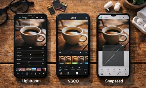
Lightroom, VSCO or Snapseed: Which is the Best Photo Editing App?
In today’s increasingly visual digital culture, where aesthetics speak louder than captions, editing photos has become a vital step in content creation. It’s not just about technical refinement — it’s a creative process that transforms an ordinary image into something memorable. Choosing the right photo editing app isn’t just a matter of convenience — it’s an extension of the creator’s visual identity. With smartphones becoming more powerful and cameras more intelligent, mobile editing has gained both freedom and sophistication. And when it comes to editing apps, three major names stand at the top: Lightroom, VSCO, and Snapseed. Each offers a unique approach, its own editing philosophy, and a loyal user base. In this guide, we’ll dive deep into the features, strengths, limitations, and practical applications of these three giants. You’ll discover which one fits best with your creative process, technical needs, and — most importantly — your visual identity. Why Photo Editing Apps Matter in Digital Identity Before diving into features and comparisons, let’s understand why a good photo editing app is essential. In a world of curated feeds, strong personal brands, and highly competitive content, editing has become the link between technical capture and emotional expression. Editing isn’t about deception. It’s about intention.It’s how you make a photo say exactly what you mean. With the right app: Adobe Lightroom: Total Control in Your Hands Best for: Demanding creators, beginner and professional photographers, or anyone seeking full control over image editing. Key features: Strengths: Limitations: When to use it: VSCO: Sensory and Stylish Editing Best for: Visual artists who value atmosphere, filters with personality, and quick but impactful edits. Key features: Strengths: Limitations: When to use it: Snapseed: Technical Depth for Free Best for: Intermediate and advanced users who want deep editing tools without paying for them. Key features: Strengths: Limitations: When to use it: How Each App Transforms the Same Photo Let’s imagine one simple image: a bicycle against a brick wall in soft afternoon light. Here’s how it would be edited in each app: One image. Three edits. Three completely different interpretations. Feature Comparison Table Feature Lightroom VSCO Snapseed Control level Advanced Basic to Medium Medium to Advanced Ease of use Moderate Very High Moderate RAW editing Yes No Yes Presets/Filters Custom Presets Film-Inspired Filters Saveable “Looks” Selective editing Yes (Premium) No Yes Video editing No Yes (Pro) No Price Free + Premium Free + Subscription Completely Free Best for Professionals Lifestyle Creators Technical Users How to Choose the Best Photo Editing App for Your Style Your choice depends on the type of creator you are: But you don’t need to choose just one. Many creators use a hybrid workflow: basic color grading in Snapseed, mood filters in VSCO, or deep adjustments in Lightroom with finishing touches elsewhere. Create Your Editing Workflow Whichever photo editing app you choose, creating an editing workflow is key to consistency and productivity: This workflow builds rhythm into your creative process, saving time and helping you refine your visual identity. The Best App is the One That Serves Your Vision Among all the features, charts, and filters, one truth remains: the best photo editing app is the one that helps you tell your story — your way. Whether through subtle adjustments or bold filters, what matters most is that your edit expresses your unique perspective. In your pocket, you hold a powerful creative tool. But it’s your vision that turns it into art. Test. Explore. Adjust. Rework.And keep creating — your next photo might be your best yet.