In the world of Digital Culture and Visual Lifestyle, where aesthetics speak louder than ever, photography has become one of the most powerful communication tools. It goes beyond a simple click: it conveys emotions, values, and even the positioning of a personal brand. However, many content creators, influencers, and even digital entrepreneurs make mistakes that sabotage the visual strength of their images — making their photos look amateur.
What distinguishes a photo that captivates and engages from one that goes unnoticed? Often, it’s technical and aesthetic details that, when overlooked, compromise the quality and professionalism of the image. In this article, we’ll reveal the main mistakes that make your photos look amateur and teach you, step-by-step, how to avoid each one.
If you want to raise the level of your visual productions — whether for social media, blogs, portfolios, or commercial projects — this content is for you.
1. Poorly Managed Lighting
Light is Everything — and It Can Be Your Worst Enemy
Lighting is one of the pillars of photography — both to highlight what matters and to create atmosphere. However, when poorly used, it can be the main factor that makes your photos look amateur, even if framing and theme are well planned.
Common Lighting Mistakes
1. Blown Highlights
When the light is too intense, especially in outdoor settings under strong sunlight, parts of the image become so bright that all detail is lost — like a cloudless sky turned into a white blob.
2. Harsh Shadows
Direct use of artificial light or flash creates strong shadows on the face or background, resulting in a marked and visually unpleasant appearance.
3. Dark, Low-Contrast Images
Photos with low exposure or taken in poorly lit places without proper compensation convey dullness and a lack of professionalism.
4. Improper Flash Use
Frontal flash, especially on smartphones, often flattens the face, causes unwanted reflections, and ruins the natural look of the scene.
How to Get Your Photo Lighting Right
• Prefer natural light whenever possible — it’s softer and favors realistic tones.
• Explore the golden hour for portraits and outdoor lifestyle shots with warm, diffused light.
• Indoors, use sheer curtains or lamps with diffusers to soften the light.
• Control shadows using homemade reflectors, like a white poster board or foam core.
Mastering light is mastering the mood of the photo. It should do more than illuminate — it should give meaning.
2. Lack of Visual Composition
Composing is Telling Stories Through Framing
Composition is what transforms a common image into a powerful visual narrative. It determines where the viewer’s gaze settles, how the elements interact, and what emotion the photograph conveys. Ignoring the basic rules of composition is one of the main reasons behind amateur-looking photos, even when lighting and equipment are on point.
Signs of Poor Composition
1. Awkwardly Cropped Objects
Cropping body parts, products, or points of interest in a random way gives a sloppy impression and disrupts visual harmony.
2. Cluttered Backgrounds
A background full of unrelated elements or visual noise steals attention from the main subject and creates confusion.
3. Lack of Focus on the Main Element
When the viewer isn’t sure where to look first, the image loses impact — often due to indecisive or disorganized framing.
4. Unintended Tilted Angles
Intentional tilt can be a creative tool, but when used accidentally, it gives a sense of technical carelessness.
How to Avoid Disorganized Composition
• Activate your camera’s grid and apply the rule of thirds, placing subjects at intersection points.
• Plan what you want to communicate and set up the scene accordingly.
• Clean the background or choose settings that enhance your message.
• Use leading lines and symmetry to create balance and professionalism in your photos.
Well-constructed composition is what separates a casual photo from one that truly communicates.
3. Overdone or Nonexistent Editing
Not Too Much, Not Too Little
Editing is a crucial step in modern photography — but when poorly executed, it quickly exposes your photo as amateur. Two extremes are common: overusing effects or skipping editing entirely. Both affect the final result and diminish your visual content.
Common Editing Mistakes
1. Over-saturation
Overly vibrant colors reduce realism and may cause visual discomfort, especially if they don’t match your content’s purpose.
2. Over-smoothed Skin
Excessive skin retouching turns faces into plastic surfaces, removing texture and expression — breaking audience connection.
3. Distorted Colors
Mismatched white balance or temperature adjustments result in images that are too orange, blue, or simply unrealistic.
4. Lack of Sharpness or Contrast
Flat, undefined photos without contrast look unfinished and lack visual impact.
How to Balance Your Editing
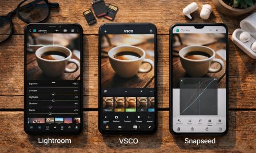
• Use tools like Lightroom, Snapseed, or VSCO for precise, natural results.
• Before applying filters, correct exposure, contrast, and color temperature.
• Create personalized presets to keep visual identity consistent across your photos.
• When editing portraits, preserve skin texture and real imperfections — this builds authenticity.
Good editing enhances — it doesn’t mask. The right balance between technique and sensitivity makes all the difference.
4. Poor Framing Choices
The Subtle Mistake That Changes Everything
Framing directs the viewer’s gaze — it’s the invisible structure that shapes the visual narrative. A small misstep in this decision can turn a promising image into something underwhelming. When done without intention, framing reveals a lack of technical command and reinforces the impression of amateur photography.
What to Avoid
1. Incomplete or Awkward Crops
Cutting off feet, hands, heads, or objects midway without visual logic creates discomfort and disrupts image flow.
2. Automatic Centering
Centering the subject without aesthetic intention can result in flat, predictable compositions with no visual dynamics.
3. Tilted Camera Without Purpose
Slanted lines or random angles may seem ‘artistic,’ but without purpose, they signal imbalance or carelessness.
Practical Solutions for Better Framing
• Study different framing types: wide shot, medium, American, close-up — each communicates something unique.
• Use natural frames like doors, windows, or foliage to lead the eye and add depth.
• Try high or low angles to break the norm and provoke different interpretations.
• Take more photos than you need and calmly select the best version afterward.
Good framing results from attention, intention, and constant practice — and makes all the difference in the final result.
5. Background Competing with the Subject
What’s Behind You Also Speaks
In photography, the background isn’t just scenery: it’s an active part of the composition and directly influences how the image is perceived. Overlooking it can ruin even the most promising concept. A clear sign of amateur photography is a background that distracts or competes with the main subject.
Problematic Background Examples
1. Domestic Clutter
Messy rooms, clothes out of place, or cluttered tables pull attention away from the main subject.
2. Cropped or Disconnected Elements
Half-visible furniture, ajar doors, or visible cables disrupt visual harmony and introduce noise.
3. Random People in the Background
Unintended figures, like someone walking by, shift focus away from the subject and weaken the narrative.
4. Objects “Growing” from Heads
Perspective errors — like poles or shelves behind the subject’s head — distract and distort image interpretation.
How to Choose a Good Background
• Neutral settings are ideal to highlight the subject and keep focus where it matters.
• Use portrait mode or wide aperture to blur the background and add depth.
• Observe carefully before shooting and change angles or remove elements as needed.
• Create your own backdrops with fabric, poster board, light walls, or intentional decorative elements.
A well-chosen background elevates the subject, organizes the image, and communicates clearly and professionally.
6. Lack of Visual Narrative
Every Image Needs Something to Say
A good photo isn’t just a pretty image — it’s a story told in a single frame. Without intention, a photo feels empty, disconnected, or uninteresting. Lack of narrative is one of the most common elements in amateur photography, especially in profiles and blogs that lack visual cohesion.
Narrative Mistakes
1. Random Photos Without Purpose
Images taken just for the sake of it, with no clear context or message, fail to connect with viewers. They feel loose and forgettable.
2. No Connection Between Sequential Images
In carousels, portfolios, or blogs, when there’s no continuity or visual logic, the audience gets lost and the message is unclear.
3. Aesthetic Doesn’t Match the Message
Using filters, compositions, or visual elements unrelated to the photo’s theme breaks consistency and hurts content credibility.
Strategies to Improve Visual Narrative
• Define the goal of the image: What do you want to express? Emotion, style, an idea, or a moment?
• Create sequences with a beginning, middle, and end — even in simple formats like Instagram stories, reels, or carousels.
• Use props, scenes, and supporting elements that reinforce the desired theme or emotion.
• Observe how well-positioned brands and influencers tell stories with their photos — and adapt those strategies to your reality.
With narrative, each image becomes more than just a click — it becomes an experience.
7. Low Resolution and Blurry Images
Technical Quality Matters (A Lot)
Even with good composition or narrative intent, a pixelated, shaky, or out-of-focus image is immediately perceived as amateur. Sharpness is what gives photography its professional touch, especially in digital spaces where visuals must make an immediate impact.
Main Causes
1. Outdated Equipment
Old devices with outdated cameras lack the resolution needed for high-quality digital content, especially in low-light conditions.
2. Dark Environments Without Support
Handheld photos in low light often result in blur from unintentional movement.
3. Digital Zoom
Zooming in with a smartphone instead of physically approaching the subject reduces sharpness and detail.
4. Lack of Focus
Shooting without checking if the subject is in focus creates confusing photos with no clear focal point.
How to Ensure Sharpness
• Use manual focus or tap on your screen to focus precisely on the main subject.
• In night shots, place your phone on a stable surface or use a tripod to prevent shaking.
• Enable the highest resolution setting on your device to capture more detail.
• Review each photo before posting — a quick check can prevent technical failures from ruining a great shot.
Sharpness equals professionalism — and that should never be missing from your visual content.
8. Incorrect Use of Colors
A Disorganized Palette Drives Viewers Away
Colors are one of the most powerful elements in building visual aesthetics. They influence emotions, guide the eye, and reinforce the identity of the person behind the image. When used randomly, without harmony or planning, they create visual noise and give the impression of disorganization. This is a classic mistake that reveals amateur photos, even when lighting and framing are well executed.
Signs of a Color Problem
1. Disconnected Palettes
When each photo follows a different color logic with no unity, the feed or portfolio looks chaotic and improvised.
2. Disorganized Aesthetics
Mixing warm and cold filters, oversaturated photos with washed-out ones, without a clear visual direction, breaks consistency and impairs readability.
3. Lack of Harmony Between Elements
Ignoring the color relationships between objects, backgrounds, and clothing leads to conflict, making the image unpleasant or unappealing.
How to Create a Visual Identity with Color
• Choose 2 or 3 main colors that represent your style or personal brand. They should appear, directly or indirectly, in your images.
• Use tools like Adobe Color to test harmonious combinations and palettes.
• Maintain consistency by applying the same tones across filters, text, backgrounds, and graphic elements.
• Take inspiration from accounts and brands with a strong visual identity — then adapt it to reflect your own essence.
Well-managed colors create instant recognition and turn your photography into a distinctive visual signature.
9. Disregarding the Purpose of the Photo
Creating Just to Create Is a Waste of Effort
In the visual world, every click should have a reason. Shooting without a clear intention is like trying to tell a story without knowing the plot. This habit, common among beginners, leads to amateur photos — images that may look nice on their own but lack relevance or coherence.
Haste, lack of creative direction, or simply shooting on autopilot weakens the narrative strength of a photo. And in a digital space where visuals need to capture attention instantly, this mistake can be costly.
How to Better Plan Your Photos
1. Define What You Want to Communicate
Before picking up your camera or phone, ask yourself: What message do I want this photo to convey? Elegance, freedom, inspiration, humor, lifestyle?
2. Choose the Elements Intentionally
Once your goal is set, select clothes, accessories, scenery, and even poses strategically. Every detail should reinforce the intended theme.
3. Build a Visual Moodboard
Gather visual references that express the aesthetic you’re aiming for: a color palette, specific lighting, or an inspiring composition.
4. Think About the Target Audience
Visualize who will see your image and how it will be perceived. This helps refine tone, visual language, and scene composition.
Photographing with purpose turns an ordinary image into memorable content — and that’s where true visual power lies.
Transform Your Photos and Your Digital Impact
The photos you share are your showcase in the digital world. In a space where the image often comes before the text, investing in visual quality means investing in authority, connection, and professionalism.
By avoiding these common mistakes that make your photos look amateur, you’re already one step ahead of those who simply ‘post to post.’ Every click can be an opportunity to inspire, impress, or even sell — but it takes attention to detail and intention in every production.
The transformation begins with perception: view your photos as part of your communication strategy, not just something pretty to share. From there, visual evolution becomes inevitable.
Whether it’s on your Instagram feed, your visual lifestyle blog, or your creative portfolio, the quality of your images says a lot about you. Now that you know what to avoid and how to improve, you’re ready to truly stand out.


