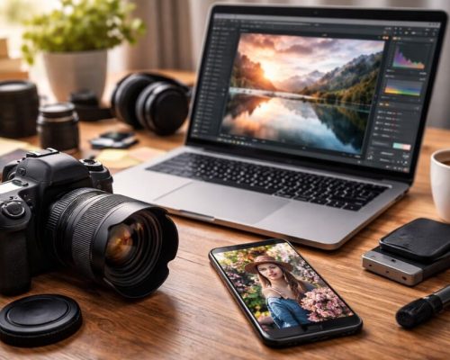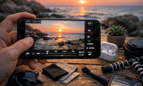
In 2026, Instagram is faster, more competitive, and at the same time, more sensitive to details. The feed is no longer just a place to “post something pretty”: it’s a storefront for attention, identity, and trust. And when attention becomes scarce, visuals become language.
That’s why understanding visual trends isn’t about chasing fads. It’s about learning how people’s taste is shifting, how aesthetics behave at social speed, and how you can use that to your advantage without losing authenticity.
In this guide, you’ll find the visual trends that show up most often in strong profiles, modern brands, and creators who look current without looking identical. You’ll also get a practical step-by-step to apply these choices with consistency and a “brand” feel — even if you create everything on your phone.
What’s shaping Instagram’s look in 2026
Before we list visual trends, it helps to understand the forces behind them. Three movements explain almost everything:
1) Aesthetics became more strategic
People recognize patterns. When your profile is coherent, it looks professional, trustworthy, and “well cared for.” That changes perceived value in seconds.
2) Content must be readable in motion
People consume content on the bus, in line, between tasks. The visuals that win are the ones the brain understands fast: contrast, hierarchy, rhythm, and simplicity.
3) Visual identity became a competitive advantage
Creators with a recognizable signature don’t need a new trend every week. The secret is using visual trends as seasoning, not the main dish.
12 visual trends for Instagram in 2026 (the ones you actually see in strong profiles)
Below are visual trends that share one thing: they work on mobile, improve retention, and make your content look current.
1) Warm minimalism (fewer elements, more feeling)
Not the cold, distant minimalism. This is clean but warm: sand, cream, brown, olive, terracotta, natural light, and soft shadows.
How to apply: a light background + one main element + generous spacing + controlled contrast. It’s one of the easiest visual trends to sustain for months.
2) Editorial typography in carousels (magazine-like hierarchy)
Carousels that feel like editorial pages: strong headlines, light subheads, short blocks, precise alignment. The goal is fast, elegant reading.
A working formula: big headline + smaller supporting line + one highlight per slide. Among visual trends, this one boosts saves when your content is useful.
3) Analog textures and intentional imperfections
Subtle grain, scanned paper, light scratches, film feel, organic borders. It humanizes digital content and creates a “made by hand” mood without looking amateur.
Tip: keep textures subtle. If the texture gets more attention than the message, you went too far.
4) Subtle motion (movement that doesn’t shout)
In 2026, motion is discreet: a soft light sweep, gentle zoom, a shadow shifting, elements floating slowly. It’s a type of visual trend that increases retention without feeling “effect-heavy.”
Where to use: Reel covers, Stories, and carousel-as-video exports with micro-animations.
5) Sorbet colors with contrast points (sweet palette + strong anchor)
Dusty pink, sky blue, mint green, buttery yellow — plus a darker anchor (graphite, navy, coffee). This feels modern and stays readable.
It’s one of the most popular visual trends for lifestyle, wellness, beauty, and digital culture because it communicates lightness with authority.
6) Frames inspired by interface design (UI aesthetic)
Posts that look like a “screen”: thin bars, cards, window-like elements, rounded corners — UI-inspired structure without copying platform branding. It organizes information and feels “digital product.”
Use carefully: the goal is structure, not clutter. Among visual trends, the line between clean and confusing is thin.
7) Documentary photos with soft flash (realism that holds attention)
Photos that feel like real moments: moderate flash, honest shadows, natural skin, less “perfect” composition. People got tired of plastic perfection. Realness returned — with style.
For creators, it’s one of the most powerful visual trends because it builds closeness and trust, especially in behind-the-scenes content.
8) Soft 3D and “inflatable” objects (without looking like a game)
Gentle 3D elements with matte, milky glass, or satin-plastic materials. It’s calm 3D used as detail, not the star.
Where it shines: carousel covers, category icons, checklist posts. Among visual trends, it signals modernity quickly.
9) Elegant digital collage (cutouts + realistic shadows)
Collage doesn’t mean chaos. It means art direction. Clean cutouts, coherent shadows, subtle layering, controlled palette.
A safe rule: max 3 layers (background + cutout + small detail). This keeps the visual trend stylish, not messy.
10) Quiet luxury — translated to digital
Sophisticated minimalism, refined typography, neutrals, few elements, premium-feeling imagery. It’s “silent luxury” adapted for the feed.
Works especially well for services, consultancies, aesthetics, personal brands, and higher-ticket offers. It’s one of the visual trends that increases perceived value fast.
11) Visual series and modular grids (instant recognition)
Instead of isolated posts, strong profiles build series: same structure, consistent colors, variations by theme. People recognize you immediately.
This is one of the most important visual trends because it solves a real problem: consistency without needing inspiration every day.
12) “Preview-first” design (covers and first frames matter more than ever)
Carousel covers, the first Reel frame, and the first Story second became your “poster.” Cover design is part of the content, not decoration.
Practical translation: your content must explain “what comes next” at first glance. Among visual trends, this most directly impacts clicks and retention.
How to choose visual trends without losing your identity
If you try to apply every visual trend at once, your profile becomes a lab without a signature. The smart move is combining a strong base with small updates.
Define your base (what stays consistent)
- Core palette (3 colors)
- One headline font + one body font
- Photo style (natural light, flash, editorial, etc.)
- Layout system (cards, columns, minimal, collage)
Pick 2 visual trends to “season” each month
Example: minimal base + analog texture + editorial typography.
That way you stay current without becoming algorithm-dependent — using visual trends as evolution, not identity.
Step-by-step to apply visual trends on Instagram in 2026 (without getting stuck)
This workflow is designed to be fast, repeatable, and phone-friendly.
Step 1) Do a 5-minute profile check
Open your grid and ask:
- Is there visual repetition, or does everything feel random?
- Could someone recognize your content without reading your name?
- Are your covers readable at small size?
- Does your palette show up consistently?
If you answered “no” twice, you need a base before chasing visual trends.
Step 2) Choose your posting “system” (your template framework)
Pick one:
- Card system: posts built with blocks and frames
- Minimal system: spacing, few elements, strong headline
- Collage system: cutouts + shadows + subtle texture
Your system is the structure where visual trends live.
Step 3) Build 3 ready-to-use templates (so you don’t depend on inspiration)
Recommended:
- Educational carousel (7–9 slides)
- Opinion post (single slide)
- Checklist (single slide + optional carousel version)
With templates, visual trends become small swaps (color, texture, frame) — not total reinvention.
Step 4) Choose a palette that works with your real content
Practical rule:
- 2 neutrals (cream + graphite, for example)
- 1 main color (blue or green)
- 1 accent color (burnt orange, for example)
This makes any visual trend easier to apply without hurting readability.
Step 5) Edit photos for consistency, not exaggeration
A simple lifestyle-friendly formula:
- Exposure: slightly up
- Saturation: slightly down
- Temperature: slightly warm
- Sharpening: moderate
You don’t want “edited.” You want “beautiful but natural.” That’s the energy behind many visual trends in 2026.
Step 6) Plan your week using series
Create a series with a fixed name and fixed cover style:
- “3 Fixes That Save It” (editing)
- “Quick Guide” (carousel)
- “Real Behind the Scenes” (photo + caption)
Series are a smart way to use visual trends with consistency and recognition.
Step 7) Run a simple A/B test with covers
For two weeks, alternate:
- Week A: minimal cover
- Week B: editorial typography + UI frame
Compare saves and retention. That tells you which visual trends work for your audience, not just what’s popular.
Design checklist for modern, readable posts
Use before publishing:
- Is the headline readable in thumbnail size?
- Is there enough contrast between text and background?
- Are you using no more than 2 fonts?
- One main element per slide?
- Consistent margins and spacing?
- Palette repeated across the week?
- Does your profile still feel like “you,” even with visual trends?
Common mistakes that make your visuals feel outdated (even with great ideas)
- Heavy filters and oversaturated colors
- Too much text on carousel covers
- Too many fonts and mixed styles
- Overdoing effects (shadow, glow, neon)
- Copying another profile’s aesthetic without adapting
- Posting with a totally different identity every day
The fix is simple: strong base + a few well-chosen visual trends + smart repetition.
A practical way to look current all year
You don’t need to chase trends every day. You need a visual system that frees you to create content — instead of becoming a design slave.
Pick two visual trends from this list to apply for the next 30 days. Update your covers, repeat your palette, create a series, and test calmly. When your profile feels coherent, something shifts: your content starts to look “bigger” than a single post.
And that’s when Instagram begins to work in your favor — when every new post isn’t just another upload, but a piece that reinforces your signature, your aesthetics, and your story.