Have you noticed how some posts seem to “hold” your eyes for longer? That’s not luck. In a feed that changes every second, attention became currency — and the people who learn to build it with intention get more than likes: they earn memory, recognition, and consistency.
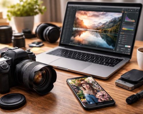
The good news is: this doesn’t depend on expensive gear, being “creative all the time,” or chasing trends nonstop. It depends on a method. And that’s exactly what you’ll find here: a practical, in-depth, repeatable guide on How to create posts that grab attention on Instagram, with a Culture Digital + Visual Lifestyle mindset — from planning to execution, with clear steps you can reuse every week.
What truly makes a post stop the scroll (and why most posts don’t)
Before you think about layout, filters, or captions, it helps to understand how Instagram works today: people don’t open the app “to see you.” They open it to feel something fast — curiosity, identification, desire, relief, surprise, belonging.
A post grabs attention when it answers at least one of these questions in under 2 seconds:
- Why does this matter to me?
- What do I get if I stop here?
- Is this beautiful, useful, new, or does it feel like me?
Most posts fail because they’re born without intention. They’re “just another post,” not a piece designed to provoke a reaction. And attention is reaction.
The “2-second rule”: what your post must communicate at first glance
No text, text on the image, single photo, carousel… the format doesn’t matter: your post needs an immediate visual hook. You need to design what people will notice first.
Think of your post like a storefront. If the storefront doesn’t attract, nobody walks in.
Your visual hook can come from:
- Contrast (light/dark, bold color on neutral background)
- A face and expression (humans stop for humans)
- Clean composition (the eye understands quickly)
- One unexpected element (a detail that creates curiosity)
- A clear promise (for carousels, the cover must “sell” the next slide)
Start with the goal: what action do you want people to take?
Here’s a decisive point in How to create posts that grab attention: a post isn’t just “pretty.” It must have one main action.
Pick only one:
- Save (useful content, checklist, step-by-step)
- Share (relatable truth, humor, “this is so me”)
- Comment (opinion, choice, dilemma, contextual question)
- Visit your profile / Click (curiosity, promise of something bigger)
- Buy / Request a quote (proof, transformation, clear offer)
When you choose one action, your aesthetic and copy get simpler, sharper, and more effective.
The 5 formats that pull attention fastest (and when to use each)
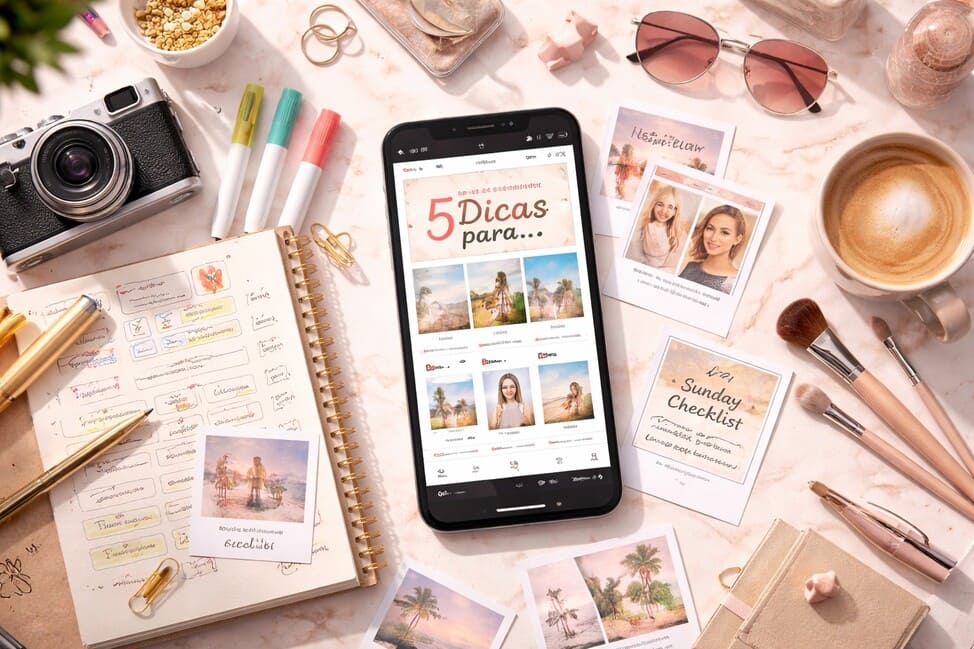
1) Educational carousel (the “save” magnet)
It works because it becomes a mini-lesson. Best for:
- step-by-step
- lists of mistakes
- before/after
- quick guides
- scripts/roadmaps
Important: if the cover isn’t strong, the carousel dies.
2) Single photo with strong aesthetics (classic lifestyle)
It works when the image speaks and reinforces your visual identity. Great for:
- travel, food, routine
- mood-based photos (calm, energy, luxury, freedom)
- personal branding
Important: the caption is what turns the photo into connection.
3) Minimal “quote” post (to drive shares and comments)
It works when it’s short, true, and visually clean. Best for:
- point-of-view statements
- positioning
- emotional behind-the-scenes
Important: less text on the image, more impact.
4) Before-and-after (the proof format)
It works because it’s instant: the eye understands transformation. Best for:
- photo editing
- design
- organization
- process results
- progress
Important: don’t fake the transformation — credibility is what sustains long-term growth.
5) Behind-the-scenes (the connection builder)
It works because it humanizes. Best for:
- “what nobody sees”
- your creative process
- mistakes and lessons
- real routines
Important: behind-the-scenes isn’t mess. It’s story.
Palette, typography, and consistency: how to build a feed that feels like a brand
Your aesthetic doesn’t have to be rigid — but it should be recognizable. A strong feed has a signature.
Three simple ways to create a visual signature:
- Fixed palette: 3 main colors + 1 accent color
- Fixed treatment: the same type of light and color grading across photos
- Fixed layout system: consistent typography and spacing in posts
You don’t need all three. One already changes the game.
Step-by-step: How to create posts that grab attention on Instagram (from zero to published)
Here is the full, repeatable process you can use every week.
Step 1) Pick a topic with intent and real interest
Ask:
- what does my audience want to learn quickly?
- what are they trying to fix or improve?
- what do they save when they see it?
Examples:
- “How to take better phone photos”
- “How to build a carousel that hooks people”
- “Mistakes that make your post look amateur”
Step 2) Define the post “promise” in one sentence
The promise is what people gain.
Examples:
- “You’ll learn a 7-slide carousel model you can reuse.”
- “You’ll get brighter photos without losing a natural look.”
- “You’ll stop posting in bad lighting without realizing it.”
If you can’t write the promise, the post is still too vague.
Step 3) Choose the right format for that promise
- Teaching = carousel
- Inspiring = single photo + strong caption
- Starting a conversation = question + context
- Proving = before/after
- Connecting = behind-the-scenes
Step 4) Outline the content before opening the design app
This prevents you from getting stuck in Canva and wasting time.
For a carousel, draft:
- Cover
- Slide 2: context
- Slides 3–6: content
- Final slide: recap + CTA
Step 5) Design the cover like a thumbnail
Your cover must work at small size.
Quick checklist:
- one idea per cover
- 3–8 words (if there’s text)
- high contrast
- one dominant element (photo, icon, headline)
Step 6) Simplify the design to win clarity
The design that grabs attention isn’t the busiest. It’s the one the brain understands fast.
Practical rules:
- use 1–2 fonts max
- keep margins and breathing room
- maintain consistent alignment
- don’t use 10 colors in one post
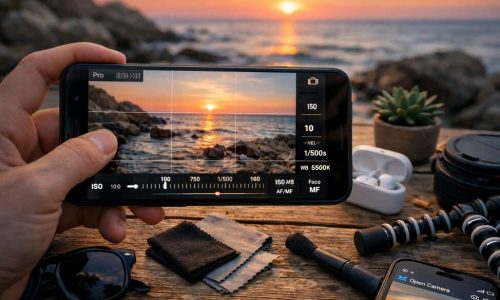
Step 7) Adjust image and color so it looks professional
This is gold for visual lifestyle:
- raise exposure slightly
- reduce saturation a bit to avoid harsh colors
- keep skin tones natural
- apply sharpening carefully
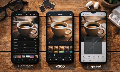
If you edit on your phone: start in Snapseed/Lightroom and finish in Canva if you need layout.
Step 8) Write a caption with rhythm (without unnecessary essays)
A strong caption has:
- a hook (first line)
- context (why it matters)
- delivery (the tip, idea, steps)
- CTA (save, comment, share)
Hook examples:
- “If your post looks good but nobody reacts, this explains a lot.”
- “You don’t need to post more. You need to post better.”
- “The difference between ‘cute’ and professional is this.”
Step 9) Publish with retention in mind
When you post:
- preview the cover at small size
- check carousel slide readability
- use relevant hashtags (no overload)
- reply to comments within the first hour
You don’t need to “go viral.” You need to signal consistency.
What to post when you run out of ideas (without relying on trends)
If you want to always know How to create posts even on low-energy days, use these templates:
Template 1: “Mistake + fix”
- “3 mistakes that make your photo look amateur”
- “What to do instead”
Template 2: “Checklist”
- “Checklist for a perfect carousel”
- “Phone photo editing checklist”
Template 3: “Before/after + process”
Show the result and explain the path.
Template 4: “Opinion with reasons”
- “Why posting every day doesn’t solve it”
- “What actually solves it”
Template 5: “Honest behind-the-scenes”
- “How I make my posts”
- “What nobody tells you”
These templates work in any niche: travel, lifestyle, design, marketing, food.
Quick wins that boost attention without adding extra work
- Use natural light whenever possible
- Get closer to the subject (avoid “too far away” shots)
- Pick a consistent editing style (preset or fixed adjustments)
- Write less on the image and more in the caption
- Create series (“Part 1, Part 2…”) to increase return visits
- Repeat what worked — creativity doesn’t mean reinventing daily
A checklist you can save and use every time
Before you publish, ask:
- Can someone understand the post at first glance?
- Is the cover clear at small size?
- Did I choose one main action (save, comment, share)?
- Does the design have breathing room and consistency?
- Does the caption have hook + value + CTA?
- Does this fit my visual identity?
If you answered “yes” to at least four, you’re on the right track.
The shift that changes everything: attention is built, not “deserved”
Posting on Instagram is like talking in a crowded room: if you speak beautifully but without direction, you disappear in the noise. If you learn to focus on the other person, organize your message, and build rhythm, you become a reference.
You don’t need to be a genius. You need to be intentional.
Now pick a simple topic, apply the step-by-step, and publish with a testing mindset: every post is a step. When you master How to create posts that grab attention on Instagram, you stop depending on luck — and you start building real presence, in a way your audience can recognize from far away.