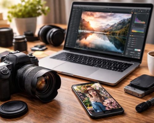
In interior photography, light, composition, and ambiance are essential for creating attractive images. But there’s one element that’s often underestimated — yet it has the power to completely transform the perception of a photograph: color.
More than just an aesthetic component, color is a strategic tool in building your visual identity. It communicates emotion, guides the viewer’s eye, creates harmony or contrast, and most importantly, helps photographers stand out.
In this article, you’ll learn how color works in interior photography, how to use it intentionally to strengthen your visual brand, and what to keep in mind to ensure that your style is authentic and recognizable.
Color as a Visual Language
In photography, every color carries symbolic, emotional, and cultural meaning. Once you understand these meanings, you can begin using them intentionally — not just for aesthetics.
Color Psychology in Interior Spaces
Here are some common associations:
- Blue: Calmness, freshness, introspection. Ideal for bedrooms, reading corners, and offices.
- Red: Energy, intensity, passion. It can warm up cold spaces or draw attention to a focal point.
- Yellow: Joy, optimism, mental stimulation. Great for kitchens and social areas.
- Green: Balance, nature, well-being. Works well in rustic or plant-filled environments.
- Gray: Sophistication, neutrality, serenity. A common choice for minimalist and modern interiors.
- White: Purity, lightness, spaciousness. Perfect for Scandinavian style or clean design.
- Black: Strength, depth, drama. Powerful when used for contrast or focal accents.
These meanings aren’t rigid — you should always adapt your color choices based on the story you want your image to tell.
Color as a Signature of Your Visual Identity
A photographer’s visual identity includes elements like composition, lighting, directing scenes, and editing — but also recurring use of color.
If you look at the portfolios of well-known photographers, you’ll often notice a dominant or consistent color palette. This helps create:
- Aesthetic consistency
- Instant recognition
- A strong personal brand
You can shape your color palette either intuitively (by noticing which colors naturally attract you) or strategically (by consciously choosing tones that reflect your message or niche).
Defining Your Palette: Where to Begin?
If you want to use color as a visual signature, start with the following steps:
1. Review Your Portfolio
Gather your favorite interior photos and observe:
- Which colors appear most often?
- Do you gravitate toward warm or cool tones?
- Are your images mostly bright, dark, or balanced?
- Do you lean toward neutral tones or bold colors?
This analysis reveals unconscious patterns that may already define your visual language.
2. Choose a Direction
Based on your findings, you can lean toward:
- Neutral, soft tones: communicate elegance and calm
- Vibrant colors: express energy and creativity
- Strong contrasts: emphasize impact and storytelling
- Monochromatic palettes: ideal for minimalist or editorial styles
The key is to stay consistent, even when natural variations occur between locations.
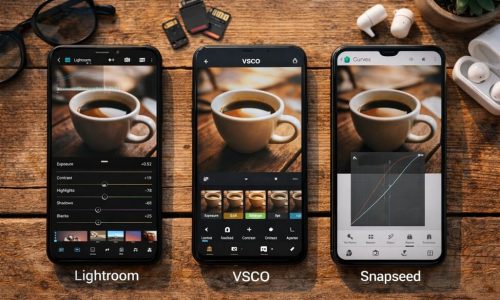
3. Use Palette Tools
Platforms like Adobe Color, Coolors, or Canva Palette Generator allow you to create color palettes based on images or emotional concepts. These tools help you maintain editing coherence across projects.
How Light Affects Color
Color never exists in isolation. It’s deeply influenced by lighting conditions.
Examples:
- Morning light tends to be cooler, enhancing bluish tones.
- Late afternoon light is warmer, adding golden hues.
- Overcast days produce soft, desaturated colors.
- Side lighting casts shadows that change color perception.
So, when using color as part of your message, always consider the direction and temperature of natural light at the time of shooting.
Using Color in Composition: Creating Balance
Beyond symbolism, color is also a compositional tool. It directs the viewer’s gaze, defines depth, and creates visual hierarchy.
Compositional Techniques with Color:
- Dominant color: Choose one strong color to occupy a large part of the frame.
- Color spot: Insert a small, bold-colored element into a mostly neutral scene to attract attention.
- Complementary colors: Use opposite hues (like blue and orange) for dynamic tension.
- Analogous colors: Use neighbors on the color wheel (like green, blue, and turquoise) for harmony.
These strategies help your work look intentional rather than accidental, giving your images a professional edge.
Color in Post-Processing: Reinforcing Your Identity
Editing is your chance to refine the presence of color and shape your photographic voice — but balance is essential.
Tips for Effective Color Editing:
- Use the HSL sliders to fine-tune hue, saturation, and brightness of specific tones.
- Apply color grading to give shadows, midtones, and highlights their own identity.
- Use tone curves to shape contrast without distorting color integrity.
- Avoid over-saturation — bold colors should support, not overwhelm, the story.
The goal isn’t to change the space, but rather to enhance what’s already there and reinforce your visual narrative.
Case Studies: How Color Reflects Style
Scandinavian Style
- Palette: White, light gray, soft green, pale wood
- Feeling: Calm, cleanliness, brightness
- Focus on subtle tones to enhance lightness and serenity
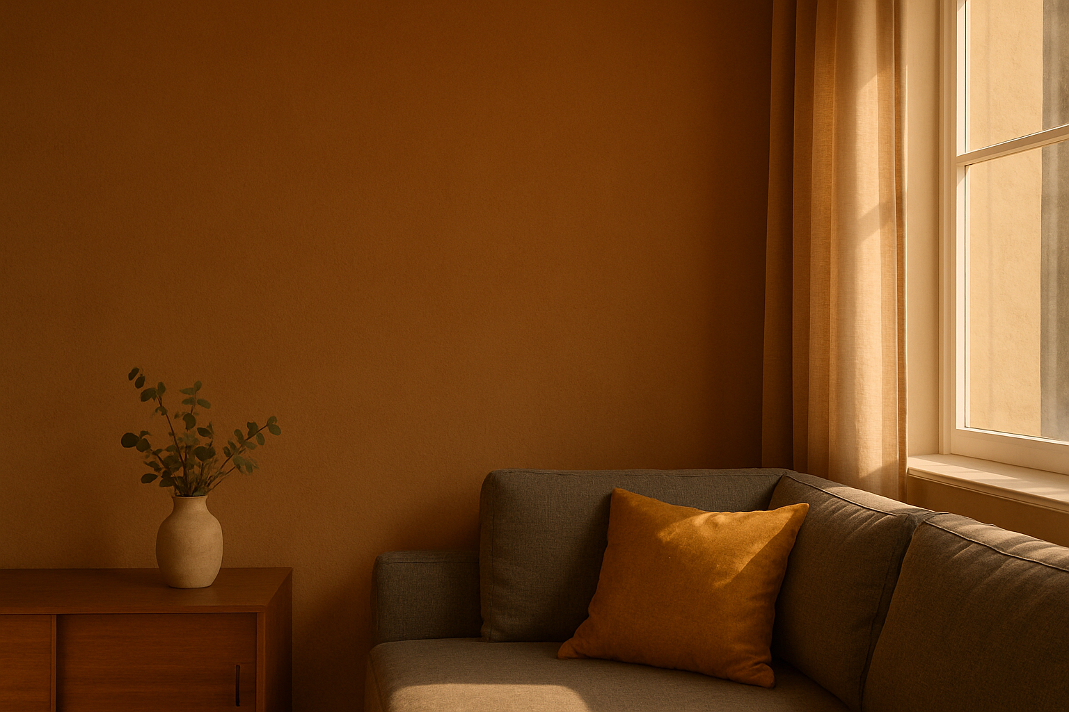
Boho Style
- Palette: Earthy tones (caramel, burnt orange, beige)
- Feeling: Warmth, creativity, personality
- Natural color combinations evoke a relaxed, lived-in feel
Industrial Style
- Palette: Gray, black, dark brown, navy blue
- Feeling: Urban, strong, minimalist
- Cool tones with accents of warmth add balance
Editorial / Lifestyle Style
- Palette: Soft neutrals with hints of gold or copper
- Feeling: Refined realism, understated luxury
- Controlled colors support authenticity and composition
This type of style-color pairing helps you define your aesthetic direction more clearly.
Developing Your Color Language with Purpose
If you want to strengthen your visual identity, try these practical exercises:
1. Monochrome Project
Choose one color (e.g., green) and shoot multiple interior scenes that include variations of that tone. This builds awareness of harmony and visual control.
2. Color Journal
For one week, photograph indoor scenes that reflect a chosen emotion or theme (e.g., “calm” = blue). This helps you associate mood with color use.
3. Limited Palette Challenge
Set a palette of 4–5 colors and stick to it across several photo sessions. Then assess how this affects your visual identity as a whole.
Conclusion: Color Is Identity, Not Just Aesthetic
In interior photography, color isn’t just a decorative layer — it’s a strategic tool of visual communication. When used intentionally, color is one of the strongest assets in building a professional, cohesive, and memorable photographic style.
Understanding color — emotionally, symbolically, and compositionally — allows you to shoot with greater intentionality. And shooting with intention is what transforms good photos into unforgettable visual experiences.
So don’t be afraid to experiment, make bold choices, and let color be your creative ally. It’s one of the most powerful elements in your journey as a photographer.