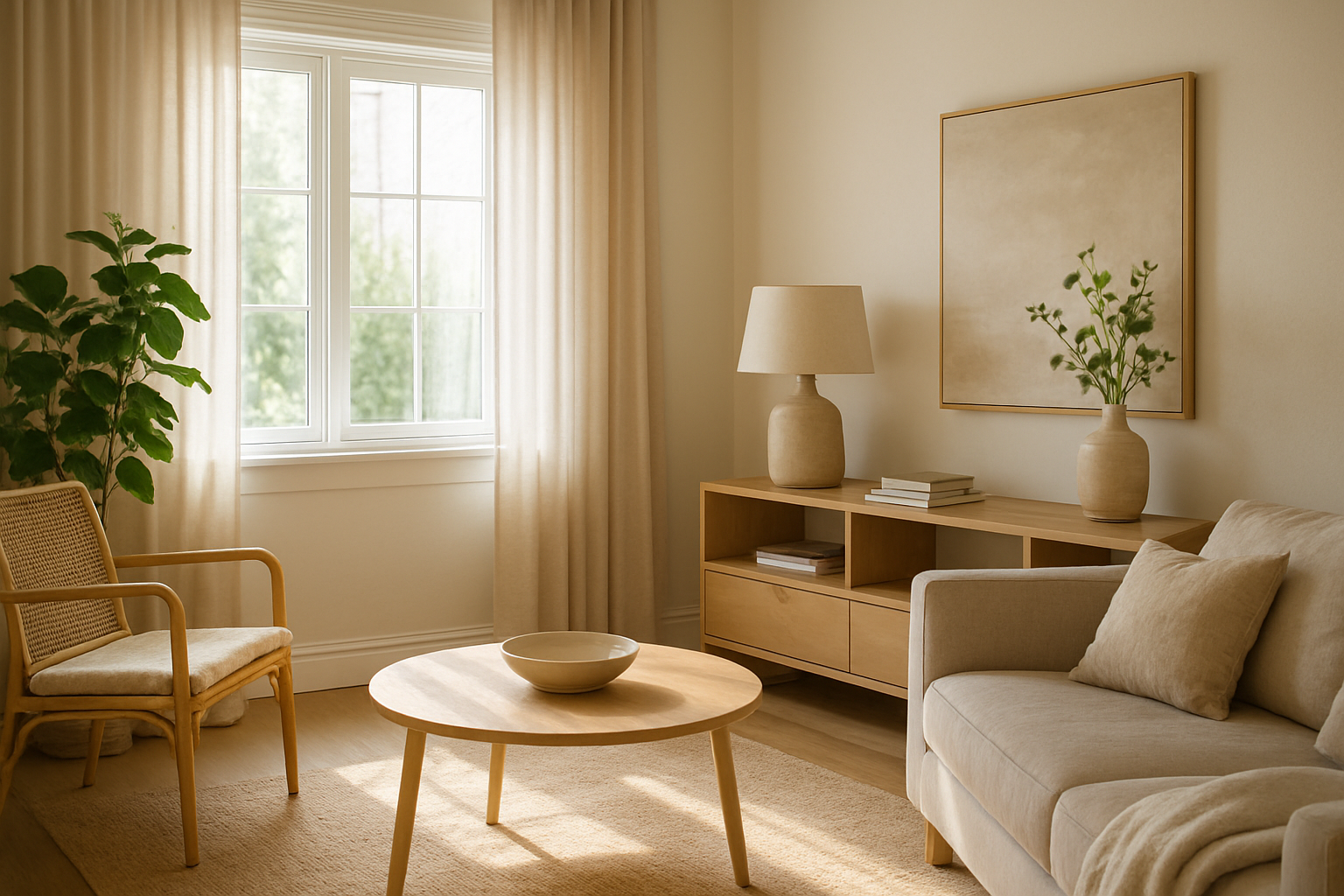
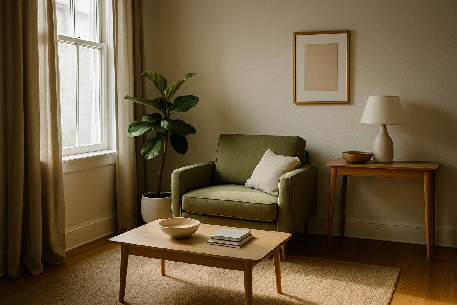
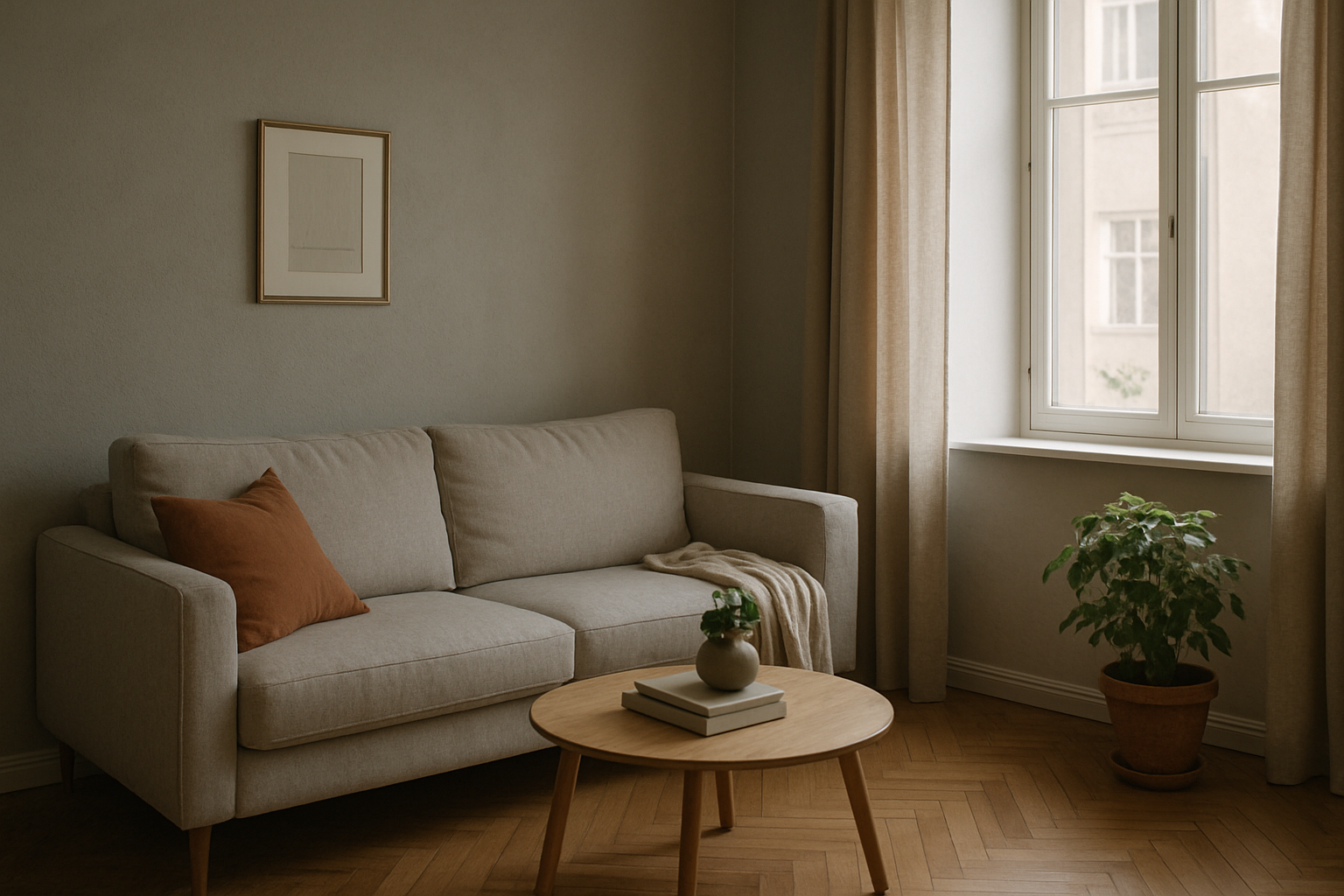
The art of photographing small spaces requires more than just good equipment. It takes sensitivity, technical vision, and a visual strategy that highlights every centimeter available. One of the photographer’s greatest allies in this challenge is natural light, which can transform tight rooms into bright, spacious-looking environments. In this article, you’ll learn how to use natural light intelligently to create the illusion of spaciousness in small areas. We’ll explore composition techniques, camera positioning, exposure control, and much more. By the end, you’ll have a complete guide to unlocking the full potential of compact spaces. Why is natural light so powerful? Natural light has unique qualities: it’s soft, organic, dynamic, and free. When used correctly, it can: In small spaces, natural light helps eliminate visual heaviness caused by harsh shadows and excessive contrast, supporting a light, flowing composition. This directly contributes to making a room feel larger. First step: Understand the light source Before even picking up your camera, analyze how the light enters the room: This observation is crucial. Shooting against the light can flatten a scene if not well controlled. On the other hand, side natural light tends to enhance volume, create soft shadows, and reinforce the sense of three-dimensionality. Choose the best time of day to shoot The quality of natural light changes throughout the day. For small rooms, the best times are: Avoid shooting under strong direct sunlight (around noon), which may cause overexposed highlights and unbalanced scenes. Camera positioning: What affects the perception of space A key secret to making a space appear larger is the angle of capture. Here are some effective strategies: Shoot from corners Positioning the camera in a corner lets you capture two walls at once, creating leading lines that guide the eye and expand visual space. Use mid-level height Avoid extremely high or low angles. Shooting from about 1.3 to 1.5 meters off the ground offers a balanced perspective — similar to natural eye level. Try diagonal angles Diagonal shots add depth and visual dynamism to the scene. Combine this with natural light direction to reinforce the sense of spaciousness. Take advantage of reflective surfaces Mirrors, glass, glossy doors, and even polished floors can reflect natural light and visually expand a room. When positioned thoughtfully, these reflections: Pro tip: Place mirrors near light sources but outside the camera’s direct field to reflect the space without catching unwanted reflections. Exposure and white balance control Even with plenty of natural light, proper camera settings are essential: Exposure White balance Composition elements that enhance the feeling of spaciousness Besides lighting, some elements can help create a sense of space. When combined with good lighting, they have a strong visual impact. Vertical lines Use full-length curtains, tall bookshelves, or vertical plants to enhance the sense of height in the room. Light colors Walls and furniture in soft, neutral tones reflect more natural light, which helps create a bright, open feeling. Soft textures Avoid cluttered patterns or heavy textures. Light fabrics, pale wood, and glass encourage light diffusion and enhance the atmosphere. Create depth with natural light Work in layers Compose your shot with elements in the foreground, middle ground, and background. Natural light can enhance these layers, adding dimension and depth. Example: A chair by the window (sharp focus), a shelf in the background (slightly blurred), and a sunlit rug on the floor. Each element in its layer, shaped by natural light. Use shadows creatively Soft shadows created by diffused natural light add dimension without overwhelming the scene. They help the viewer distinguish volumes and distance between objects. Guide the viewer’s eye Side lighting can be used to lead the viewer’s gaze through the scene. Place furniture or plants along the light path to reinforce continuity and depth. Integrate the space with the outdoors If natural light enters through a window, try including a glimpse of the outside — a tree, balcony, or garden. This creates a visual connection to the outside world, adding depth and a sense of openness. Just be sure the outside view isn’t overexposed — adjust your exposure to balance interior and exterior light. Photographing details: Natural light and focus In small rooms, photographing details helps tell the story and highlight the environment. Try capturing: These close-ups, when naturally lit, bring warmth and elegance to the space. What if there isn’t much natural light? Not every room is naturally well-lit. In these cases: Common mistakes when using natural light in small spaces Post-processing: Subtle edits to enhance the light In editing, you can enhance natural light effects without overprocessing: Final thoughts: The power of natural light in smart composition Natural light is more than an ally — it’s a central character in interior photography, especially in compact rooms. It can highlight volume, expand visual space, enhance color realism, and tell stories with softness and elegance. With the right composition techniques and lighting control, you can transform something simple into something sophisticated — all without expensive gear or artificial effects. If you want to master the art of making small spaces look bigger, natural light should always be your starting point.
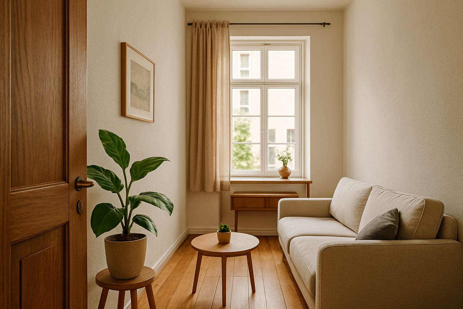
How to Create Depth in Photos of Narrow Spaces
Photographing narrow spaces is one of the biggest challenges for those working with interior composition, architecture, or even lifestyle in compact apartments. In these situations, limited space can result in flat images, lacking the dimensionality that makes a photo visually engaging. However, with the right techniques, it’s possible to create depth and turn these constrained scenes into rich and expressive compositions. In this article, you’ll learn how to create depth in photos of small spaces using composition principles, camera settings, lens choices, light control, and visual tricks that expand the perception of space. Let’s dive in. Why Depth Is Essential in Interior Photography Depth in an image has the power to draw the viewer in. It conveys the sensation that the scene goes beyond the flat surface of the photo, leading the observer through different layers within the image. In narrow spaces, this effect is even more valuable, as it helps avoid the “flat” appearance typical of small rooms. When depth is well executed, even the smallest space can feel larger, more inviting, and full of character. This is especially important for photographers working with interior design, real estate, architecture, or lifestyle-focused social media in compact homes. Understanding the Illusion of Depth Photography is a two-dimensional medium. However, the illusion of depth can be created using several techniques that manipulate perspective, layering, lighting, and focus. When well applied, these techniques help the viewer perceive layers within the scene, making the image more dynamic and engaging. Composition Techniques to Create Depth Converging Lines Use architectural lines or elements of the space (like floors, walls, windows, or furniture) to guide the eye toward a vanishing point. Converging lines create a sense of distance and depth, even in very tight spaces. Example: A photo taken from the corner of a hallway, with walls and flooring leading the eye toward a door in the distance. Foreground, Middleground, and Background Layers Create three distinct planes in your composition: This technique helps visually organize the space and gives the photo a clear sense of spatial depth. Object Overlap Include partially overlapping objects. When viewers see one object blocking part of another, their brain naturally perceives distance between them — a simple yet powerful way to suggest depth. Natural Framing Use doorways, windows, mirrors, or architectural features to create internal frames. These frames add layers to your composition and guide the viewer’s eye through the image. Choosing the Right Lenses Wide-Angle Lenses Wide-angle lenses (14mm–24mm on full-frame cameras) are ideal for small spaces because they capture more of the scene and enhance perspective lines. However, be cautious of distortion, especially around the edges. Pro tip: Keep the camera level to avoid exaggerated vertical distortion, often seen in tight interior shots. Moderate Aperture Use apertures around f/4 to f/8 to maintain a good depth of field and ensure sharpness across multiple elements in the scene. This keeps more of the space in focus and supports the layered composition. Light Control: A Key to Perceived Depth Use Side Lighting Side lighting is excellent for highlighting textures and creating soft shadows. It helps define volume, especially in furniture and decor, contributing to the image’s three-dimensional look. Add Accent Lights Support lighting — like lamps, floor lights, or LED strips — can help create zones of light and shadow, adding contrast and enhancing depth. Avoid flat, even lighting, which can reduce dimensionality. Composition and Eye Movement Strategic Angles Avoid shooting directly into walls, which flattens the scene. Instead, favor diagonal angles, which increase the sense of perspective. Position yourself in corners or use furniture lines to lead the viewer’s eye into the space. Include Human Elements Having a person in the shot — sitting, walking, or interacting with the space — helps the viewer gauge scale and creates a point of interest that adds visual depth. Color and Texture as Subtle Depth Tools Contrast Between Planes Use contrasting colors between foreground and background. Lighter tones in the back and darker ones in the front (or vice versa) can emphasize spatial distance. Variety of Textures Mix materials like wood, fabric, glass, and metal to stimulate visual layering. Texture adds complexity and prevents the scene from appearing flat. Post-Production for Depth Local Contrast and Clarity In Lightroom or Photoshop, boost clarity and local contrast selectively to bring volume to certain elements and separate them from the background. Soft Vignetting Apply a subtle vignette to darken the image’s edges, guiding the viewer’s eye toward the center — where most layers typically are. Use this technique carefully to maintain a natural look. Selective Blur In editing, you can simulate depth of field with gradual blur from front to back. This should be done subtly and realistically to mimic real lens behavior. Use Bokeh Strategically With a wide aperture (f/1.8 or f/2.8), you can focus on a foreground element while softly blurring the background. This contrast helps isolate the subject and gives the image a layered effect. In interior photography, use this effect with care so you don’t lose important context in the background. Mirrors: More Than Just Reflection Well-placed mirrors reflect light, simulate continuity, and add dimension. Avoid placing them directly in front of the camera. Instead, shoot from angles where the mirror reflects parts of the room not visible in the frame. Design Elements That Help Build Depth Creative Techniques to Reinforce Depth Tripod + Long Exposure In low-light small spaces, using a tripod with long exposure and low ISO helps you capture more detail across the frame and improves sharpness between layers. Focus Stacking Take multiple shots focused on different planes (foreground, middle, background) and blend them. The result is an ultra-sharp image with strong depth perception. Warm vs. Cool Light Contrast Introduce warm tones in the foreground and cooler tones in the background (or vice versa) to separate planes through color temperature. This adds depth and mood to the scene. Case Study: Photographing a Narrow Bathroom Imagine a 1.5m x 2m bathroom with no window. Use a wide-angle lens (18mm), soft
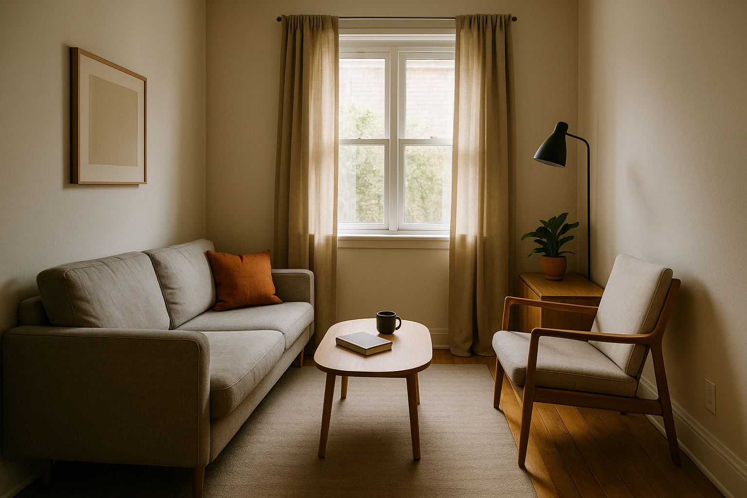
What Not to Do: 6 Common Mistakes When Composing in Small Spaces
Photographing small interiors demands more than just technical skill — it requires sensitivity and attention to detail. In limited spaces, every object, line, and ray of light matters. Small mistakes, which might go unnoticed in larger rooms, are amplified and can compromise the entire composition. To compose well in small environments, it’s not just about knowing what to do — it’s also about knowing what to avoid. In this article, you’ll discover the 6 most common composition mistakes made when photographing small rooms with natural light — and how to avoid them with simple, effective solutions. By the end, you’ll have a sharper and more professional eye, ready to bring out the best in even the smallest spaces. 1. Trying to Show Everything in a Single Shot One of the most frequent mistakes is trying to capture every detail in one photo. The intention might be good — to showcase everything the room has to offer — but the result is often the opposite: a cluttered, unfocused image that feels overwhelming. Why this happens: How to avoid it: Remember: a clear intention creates stronger, more engaging compositions. 2. Ignoring the Background In small spaces, everything in the frame matters — especially the background. A common mistake is focusing only on the foreground and forgetting that the background communicates just as much. Examples of problematic backgrounds: How to fix it: A well-thought-out background enhances your subject. A distracting one can ruin the photo. 3. Cutting Objects Unintentionally Cropping is part of photography — but in small rooms, accidental or unbalanced cuts are very common, and they hurt your composition more than you think. Common issues: How to avoid: Pro tip: avoid cropping where the viewer’s eyes naturally land — it causes instant discomfort. 4. Misusing Natural Light Natural light is powerful — but when uncontrolled, it becomes your worst enemy. In small spaces, its intensity, direction, and temperature directly impact the image quality. Frequent problems: How to improve: Light isn’t just technical — it’s part of your composition. Control it at the moment of the shot, not just in post-production. 5. Using Unflattering Angles and Heights Camera position is everything. In small rooms, a slight mistake in height or angle can distort furniture, flatten depth, or create a sense of imbalance. Common mistakes: How to fix it: Remember: the right angle enhances depth and harmony. A bad one makes the room feel chaotic. 6. Relying on Editing to Fix Everything Editing can improve a photo — but it won’t save a poorly composed one. Many photographers assume that Lightroom or Photoshop will fix everything, but editing only enhances what’s already working. Why overediting is a mistake: What to do instead: Editing is your assistant — not your safety net. Bonus: 2 Extra Mistakes to Avoid 7. Ignoring the Room’s Style Every room has a story. Whether it’s minimalist, rustic, or modern, it carries a visual identity — and your photo should respect that. Adjust your visual approach to match the space’s personality. 8. Forgetting the Photo’s Purpose Who is the photo for? What is its goal? If you don’t know this, you’re shooting in the dark. Define the purpose — and let that guide your composition. Final Thoughts: Smart Composition Starts with Avoiding Mistakes Small interiors challenge photographers to make smart choices. There’s no room — literally — for clutter, distractions, or poorly thought-out visuals. That’s why good composition begins with knowing what not to do. Avoiding these mistakes helps you: As you develop your eye and your workflow, these adjustments become second nature. And that’s where the real evolution begins — when every photo is intentional, clean, and confidently composed.
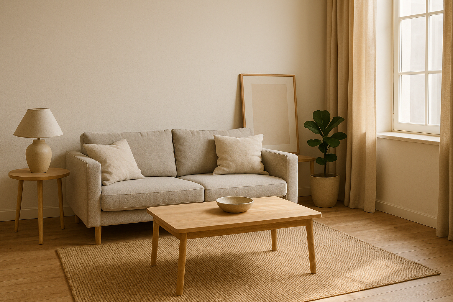
How to Avoid Visual Clutter When Composing Tight Spaces
Small spaces demand a trained and careful eye. A single misplaced object can compromise the entire composition of a photo. When space is limited, every element that enters the frame must have a purpose and contribute visually. That’s why avoiding visual clutter is one of the most valuable skills for anyone photographing interiors with natural light. In this article, you’ll learn practical and creative techniques to eliminate excess, organize the environment visually, and compose cleaner, more elegant, and impactful images — even in the tightest of spaces. What Is Visual Clutter in Interior Photography? Visual clutter occurs when too many elements compete for the viewer’s attention within a single image. This can include: The result is a confusing image, with no clear focus, which leads to visual fatigue and reduces the image’s impact — even if the room itself is beautifully decorated. Why Are Small Spaces More Prone to This Problem? Tight environments leave less room to breathe. One extra piece of furniture, a pillow out of place, or a poorly positioned plant is enough to throw the whole image off balance. Additionally, when using natural light, the contrast between light and shadow can accentuate visual chaos if elements aren’t organized. That’s why a clean composition is essential for highlighting the right details and conveying a sense of order. 1. Start by Removing Before Adding The first step in avoiding visual clutter is to remove everything that doesn’t serve the photo. Before thinking about framing or lighting, look at the space with a critical eye and ask: Does this contribute visually, or is it just here out of habit? Remove: Start with a minimalist space, and only add items that genuinely enhance the scene. 2. Organize the Scene by Color and Shape A simple yet effective visual technique is to organize objects by color and shape. This creates harmony and prevents the eye from becoming overwhelmed. Practical tips: Repetition and visual patterns help tame chaos. Three similar vases have more impact than five random ones. 3. Watch the Edges of the Frame Visual clutter often sneaks in at the edges of the image, where objects are unintentionally cut off or appear without context. Avoid: Pro tip: before pressing the shutter, scan the frame’s edges. Adjust the camera or the elements until everything that appears in the image is intentional, not accidental. 4. Use Negative Space Wisely Negative space is the “empty” area in a photo — walls, floors, or surfaces without objects. It’s essential for creating visual breathing room, especially in tight spaces. Don’t fear the empty areas. They: Ask yourself: Does this photo give the viewer room to rest their eyes? If not, it may be time to reduce or reposition some elements. 5. Limit the Number of Points of Interest Don’t try to show everything at once. Choose a single focal point per photo, and allow supporting elements to play a secondary role. Examples of strong focal points: Photos with multiple points of interest confuse the viewer. Simplicity is often more powerful and more effective in small spaces. 6. Control Depth of Field Using a shallower depth of field (blurring the background) can isolate the subject and soften any excess visual information. You can do this by: This technique helps draw attention directly to what matters and is especially useful in cluttered or compact environments. 7. Choose the Best Angle to Avoid Overlapping Elements Shooting straight on isn’t always the best choice. Trying other angles can help you: Try photographing from a corner, from above, or at a diagonal. These angles often help simplify the frame and reduce the number of elements competing for attention. 8. Use Natural Light to Organize the Scene Light can be a powerful tool in composition. With it, you can: Light direction matters too. Side lighting adds depth and separates the subject from the background. Frontal lighting tends to flatten the scene, so use it sparingly. Tip: Take advantage of early morning or late afternoon when light is softer and more directional. Diffused light enhances textures without creating harsh contrast. 9. Don’t Ignore the Floor and Ceiling In small rooms, the floor and ceiling often appear in your image. If overlooked, they can distract or ruin your composition. On the floor: On the ceiling: These may seem minor, but they make a big difference in visual cleanliness. 10. Review Before and After Shooting Interior photography is an exercise in attention to detail. Even after staging the scene, it’s worth reviewing before clicking: After shooting, review the image carefully. Often, clutter only becomes obvious when viewed on a large screen. Don’t hesitate to make adjustments or reshoot — this final review step is what separates amateur shots from polished, professional work. 11. Work with Visual Themes One powerful strategy to reduce visual clutter is to define a theme for the photo. This can be a dominant color, a texture, a furniture style, or even a concept like “coziness” or “urban minimalism.” Having a theme helps eliminate what doesn’t belong and reinforces the image’s identity. This makes your composition more coherent and visually strong — even in limited spaces. Less Is More: The Strength of Simple Composition Avoiding visual clutter isn’t about limiting creativity — it’s about refining your visual message. In tight spaces, a clean composition is what allows the room to shine, light to be appreciated, and details to take center stage. When the viewer steps into a clean, well-composed image with a clear focus, they stay longer, observe more, and connect deeply with the scene. And that is the ultimate goal of interior photography: to visually communicate with clarity and emotion.
The Complete Composition Guide for Those Who Photograph with Natural Light
Composition is the soul of photography. When it comes to indoor spaces — especially small ones where natural light is the primary (or only) source of illumination — mastering composition techniques makes all the difference between a simple snapshot and a visually impactful image. This complete guide will show you how to compose your interior photos using natural light, creating balance, depth, visual interest, and directing the viewer’s attention. All of this without using flashes, reflectors, or advanced equipment. Just you, your camera (or smartphone), the space, and real light. Why Good Composition Matters More Than Expensive Equipment It’s common to think that expensive gear is what produces great photos. But in small rooms with limited natural light, those who understand composition can work wonders with what they have. Knowing how to compose allows you to: Beginner photographers often underestimate the power of composition and focus only on exposure or sharpness. But the visual structure of the image is what truly makes it stand out — and that’s exactly what you’ll learn here. Furthermore, strong composition increases the viewer’s time spent on the image, which — in terms of digital presence — translates to more engagement and greater impact. 1. Understand How Natural Light Interacts with the Space Before picking up your camera, observe how light behaves throughout the day. Look for: Direct light creates hard shadows and contrast. Diffused light (like on cloudy days or through sheer curtains) creates softness and balance. Composing with natural light requires patience, since the light is constantly changing. You can even use a notebook to track how light behaves in each room, noting what changes from morning to afternoon. This kind of mapping helps you plan your photos more strategically. 2. Define a Clear Focal Point for Each Photo Every strong composition has a clear subject or point of interest. It could be a piece of furniture, a decorative object, a window, or even a shadow. Before you press the shutter, ask yourself: What do I want the viewer to see first? Once the focal point is defined, use composition to guide the eye toward it, avoiding elements that distract or compete with it. In small spaces, this is even more crucial, as too many visual elements can easily overwhelm the image and dilute its impact. 3. Apply the Rule of Thirds This classic rule works perfectly for interiors using natural light. Mentally divide the frame into 9 equal parts (two vertical and two horizontal lines). The points where the lines intersect are ideal spots to place your subject. Practical example: A chair illuminated by a window can be placed in the lower-right third of the frame, while the window itself enters from the left. This creates instant balance and visual appeal. You can enable this grid on your camera or phone to help visualize it in real-time while shooting. 4. Use Lines and Shapes to Guide the Eye Floorboards, shelves, windows, and moldings can serve as leading lines in your composition. They guide the viewer’s gaze to the focal point and create visual order — even in compact spaces. Additionally, geometric shapes in your décor (squares, circles, triangles) can be repeated or arranged to create rhythm and balance. For example, you could align a series of frames on the wall to guide the eye toward a lamp, or position a rug to lead attention toward a source of light. 5. Work with Layers and Visual Depth A “flat” image, where everything seems to be on the same plane, lacks interest. But an image with visual layers — foreground, midground, and background — holds the viewer’s gaze for longer. How to create this with natural light: Natural light entering from the side helps form these layers using soft shadows, enhancing depth perception. You can also create depth by using elements like doors, curtains, or archways to subtly frame the image from the edges. 6. Use Light as a Compositional Element Light isn’t just there to brighten the scene — it can and should be part of the composition. Examples: You can even explore “hot spots” — areas where light is most intense — to draw the eye without adding clutter. 7. Simplify the Scene and Avoid Visual Overload Small spaces can easily become visually cluttered. That’s why your composition should be clean, with few elements and a clear focus. Practical tips: Minimalism is a strong ally in interior photography — it lets the light, shapes, and textures shine through more clearly. 8. Control Camera Height and Shooting Angle The camera’s height drastically affects composition. Shooting from above, below, or at eye level gives very different results. Recommendations: In natural light photography, angle also affects how light and shadow fall. Observe how illumination changes on different surfaces and adjust your shooting position accordingly. 9. Pay Close Attention to the Background The background can enhance or ruin your composition. It should support the focal point without competing with it. Avoid: A clean, well-lit background that’s in harmony with the rest of the scene makes your image look polished and intentional. Before shooting, do a quick “visual sweep” of the space — tuck away cords, adjust cushions, and make minor tweaks to avoid unwanted visual noise. 10. Experiment, Review, and Improve Composing with natural light isn’t a fixed formula — it’s a matter of observation, trial, and refinement. Photograph the same scene with different compositions: Then compare your results. Which one best conveys the story you intended to tell? Over time, your visual intuition will sharpen. You can also study professional interior photographers and analyze how they use natural light and composition — this can fast-track your growth. Composition Is About Choices: What to Include, What to Exclude, What to Emphasize Interior photography with natural light has its challenges, but also offers incredible creative opportunities. And it’s through composition that everything comes together. It’s where you: Mastering composition is empowering. You don’t need expensive equipment or elaborate setups — just the ability to observe and
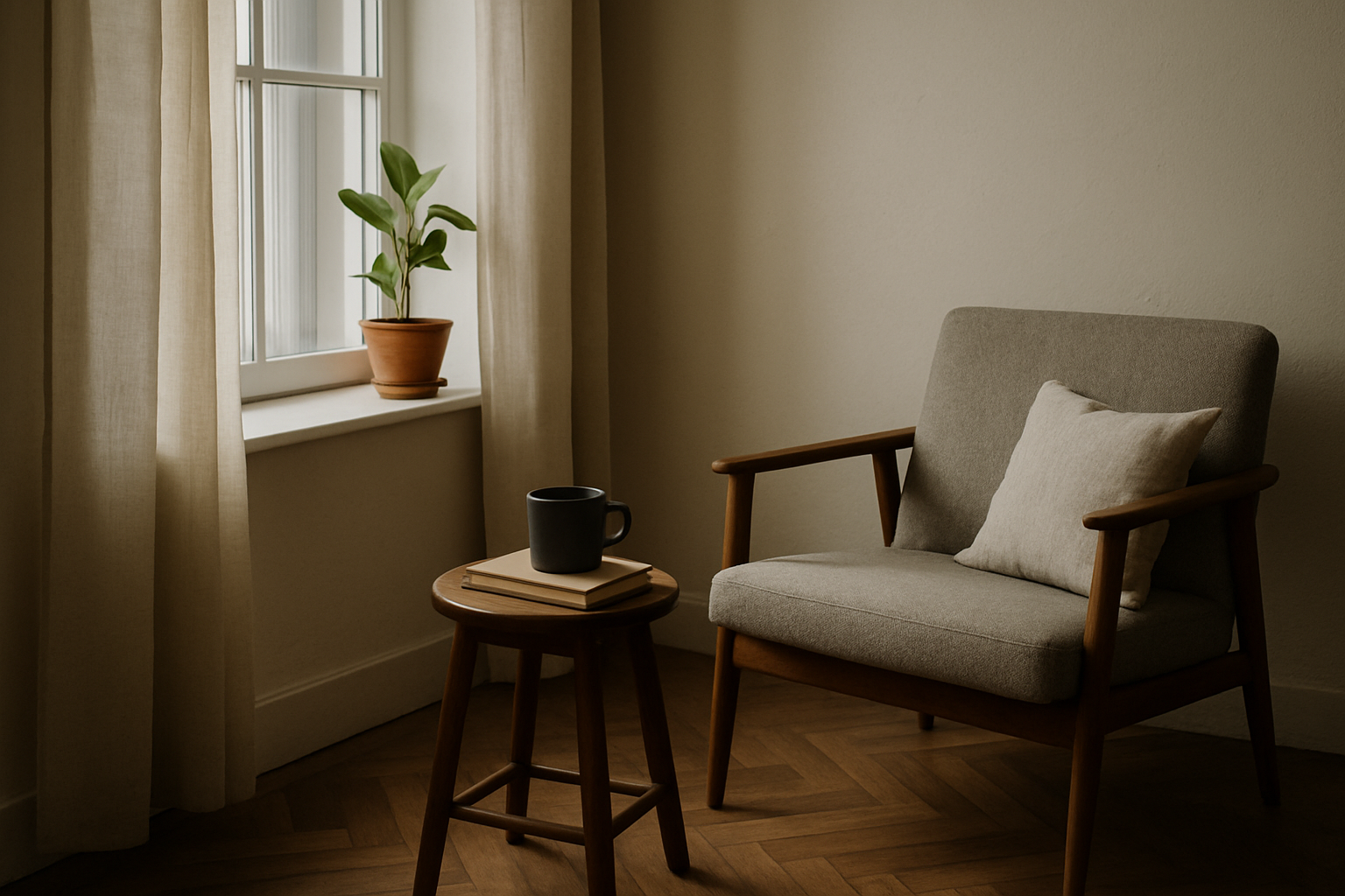
How to Use Lines and Shapes to Guide the Eye in Small Interiors
In interior photography, especially when working in small spaces, every visual element must be chosen with intention. Limited space demands smarter compositions, and one of the most powerful tools for this is the use of lines and shapes already present in the environment. When used effectively, lines and shapes guide the viewer’s eye, help build a harmonious image, and create a sense of depth even in tight rooms. In this article, you’ll learn how to identify and use these elements strategically to enhance your photos in spaces with limited size and natural light. The Importance of Visual Direction in Interior Photography The human eye naturally follows lines. When we look at an image, our brain seeks out patterns and directions. If you understand this behavior and intentionally apply visual lines and shapes, you can guide the viewer’s gaze exactly where you want it to go. This technique is especially useful in: With the right composition, you can highlight the essential, eliminate distractions, and transform an ordinary space into a clean, elegant, and impactful photograph. 1. Identify the Room’s Natural Lines Before positioning your camera, take a moment to observe the space closely, looking for natural lines. These might be found in: These lines are already part of the architecture and layout, and they can be used to create visual direction within the frame. Practical example: floorboards that lead toward a window naturally guide the eye to the light source — which is often the most compelling feature in low-light spaces. 2. Use Horizontal Lines to Convey Stability Horizontal lines communicate a sense of calm, balance, and stability. In interior photography, they’re useful for grounding your image and creating a strong visual base. You can align horizontal lines using: Pro tip: keep your camera level with the horizon (use a built-in level or a grid overlay) to ensure horizontal lines remain straight — crooked lines can create visual tension and imbalance. 3. Explore Vertical Lines to Emphasize Height In small rooms, a sense of verticality can visually expand the space. Vertical lines bring elegance and lead the viewer’s gaze upward, making the room feel taller. Great vertical elements to use: Best approach: position your camera so these lines appear parallel along the edges of the image, reinforcing structure and order. 4. Diagonal Lines Create Depth and Movement Diagonal lines are excellent for dynamic compositions. They break the monotony and introduce depth — even in narrow or confined areas. You’ll often find diagonals in: Creative tip: shoot from a room’s corner and let the diagonals formed by walls or furnishings guide the eye toward a focal point (like a chair or window with light). 5. Geometric Shapes Also Guide the Eye Beyond lines, geometric shapes present in the room can help create visual organization. Squares, rectangles, circles, and triangles in furniture or décor become visual anchors in the composition. Examples: Practical suggestion: frame your shot so shapes either repeat or contrast. This keeps the viewer’s eye engaged and introduces a visual rhythm to the image. 6. Create Composition with Converging Lines Converging lines are lines that meet at a vanishing point. They’re fantastic for adding depth and perspective, which is especially helpful in small interiors. Use: Technique: place yourself at a spot where two or more lines “point” to the object or space you want to emphasize. This guides the eye and instantly strengthens the composition. 7. Avoid Visual Chaos from Conflicting Lines A common mistake in photographing small spaces is allowing too many lines to compete in the frame. Misaligned lines or conflicting angles cause visual confusion. Example of what not to do: photographing a bookshelf from above while the floor appears crooked and the ceiling cuts diagonally through the image. How to avoid this: 8. Use Lines of Light and Shadow in Your Composition When natural light is limited, shadows themselves become compositional elements. Curtains, blinds, or window frames can cast linear shadows that direct the viewer’s gaze. Try this: shoot during times when light enters the room at an angle (morning or late afternoon), and use the resulting shadows to create directional lines that lead toward your focal point. This is particularly effective in minimalist spaces, where light becomes one of the few—but strongest—visual elements. 9. Reinforce Your Visual Style with Repetition of Shapes Repeating similar shapes within the same scene is a powerful way to create harmony and visual flow. Repetition builds rhythm and cohesion. Practical examples: This repetition helps the viewer navigate the photo smoothly, with a sense of balance and structure. 10. Combine Lines and Shapes with the Rule of Thirds If you’re already familiar with the rule of thirds, you can supercharge your compositions by combining it with lines and shapes. Position major lines along the rule of thirds grid and place key shapes at points of interest. Example setup: This combo creates a visually strong and intentional image, making your interior photography both technical and artistic. Guiding the Eye Is About Telling a Story Precisely Using lines and shapes to guide the viewer’s eye in small interiors goes far beyond aesthetics — it’s a way to visually narrate the essence of the space. You emphasize what matters, suggest visual paths, and eliminate distractions. Small spaces demand intelligent composition. It’s not just about documenting the room — it’s about composing with purpose, considering how each visual element influences perception. When you master lines and shapes, even the smallest room can become a bold, professional, and memorable photograph.
The Rule of Thirds Applied to Interiors with Limited Natural Light
The rule of thirds is one of the most well-known composition techniques in photography — and also one of the most effective. Simple to understand and powerful when used with intention, this rule can completely transform the way you photograph interior spaces, especially small ones with limited natural lighting. In this article, you’ll learn how to apply the rule of thirds smartly and creatively in interior settings with restricted natural light, increasing the visual impact of your photos, creating balance in composition, and making the most of the light you have available. What Is the Rule of Thirds? The rule of thirds consists of dividing the image into nine equal parts by drawing two vertical and two horizontal lines — creating a sort of imaginary grid over the photo. The four points where these lines intersect are called points of interest. The main idea is to place the most important elements of the scene near these points or along the lines, instead of centering everything. This small adjustment in placement brings more dynamism, visual balance, and a natural flow to the viewer’s gaze. Why the Rule of Thirds Works So Well in Low-Light Interiors Rooms with limited natural light require extra attention to: By applying the rule of thirds in these contexts, you make better use of the available light, avoid unnecessary centralization that flattens the image, and guide the viewer’s eye more fluidly. Additionally, using the rule of thirds in small and darker interiors helps balance visual elements (like windows, furniture, and décor), optimizing limited space without overwhelming the composition. 1. Position the Light Source Along One of the Thirds A powerful tip is to use one of the vertical lines of the rule of thirds grid to place the natural light source, such as a window or glass door. This allows light to enter the frame from the side, creating soft shadows and enhancing textures in walls and objects — ideal for adding depth and subtle detail. Practical example: if you’re photographing a living room with a side window, position the camera so that the window sits on the left or right third of the frame. This allows the light to gently fill the rest of the composition with balance. 2. Use the Points of Interest to Highlight Key Objects In a small space, less is more. That’s why it’s important to intentionally choose which elements to highlight in the image. Apply the rule of thirds by placing important objects — like a reading chair, plant, lamp, or artwork — on the intersection points of the grid. This helps the object stand out, adds visual harmony, and gives the viewer a clear focal point. Important: Avoid placing your main subject in the center unless the composition is perfectly symmetrical. An off-center placement — when done intentionally — adds movement and a more natural feel. 3. Align Horizontal Elements with the Grid for Better Balance Floor lines, wall divisions, or furniture height lines can be used as visual guides. Aligning them with the horizontal lines of the rule of thirds helps better organize space within the image. Tip: use the bottom horizontal line to align the top of a couch or sideboard. This creates room for the upper part of the photo to “breathe,” especially when soft daylight is entering from above. You can do the same with shelves, curtains, and wall art — aligning these with thirds results in a more aesthetically pleasing proportion. 4. Balance Light and Shadow Using the Grid When natural light is limited, managing contrast between light and shadow becomes even more important. The rule of thirds can help you balance these areas intentionally. For example: This split doesn’t have to be exact, but it prevents the photo from feeling heavy or unbalanced. It also helps you avoid overexposed areas that might appear if the brightest part of the scene is centered. 5. Apply the Rule in Close-Ups and Detail Shots The rule of thirds isn’t just for wide-angle shots of full rooms — it also works great for close-ups and smaller compositions. If you’re photographing a tabletop scene, a bookshelf, or a decorative corner, use the grid’s intersection points to arrange the key elements. Even simple setups can feel elegant and professional with this rule. Example: place a coffee mug on the lower left third, and a small plant on the upper right. This kind of placement creates a balanced and harmonious feel. 6. Avoid Forced Symmetry in Asymmetrical Spaces Trying to force symmetry in spaces where it doesn’t exist can result in awkward visuals. In interiors with side lighting or irregular layouts, this can also create unintentional imbalance between light and shadow. Using the rule of thirds allows for a more natural, flowing composition — especially useful in small rooms with a single light source or an uneven layout. Instead of trying to fake balance, use the rule to guide the eye to where the visual weight belongs. 7. Use the Rule as a Guide, Not a Limitation The rule of thirds is a guideline, not a rule set in stone. It should be used mindfully, not rigidly. There are moments when centering an object makes more sense — for example, when the composition is perfectly symmetrical or when you want to create dramatic tension. Tip: try both approaches. Take one photo using the rule of thirds and another using a centered composition. Compare the results. Over time, your eye will develop the ability to know when to follow the rule and when to break it. Tools to Apply the Rule of Thirds in Real Time Today, most cameras and smartphones offer an option to activate a grid overlay on the screen — showing the rule of thirds as you frame your shot. Tip: turn this grid on permanently. It helps train your eye, and with time, applying the rule becomes second nature. Even during post-processing, the rule of thirds can be applied during cropping. Editing tools like Lightroom, Photoshop, and
Framing Techniques to Visually Expand Small Spaces
Photographing small interiors may seem like a challenge at first, but with the right framing techniques, it’s possible to transform a compact room into an image that conveys spaciousness, lightness, and functionality. When used strategically, framing allows the photographer to guide the viewer’s eye, add depth to the scene, and highlight the best features of the space—even when it’s very limited. In this article, you’ll discover professional and creative framing techniques to visually expand small interiors using only what you already have: natural light, your camera (or smartphone), the room’s décor, and—of course—an attentive eye. What Is Framing and Why Does It Matter? Framing is how you define the boundaries of an image—what you include or leave out, and how you organize the elements within the rectangle of the photo. It’s a crucial tool to create a sense of space, depth, and visual balance. In small rooms, framing becomes even more important, because a poorly chosen frame can flatten, “compress,” or visually clutter the scene. When done well, framing transforms an ordinary space into an elegant composition that enhances both the décor and architectural design. 1. Use Leading Lines to Create Depth Leading lines are imaginary lines that guide the viewer’s eye toward a focal point in the image. They create the illusion of depth, even in short or narrow spaces. You can use: Practical tip: Position yourself so that these lines enter the image diagonally, leading from the sides toward the center or background. This makes the space appear deeper than it really is. 2. Diagonal Framing: The Small Space’s Best Friend The most common way to photograph a room is straight-on, centering the opposite wall. However, in small spaces, this can flatten the scene and remove dimensionality. Switching to diagonal framing allows you to capture at least two walls and often includes a natural light source. This creates more visual layers, increases the feeling of three-dimensionality, and provides a more engaging perspective of the room. Try this: Stand in one corner of the room and point your camera toward the opposite diagonal. Adjust your angle to include parts of the ceiling and floor, reinforcing the room’s visual volume. 3. Use Foreground Elements with Intention Many people avoid placing objects close to the lens, but intentionally using foreground elements is a powerful trick for creating depth. For example, photographing a plant near the camera and a couch in the background creates a layered scene that tricks the eye into perceiving a larger space. The key is ensuring the foreground element doesn’t block the rest of the scene but enhances it. Suggestion: Place an object in the bottom corner of the frame—such as a lamp, vase, or chair—to create this sense of depth. 4. Vertical Framing to Highlight Room Height Although horizontal framing is the most common in interior photography, vertical framing (portrait mode) can be a secret weapon to highlight ceiling height. Small rooms with high ceilings benefit greatly from vertical photos. This format allows you to show the base and top of the space while emphasizing features like tall curtains, shelving, light fixtures, or wall art. Bonus tip: Combine vertical framing with a low perspective—shoot from a lower angle upward. This enhances both the sense of height and depth. 5. Embrace Negative Space In a world where we often try to show “everything all the time,” negative space—the empty areas in a photo—can offer a valuable visual pause. By intentionally leaving parts of the image empty (like a plain wall or visible floor), you highlight the elements that are present, create elegance, and convey openness. It gives the image room to breathe and makes the space appear larger. Important: Use negative space thoughtfully. It shouldn’t feel like an accidental blank spot but rather an intentional part of your composition. 6. Avoid Unintentional Cropping at the Edges A common mistake in interior photos is accidentally cropping objects along the edges, which can create visual discomfort and a sense of imbalance. Avoid framing in a way that cuts furniture “in half” unless it’s a deliberate stylistic choice. Either include the full object or crop in a way that respects the visual logic of the scene. Practical rule: Before clicking, scan the edges of your frame. Look out for chair legs, half cushions, or decor items that seem like they’re “escaping” the photo. 7. Use Mirrors to Double the Space Mirrors are incredible elements for small space photography. When placed strategically, they reflect light and visually double the room, creating a sense of continuity and openness. You can use mirrors as part of the composition (photographing the reflection) or as a background tool (reflecting windows, for instance). Essential precautions: 8. Center Your Frame Only with Symmetry Centering the frame can work well, but only when there’s true symmetry in the scene—like two identical lamps, twin artwork, or a bed with matching nightstands. If the scene isn’t symmetrical, central framing often feels visually confusing. In such cases, it’s better to use the rule of thirds or a purposeful asymmetric composition. Tip: To convey calm and order, use symmetry. For a dynamic and modern feel, go for asymmetry. 9. Shoot in Series: Variations on One Corner One of the best ways to discover the ideal frame is to photograph the same corner or area from multiple angles. This helps you test what works best in terms of light, depth, and visual balance. Experiment by changing: Later, compare your images and evaluate which one best conveys the sense of spaciousness you’re after. 10. Use Light as Part of the Frame Natural light doesn’t just illuminate—it should be part of the composition. Framing in a way that includes light from the side or background can soften the image and visually expand the scene. Take advantage of times when the light enters the room in a diffused way (early morning or late afternoon) and position yourself so that it creates gentle shadows, textures, and highlights. Avoid: Shooting directly against bright windows without control—this can result
How to Find the Perfect Angle in Small, Low-Light Rooms
Photographing small and dimly lit interiors is a true art. In these situations, finding the ideal angle makes all the difference in revealing the best of the space, conveying a sense of comfort, depth, and enhancing key elements. But how do you find the perfect angle when space is limited and natural lighting is scarce? In this article, you’ll learn practical and smart techniques to discover the best photographic angle in small, dark interiors—using natural light, architectural features, and room elements to your advantage. The goal is to make your photography speak for itself, conveying a sense of spaciousness, coziness, and style—even in the most challenging environments. What Makes an Angle “Perfect”? First, it’s important to understand that there’s no one-size-fits-all perfect angle—but rather the best angle for each situation. The ideal angle is one that: In small, low-light rooms, achieving this balance takes a trained eye, experimentation, and technical knowledge. Let’s explore the most effective ways to achieve it. 1. Observe the Source of Natural Light Even in dark environments, there’s usually some source of natural light—a window, glass door, or skylight. The first step is to observe where the light comes from, the direction it hits, and how it interacts with objects in the room. Practical tip: Position yourself in different parts of the room throughout the day and observe how the light behaves. Often, the perfect angle depends on the time of day. Side light is often ideal for showing texture and depth. Front light can soften shadows, while backlighting (light coming from behind the subject) can create a dramatic effect—if properly controlled. And remember: the smaller the natural light source, the more strategic your camera positioning needs to be. Test several variations until you find the perfect light-shadow balance that flatters the room. 2. Start by Shooting from the Corners In small spaces, a technique that almost always works is starting from the corners. Corners offer a wider perspective and help create leading lines that guide the viewer’s eye into the scene. Shooting from a corner allows you to capture two walls in one frame, which increases the sense of depth and dimension—even in narrow rooms. It’s also a great way to incorporate side window lighting into the composition. Positioning tip: Stand with your back nearly against the corner and tilt the camera slightly downward if you want to emphasize the perspective. Diagonal angles also add visual interest and break from the typical straight-on shots. 3. Try Different Camera Heights Most people shoot from eye level, but in small interiors that may not be the most flattering option. Experimenting with different camera heights can reveal more interesting and functional angles for your composition. Low angles: Positioning the camera close to the floor (around 40–60 cm) can increase the sense of height and depth. This works well to show ceilings, light fixtures, and floor textures. Mid-level angles: Focusing at the height of furniture (like a table or the back of a sofa) can create a balanced scene and highlight decor elements. High angles: Placing the camera at a higher position (1.80 m or more) helps capture the room from top to bottom. It’s great for symmetrical layouts or when plants and overhead elements are part of the decor. Pro tip: Use an adjustable tripod or safely place your camera on furniture to try unconventional angles. A shift of just 20 cm can completely change the photo’s impact. 4. Use Architectural Features to Your Advantage Even the smallest room may have architectural details that help guide the eye and naturally frame the composition. Doors, windows, beams, floors, moldings, and columns are worth close attention. These elements help “shape” your framing, serving as internal borders or visual dividers. Aligning your camera with these features creates harmony and reinforces the space’s structure. Practical example: Aligning a straight wall with the base of your photo creates balance. Using a ceiling beam as a diagonal line can lead the eye toward the light source and create visual interest. 5. Intentionally Include a Focal Point Every good angle needs a visual point of interest, which could be an object, texture, plant, armchair, or even the light entering the room. When composing, think about where you want the viewer’s eye to land first. This focal point should be placed deliberately, ideally using the rule of thirds or leading lines. Important: Avoid including distracting elements that steal focus or create visual noise. In small spaces, every centimeter of the frame matters. Use contrast in color or texture to enhance your focal point. A dark vase on a light surface, for example, naturally attracts the eye and “anchors” the composition. 6. Check the Background and Edges Many times, the ideal angle is ruined by distractions in the background or image edges. In small spaces, it’s common for unwanted items—like cables, plugs, or clutter—to sneak into the frame. Before you click: carefully scan what appears behind your main subject and along the borders of the image. Shifting your camera just a few centimeters can remove visual distractions and significantly improve the final result. Another key tip is to maintain horizontal and vertical alignment. Use your camera’s level tool to avoid crooked lines—especially important when photographing walls, furniture, and windows. 7. Experiment, Adjust, and Repeat No matter how well you know the space, light, or composition techniques, practice is irreplaceable. The perfect angle is often not discovered right away—it’s built over time, through trial, error, and observation. Take multiple shots of the same scene with slight changes in height, angle, and distance. Compare the results, see what works best, and take note of what you learn. Consider keeping a visual journal where you save different versions of the same shot along with notes about light, perspective, and what you observed. Over time, you’ll build a creative toolbox that speeds up decision-making and improves consistency. The Perfect Angle Is One That Transforms Finding the perfect angle in small, dark rooms isn’t just a technical decision—it’s a creative, sensitive,
7 Composition Tricks to Enhance Small, Low-Light Spaces
Photographing small and dark interiors can be a daunting challenge, even for experienced interior photographers. The lack of space limits movement and framing options, while low light compromises sharpness and image balance. The good news is that with a few smart composition strategies and creative use of the available natural light, it’s possible to turn these obstacles into strengths and create powerful, personality-filled images. Below, you’ll discover 7 practical composition tricks that help highlight compact, dimly lit spaces—revealing their aesthetic and functional potential through photography. 1. Use Lines to Guide the Viewer’s Eye Lines are one of the most powerful tools in photographic composition. In small spaces, they help guide the viewer’s eye and create a sense of depth—even in tight environments. Observe the lines formed by floors, shelves, windows, doors, or even picture frames. Aligning these elements with the image’s frame (such as diagonals) allows you to explore the room’s geometry and add visual interest. Practical tip: Position yourself in a corner of the room to take advantage of converging lines formed by the floor and walls. This creates an illusion of spaciousness and leads the viewer’s eye to a specific focal point. These lines act as visual paths, directing the viewer exactly where you want them to look. Horizontal lines convey calm and stability, vertical lines emphasize height and elegance, and diagonal lines introduce movement and depth. 2. Frame with Smart Proportions Small interiors require strategic framing. A strong composition avoids showing everything at once. Instead, it focuses on what’s essential to convey the room’s atmosphere and function. Choose partial framings that highlight meaningful elements: a chair illuminated beside a window, a cozy reading nook, or a well-organized countertop with thoughtful objects. Golden rule: Use the rule of thirds to place key elements off-center. This creates natural visual balance and makes it easier to include light sources in the frame. Another approach is to work with partial symmetry, where both sides of the image are balanced but not identical. This technique helps organize visual information, especially in rooms filled with objects. 3. Embrace Simplicity and Organization Overloaded visuals make small spaces appear even more cramped and darker. That’s why your composition should favor simplicity: fewer objects, more visual space. Before shooting, reorganize the space. Remove unnecessary items, align objects, and stick to a cohesive color and decor palette. A clean, well-arranged setting significantly improves the overall composition. Remember: negative space is part of the composition too. When used strategically, it gives the image room to breathe and draws more attention to the focal points. Avoid visual clutter. A scene with a few well-placed elements is often far more effective than one overloaded with details. Especially in low-light environments, simplicity also reduces harsh shadows or unwanted darkness. 4. Use Natural Light at the Right Time of Day Composing in low-light interiors comes alive with strategic use of natural light. Even when limited, natural light can be sufficient if directed well. Shoot during times with softer light—early morning or late afternoon. During these hours, the light is more diffused and creates gentle shadows that add texture and dimension. Smart positioning: Frame your shots so that the light source (like a window) is lateral or diagonal to the camera. This adds contrast and reveals surface details that flat or backlight would otherwise lose. Use sheer curtains to soften direct light or bounce it off white walls for a more even glow. Avoid using harsh artificial lights during shooting—they can clash with natural light and disrupt the visual harmony. 5. Use Mirrors as a Compositional Tool Mirrors are powerful allies in interior photography. In addition to reflecting natural light, they visually expand the space and enable creative compositions. Place mirrors strategically to reflect windows, light sources, or key decor elements—creating scenes within scenes. Be mindful of unwanted reflections: Don’t let yourself appear in the image, and avoid reflecting objects that don’t add value to the composition. When used well, mirrors enhance depth and interest. They also help brighten shadowed areas by redirecting natural light. Mirrors with stylish frames can serve as decorative accents that reinforce the room’s overall visual identity. 6. Play with Low-Angle Perspectives Shooting from lower angles is an effective technique to visually enlarge tight spaces. By positioning the camera close to the floor, you completely shift the perspective and draw attention to vertical features. This technique also allows you to include more of the ceiling and upper parts of the room, enhancing the sense of height and spaciousness. Try this: Use a low tripod or rest your camera on a stable surface. Experiment until you find the ideal angle that highlights the space’s design and structure. Low angles can also create a cinematic feel, bringing the viewer closer to the scene. It’s especially useful when emphasizing floor textures, rugs, or low-profile furniture. 7. Focus on Storytelling Details Sometimes, a single well-composed detail tells a stronger story than a wide shot of the entire room. Focusing on textures, personal items, filtered light, or projected shadows can be far more expressive. These details add emotion, intimacy, and aesthetics to the photo—especially in small interiors, where every corner can hold meaning. Practical suggestion: Get closer to an interesting object (like a plant in soft side lighting, a pillow on an armchair, or an open book), and explore different framings to capture its essence using the natural light available. Highlight materials like wood, fabric, and ceramics—and observe how they interact with light. This approach creates sensory, atmospheric images. Turning Limitations into Creative Potential Photographing small, low-light interiors is not a limitation—it’s an opportunity to sharpen your creativity, technical eye, and aesthetic sensitivity. With these seven composition tricks, you’ll be able to transform challenges into visual strengths and produce high-quality images, even in the most restricted settings. The key is understanding your space, working with the available light, and using composition techniques to emphasize what truly matters. Instead of trying to show everything, shoot with intention. And instead of compensating for limited space