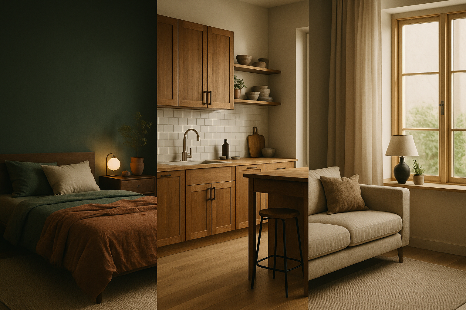
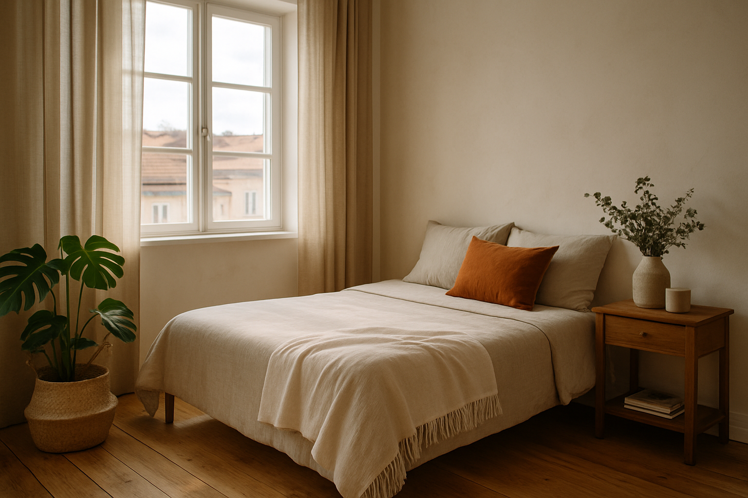
Interior decoration is one of the most important elements in how we perceive, live in, and visually document a space. Especially in small environments, every decision—from the color palette to the number of decorative objects—directly impacts functionality, aesthetics, and the sense of spaciousness. Two very popular styles stand out for their opposite approaches: minimalism and the maximalist style. But after all, which one works best in compact spaces? In this article, we’ll explore both styles, their advantages, disadvantages, and how they behave visually and photographically in small environments. What Is the Minimalist Style? Minimalism is characterized by the famous saying “less is more.” It prioritizes: Visually, the minimalist style promotes visual cleanliness, organization, and calm. It eliminates excess and gives prominence to subtle details. Furniture with straight lines, soft colors, and clutter-free surfaces create environments that convey serenity and focus. Advantages of the Minimalist Style in Small Spaces 1. Sense of Spaciousness Reducing furniture and decorative objects helps visually enlarge the space. Small environments seem larger when free of visual obstructions. The freer the space, the more the eye can move smoothly through the room. 2. More Light Light palettes reflect natural and artificial light better, enhancing the lighting in small environments. Using mirrors and soft reflective surfaces also boosts this quality. 3. Easy Maintenance Fewer objects = less clutter and more practicality to clean and organize. Additionally, with fewer elements, it’s easier to maintain an efficient cleaning routine. 4. Highlight Key Elements In a space with few elements, a single piece of art, a designer piece of furniture, or an interesting lamp stands out. This values quality items and focuses attention on the essential. Disadvantages of the Minimalist Style 1. Risk of Coldness If poorly executed, minimalism can result in cold, impersonal, and unwelcoming environments. Too minimalist spaces can feel clinical or lifeless. 2. Limited Personal Expression For those who enjoy showcasing personality, history, and memories in their space, minimalism can seem limiting. Photos, travel mementos, and sentimental objects often don’t have room in this style. What Is the Maximalist Style? Maximalism is the opposite of minimalism. It embraces: This style celebrates individuality, aesthetic accumulation, and the mixture of influences. It’s common to see elements from different cultures, periods, and styles harmoniously coexisting. Advantages of the Maximalist Style in Small Spaces 1. Personality in Full Display The space becomes a pure expression of the resident’s personality. Every detail tells a story, creating a strong identity for the room. 2. Cozy Atmosphere The mix of textures, colors, and objects creates a “nest-like” feeling, which can be very inviting. Cushions, throws, paintings, and personal items compose a warm setting. 3. Opportunity to Create Focal Points With more visual information, it’s possible to create striking focal points that draw the eye and highlight specific areas. It could be a colorful bookshelf, a gallery wall, or a patterned rug. 4. Ideal for Art and Collection Lovers For those who have collections, books, artworks, and keepsakes, the maximalist style allows them to be displayed without restrictions. These elements become an active part of the decoration and visual narrative. Disadvantages of the Maximalist Style 1. Feeling of Tightness Already small spaces can feel even smaller when filled with objects and dark colors. Circulation can be impaired, and the space may appear visually overloaded. 2. Visual Pollution Too much information can tire the eyes and make it harder to relax. It can also make organizing and cleaning more difficult. 3. Requires Harmony and Balance Without planning, the room risks becoming disorganized or visually chaotic. Combining many elements requires aesthetic sensitivity and attention to composition. Which Style Works Best for Small Spaces? The answer is: it depends on your goal and how the style is applied. Rather than choosing a “better style,” the key is to align the style with your routine, personal tastes, and relationship with the space. Key Points for Each Style Tips for Well-Executed Minimalism: Tips for a Balanced Maximalist Style: The Photographer’s Eye in Each Style Minimalism in Photography: Maximalism in Photography: Successful Examples 1. Minimalist Studio A 35m² apartment in São Paulo with a palette of white, light wood, and black. Few well-placed furniture pieces, plants, and monochrome frames create a functional and elegant space. Natural light and sliding doors optimize the room. 2. Maximalist Studio Apartment A 28m² studio in Rio de Janeiro, decorated with patterned fabrics, colorful walls, bookshelves, and art pieces. An organized chaos that reflects the artist-resident’s soul. Every corner has a visual point of interest and tells a different story. Hybrid Alternatives: The “Warm Minimalism” Style You don’t always have to pick just one side. Many current projects adopt an intermediate approach: This combination balances the benefits of both styles and adapts well to small spaces. It creates a cozy, organized, and personality-filled home feel. How to Choose the Ideal Style Ask yourself questions like: The answers will guide your choice more assertively. Remember, the style should serve your life, not the other way around. Final Considerations Small spaces don’t need to be limiting, but rather an invitation to creativity. Both minimalism and the maximalist style have the potential to transform compact environments into places full of personality, comfort, and beauty. The secret is knowing each approach well, its visual effects, and its relationship with functionality. In interior photography, both offer richness: minimalism for refinement and light, maximalism for visual explosion and implied narratives. Choose consciously, execute with care, and your small space will be grand in style.
How to Define a Visual Palette for Dark Interior Projects
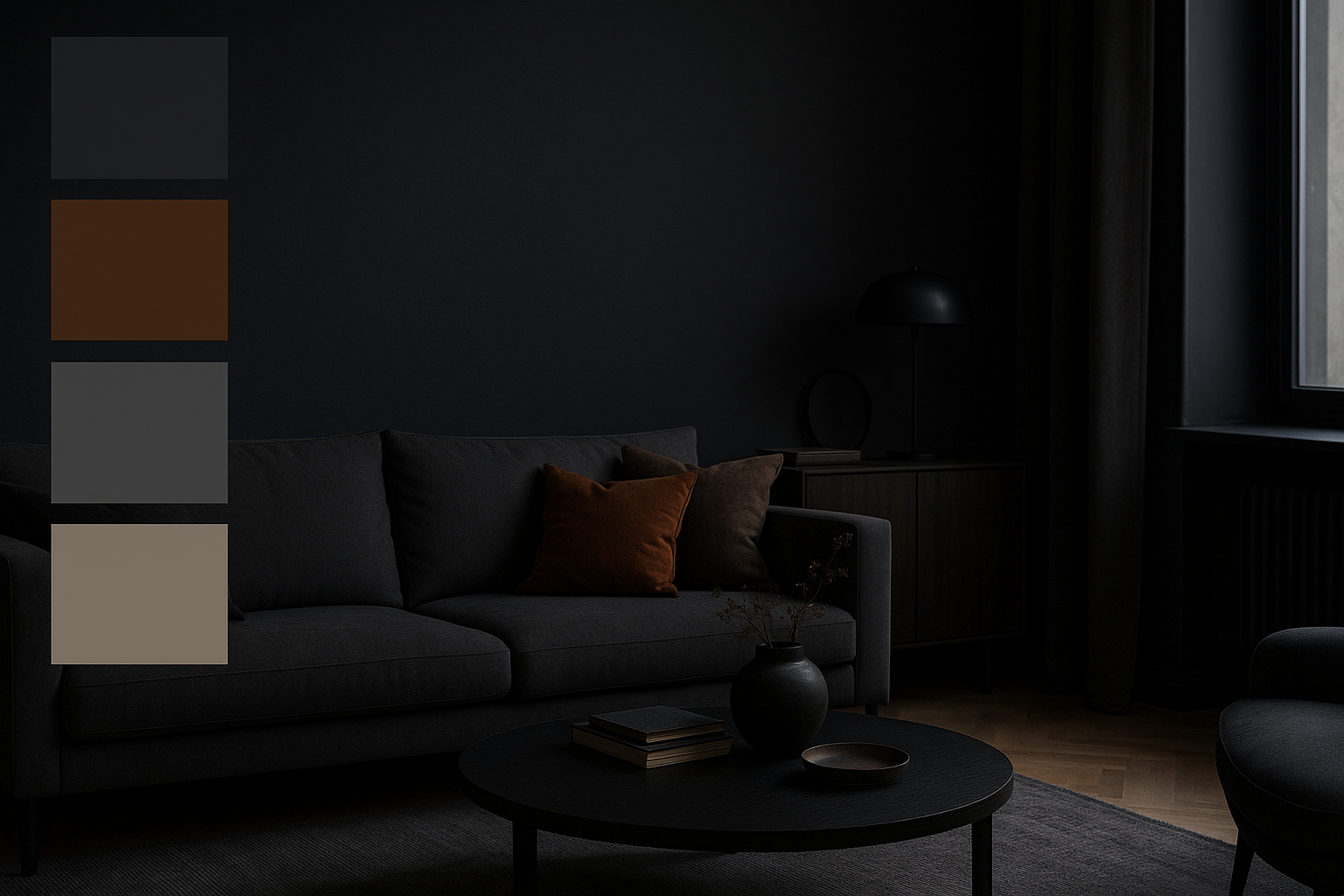
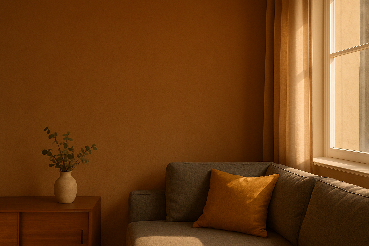
Interior design projects that use dark environments as a base offer a noble opportunity to create sophisticated, cozy, and dramatic atmospheres. However, when working with low-light aesthetics, it is essential to have a well-structured visual palette to prevent the space from appearing monotonous, heavy, or lifeless. This detailed guide will help you, whether you’re a professional or an enthusiast of photography and design, understand how to define a coherent and effective visual palette for dark interior projects. Why Is the Visual Palette So Important in Dark Environments? The visual palette is the set of colors, textures, and materials that give identity to a visual project. In dark environments, it plays an even more crucial role due to the following factors: Furthermore, for those working with photography, these environments require even more attention to visual planning, as the way colors are captured by the lens can drastically change the final perception. Step 1: Understand the Purpose of the Space Before defining any color, it is essential to understand the functional and emotional objective of the space. Ask yourself: For example, a dark home office can convey focus and professionalism, while a dark living room can offer comfort and elegance. These elements define not only the color palette but also the choice of furniture, textures, and lighting. Step 2: Choose the Dark Base Color The base color will be the foundation of the project. It is applied to major surfaces, such as walls, large furniture, or rugs. Some popular options include: Beyond the color choice itself, consider the finish (matte, satin, textured) as this directly influences the absorption of light and the tactile sensation of the space. Step 3: Create Contrast with Supporting Colors A well-structured dark palette needs supporting colors to avoid monotony. These colors complement the base and appear in smaller details, such as cushions, decorative objects, or wall art. Examples of good combinations: Use the 60-30-10 rule: Supporting colors help guide the eye, highlight focal points, and make the space more welcoming. Step 4: The Importance of Textures In dark environments, texture variety is essential to create visual depth. Similar colors can look flat if applied to homogeneous surfaces. Recommended textures include: The tactile diversity creates a rich atmosphere, where lighting can interact dynamically with surfaces, revealing different nuances throughout the day. Step 5: Lighting and How It Affects the Palette No visual palette survives a poorly planned lighting project, especially in dark environments. Here are the key points: The same navy blue tone can look cold and dull under cool white light or deep and sophisticated under warm, indirect light. Additionally, choosing light fixtures with harmonious design reinforces the space’s aesthetic cohesion. Step 6: Visual Palette for Photography of Dark Interiors For those working with interior photography, choosing a suitable palette also improves the photo results: Also, think of the composition as a photographic frame: the dark background can enhance lighter objects, creating a visual interplay that adds artistic value to the image. Step 7: Inspiring Chromatic References Getting inspiration from professional palettes helps develop your eye. Some classic references for dark environments include: Create visual boards with these references and analyze how professionals balance colors, lights, and materials. This serves as an excellent starting point for authorial projects. Step 8: Test on a Small Scale Before committing to a large-scale palette, test: These tests help prevent regrets and expensive adjustments later. You can check how the color behaves under natural, artificial light, and in photographs. Step 9: Visual Composition with Artistic Elements Incorporating artworks, paintings, sculptures, or authorial photography also helps enrich the palette. Art should not just fill empty spaces but integrate with the aesthetic narrative of the environment. Step 10: Visual Palette Coherent with the Entire Residence Even if only one room is dark, it is important that it connects with the other spaces in the house. Maintain common elements: This coherence helps create a visual flow between rooms and reinforces the sense of unity and sophistication throughout the home. Extra Tip: Digital Tools to Simulate Palettes Today, there are several digital tools that allow you to test palettes before applying them in the real environment: Using these tools can save time and reduce errors, in addition to facilitating communication with clients or project partners. Finishing with Elegance Defining a visual palette for dark environments requires sensitivity, planning, and experimentation. It’s a creative journey that can transform ordinary spaces into true cinematic scenarios. When well applied, the combination of colors, lights, and textures results in environments full of identity and personality. If you’re a photography professional, chromatic harmony not only enhances the on-site experience but also elevates the quality of the images captured. Be bold, explore, and refine your creative eye to craft environments that are memorable both in person and in photographs.
Visual Identity in Practice: Before and After of 3 Real Photo Shoots
Building a solid visual identity is a critical goal for photographers who want to be recognized for their unique style. In the world of interior photography—where each environment brings different challenges with light, composition, and décor—maintaining a consistent aesthetic is what transforms common work into an unmistakable visual brand. In this article, we’ll apply that concept in practice. You’ll see how visual identity is expressed through three real shoots (hypothetical but based on typical scenarios) showing “before and after” editing. The aim is to show how, even in different environments, you can maintain a consistent photographic language without losing the authenticity of each space. What Is Visual Identity in Photography? Visual identity is the set of aesthetic choices that make a photographer’s work recognizable and authorial. It can be perceived through: Building this identity requires consistency and intent. More than following trends, it relies on authenticity and technical mastery. Before and After: The Importance of Visual Coherence Editing isn’t just correction—it’s a refinement of your photographic vision. The “before” shows what was captured with technique and sensitivity; the “after” reveals how your visual identity manifests through editing, composition, and narrative. In the next three shoots, you’ll see how visual identity can be maintained with small adjustments that make a big difference. Shoot 1: Scandinavian Apartment with Diffuse Light Context:A light space with white walls, light wooden furniture, and minimalist décor. Natural light softly enters through sheer drapes. Before: After Editing: Result:The final image carries the photographer’s aesthetic—minimalist, natural, and welcoming. The style is discrete but consistent, with emphasis on soft light and color harmony. Shoot 2: Industrial Loft with Directional Lighting Context:An urban environment with concrete walls, exposed plumbing, and dark décor. Natural light enters laterally through large windows. Before: After Editing: Result:The edited image conveys strength, drama, and personality. Although the setting differs from the first, the photographer’s style remains clear—strong contrast, controlled palette, and visible visual storytelling. Shoot 3: Country House with Variable Natural Light Context:A living room with rustic décor, small windows, and natural lighting that changes with the day. Decorative objects with texture: baskets, ceramics, textiles. Before: After Editing: Result:The final image carries the visual signature of someone who values natural light, textures, and a cozy atmosphere. It looks organic and thoughtfully composed. What Do These Shoots Have in Common? Despite distinct styles of environment (minimalist, industrial, rustic), there is a unifying thread that reveals the photographer’s identity: This shows that visual identity does not depend on the environment—it depends on conscious choices made throughout the photographic process. Applying This to Your Work 1. Conduct before‑and‑after analyses of your own shoots Compare photos pre‑ and post‑editing and observe what you are maintaining as standard—and what is varying too much. 2. Build a portfolio with consistency Choose images that, together, speak the same “visual language”. Even if the subject varies, the language must be recognizable. 3. Edit based on your vision—not trends Avoid applying editing styles that don’t align with what you want to convey. Great auteur work is timeless. 4. Develop presets based on you Create your own presets and variants for different lighting conditions and spaces—but from the same aesthetic foundation. 5. Train your eye for light and color Observe how light changes during the day and how it affects objects and spaces. The more you master light, the more unified your aesthetic will be. Bonus Tip: Share Behind the Scenes Showing the “before and after” of your shoots can be a powerful way to: Use social media, stories or blog posts to share this content and strengthen your brand. Conclusion: Before and After as Authenticity Tool The “before and after” approach goes far beyond showing editing skill. It’s an identity exercise, where every adjustment reaffirms who you are as a photographer. This is not about “beautifying” images—it’s about revealing the unique viewpoint behind the camera. Visual identity is built slowly, through consistency and intent. Each shot, each edit, each aesthetic decision shapes your language. The more you work consciously, the clearer your style becomes—to both yourself and your audience. So, use your own shoots as your laboratory. Observe, compare, refine. And always remember: the true “after” of a photograph begins when it aligns with your vision as an artist.
How to Edit Photos While Staying True to Your Photographic Style
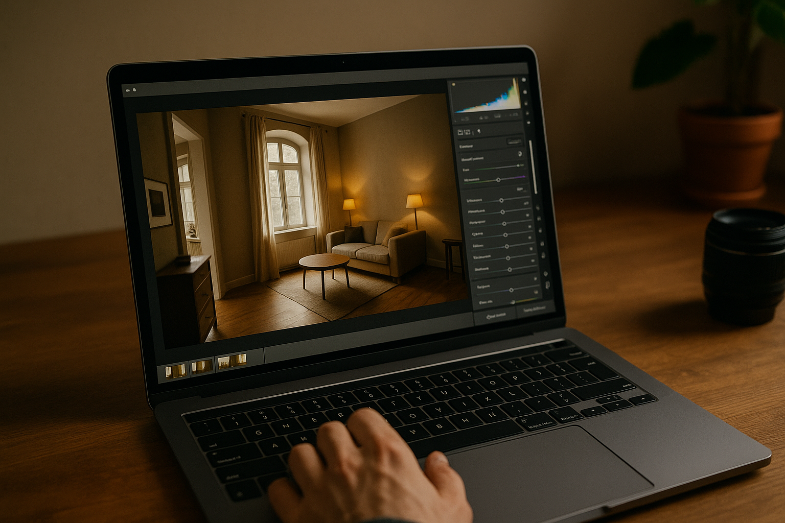
Developing your own photographic style is one of the greatest achievements for any photographer. However, capturing images with a consistent aesthetic means little if the editing process doesn’t uphold this standard. Post‑production is where your visual identity is cemented or lost — and knowing how to edit while staying true to your style is essential for conveying coherence, professionalism, and personality in your portfolio. In this article, you’ll learn how editing influences the consolidation of your style, which elements you should monitor to keep your aesthetic intact, how to create efficient workflows, and most importantly, how to edit without getting lost in trends and filters that do not represent you as a photographer. Why Editing Is an Essential Part of Your Style Photo editing is far more than technical adjustment. It’s a creative step, where you reaffirm the visual choices made at capture time: light, color, composition, atmosphere. That is why editing intentionally is just as important as composing a strong image. Here’s what editing can define: If you want to build a recognizable visual signature, you must treat editing as part of the creative process — not just a correction after the fact. First Steps: Define Your Photographic Style Before opening any editing software, ask yourself: Answering these questions helps you understand which visual language you want to maintain through editing. From there, it becomes easier to make technical and creative edits with purpose. Choose a Consistent Color Palette Color is one of the most immediately noticed elements in an image. A coherent color palette creates visual unity, even when you shoot different subjects and locations. Tips to maintain your palette: A strong palette creates a powerful signature — and helps your audience recognize your work at a glance. Create Your Own Presets (or Editing Profiles) Using custom presets is one of the best ways to ensure consistency, save time, and reinforce your style. How to create them: You might develop variations of your presets for different lighting conditions (e.g., “Soft Natural Light”, “Backlight Interior”, “Low‑Light Mood”). Avoid over‑reliance on presets purchased from others unless you fully customize them — they can dilute your visual identity. Control Exposure, Contrast and Shadows These three elements radically transform an image’s aesthetic. The key is to keep consistency across your images. Sudden shifts in these values from one image to the next can break visual identity. Sharpness and Texture: Be Consistent How you handle sharpness and texture contributes significantly to your style. Whichever style you adopt, apply it consistently across a series of images. Avoid Overused Filters and Excessive Saturation A frequent mistake is attempting to “fix” an image with heavy filters or extreme saturation — which can in fact mask your true visual identity. Use Tone Curves with Personality Tone curves are a powerful tool to shape an image’s mood. Choose a curve that supports your style rather than overwriting it. Test, save variations, and apply. Local Editing: Micro Adjustments with Macro Impact Beyond global edits, local adjustments allow you to reinforce your visual intention: These should be subtle — but if well applied, they reinforce your visual intent and keep the aesthetics aligned. Post‑Production Is Not Transformation — It’s Refinement Maintaining your style means thinking of editing not as changing the image, but as revealing what is already there. Good editing respects the scene you captured, enhances the authentic, and removes distraction. Avoid using editing as a crutch for poorly composed or exposed images. The better you build your shot in camera, the simpler the edit — and the more genuine the result. How to Know If You’re Staying True to Your Style Ask yourself: ✅ Does this edit represent my style or am I just chasing a trend?✅ Could this photo be part of my portfolio?✅ Would someone recognize my work based solely on this image?✅ Do all photos in this project visually relate to one another?✅ Am I editing with intention or on autopilot? If you answer “yes” to most of these, you’re on the right path. Bonus Tip: Create a Mood Board of Your Style Assemble a board of 15–20 images that illustrate your ideal style. They can be your own work or references you admire. Keep this board visible during editing. It acts as a guide to preserve coherence, avoid excess, and remember what belongs — and what doesn’t — in your aesthetic. Conclusion: Your Editing Is Your Signature Staying true to your style in editing is one of the greatest challenges — and greatest powers — of auteur photography. It’s not about repeating formulas but creating a visual standard that expresses who you are, what you feel, and how you see the world. Your style may evolve, but at each phase, it must be intentional, consistent, and authentic. When in doubt, less is more. The best filter is the one that reveals the essence of your photograph — not hides it.
The Role of Natural Light in Developing a Visual Signature
In the world of interior photography, the search for a unique visual signature is what sets an ordinary photographer apart from a recognized professional. Among the many elements that shape this style, natural light plays a central role — not just as a source of illumination, but as a tool for identity. In this article, we’ll explore how natural light can be used to develop a strong personal aesthetic, how it influences composition, color, storytelling, and the emotional perception of your images. We’ll also share practical tips to master its use and make it a defining part of your visual style. Why Is Natural Light So Important? Natural light is one of photography’s most valuable — and most challenging — resources. It is: For interior photographers, working with natural light allows you to highlight the architecture, materials, and real colors of the space, while creating a visual language that audiences perceive as authentic and human. Visual Signature: What It Is and Why You Need One A visual signature is a set of consistent aesthetic choices that make your work recognizable. When someone sees one of your images and thinks, “this photo looks like so-and-so’s,” you’ve achieved it. Elements that shape a visual signature: Light is undoubtedly one of the first things viewers perceive in a photo. When you master and use it consistently, it becomes a hallmark of your visual identity. How Natural Light Shapes Image Aesthetics 1. Direction and Angle The sun’s position — or the direction of the natural light — drastically affects how the space appears. 2. Intensity Strong midday sunlight is completely different from the gentle glow of morning or late afternoon. 3. Color Temperature Light changes color throughout the day, directly impacting your photo’s color palette: Using one or more of these consistently can help define an aesthetic that viewers begin to recognize as yours. How to Develop Your Signature with Natural Light 1. Choose a Favorite Time of Day Photographing consistently at the same time of day helps shape a clear lighting identity. If you always shoot during golden hour, your photos will have a recognizable mood. 2. Test Different Light Types in the Same Room Photograph the same room at different times to see how light changes the mood. This helps you discover which style resonates with you most. 3. Observe and Map Natural Light Patterns Pay attention to the patterns of light in your most photographed spaces. Where does the light enter? At what time? What shadows appear? This awareness is crucial for consistent compositions. 4. Design Scenes to Maximize Light Natural Light as a Storytelling Tool Beyond aesthetics, natural light also serves as a narrative device. It influences emotions and can change how a viewer interprets an image. Visual Storytelling Examples Using Light: When you’re clear about the mood you want to convey, your light choices become a powerful way to tell stories with consistency. How to Maintain Consistency Across Different Spaces If you photograph different locations but want to maintain a cohesive visual signature, natural light can be your common thread. 1. Apply the Same Light Principles Across Rooms Even if the decor changes, using the same direction, intensity, and temperature of light makes your images feel visually connected. 2. Create a Natural Light-Based Editing Preset Editing is part of your visual signature. Subtle adjustments to white balance, highlights, and tone curves can reinforce your natural light style. 3. Use Similar Camera Settings Low ISO, mid-range aperture, controlled exposure time — consistent settings help avoid sudden changes in image quality and preserve aesthetic unity. Photographers Who Use Natural Light as Their Signature Derek Swalwell Architecture and interior photographer known for using strong natural light and contrast to emphasize form. Anna Malmberg Soft, vintage-inspired style with diffused light and warm tones — her images evoke serenity and nostalgia. Rory Gardiner Focused on light and shadow as sculptural elements, using natural light to highlight architecture with elegance. Alice Gao Uses natural light as an emotional and aesthetic tool, maintaining consistent softness and color tones across varied interiors. Studying these photographers shows how natural light can become your personal trademark. Practical Techniques to Control Natural Light Advantages of a Natural Light-Based Signature Checklist: Are You Developing a Natural Light Signature? ✅ Do you mostly shoot with natural light?✅ Do you know which time of day gives you the desired mood?✅ Do you consistently use the same light direction and quality?✅ Do you study how light behaves in your shooting environments?✅ Do you edit in a way that enhances this light?✅ Do people recognize your work by the lighting style? If you answered yes to most of these, congratulations — your visual signature is taking shape, and natural light is your ally in that process. Final Thoughts: Your Light, Your Style More than just illumination, natural light defines the soul of your photography. When used with intention, it becomes your voice, your brand, your artistic identity. You can photograph various themes, spaces, or styles — but if your approach to light remains consistent, your work will always be recognizable and authentic. Developing a visual signature is a lifelong journey. And along that path, natural light is more than just a tool — it’s the starting point of your creative expression.
Create a Cohesive Aesthetic Even When Photographing Different Rooms
Maintaining a cohesive aesthetic while photographing different rooms can seem like a challenge — especially when each space has its own purpose, lighting, and decor. However, for professional photographers and content creators looking to build a strong visual identity, consistency is key. In this article, you’ll understand why visual cohesion matters in interior photography, how to achieve it even in contrasting spaces, and which visual elements can connect your shots — even when the rooms are entirely different from one another. Why Does Visual Cohesion Matter? A consistent aesthetic makes your photos feel like part of a whole, even when they show very different locations. This results in: Different rooms don’t need completely different styles — you can build a connected photo narrative using consistent choices in lighting, color, composition, and editing. 1. Define Your Photographic Identity Before considering how to photograph the rooms, it’s important to clarify who you are as a photographer. Your visual identity will be the thread that ties all images together. Ask yourself: Once you define your style, it starts to guide all your photographic decisions — from lens selection to post-production. 2. Choose a Base Color Palette Color is one of the most noticeable elements in photography. Using a consistent color palette helps you visually connect separate spaces. Tips for Application: You can absolutely photograph different styles — but if the core colors complement each other, your aesthetic will remain cohesive. 3. Lighting: The Great Unifier The way light is used in your photos has a huge impact on overall aesthetics. Even very different rooms can look like part of the same “universe” if photographed under similar lighting conditions. Lighting Strategies for Cohesion: Light doesn’t just reveal a space — it sets the mood. Standardizing your lighting approach is one of the most effective ways to create visual cohesion. 4. Use the Same Equipment and Settings Your lens, sensor, and camera settings affect the final aesthetic of each image. To Maintain Consistency: This technical consistency supports your visual identity even when layouts or room purposes vary. 5. Composition: Repeat Visual Patterns Repetition of lines, framing, and compositional structure is a powerful way to generate unity across images. Examples of Compositional Consistency: Even if the environment changes, your photographic eye remains steady — and that’s what creates a strong connection across your photo series. 6. Editing Style: The Final Touch Editing is one of the most decisive steps in unifying different photographs. This is where you harmonize color, contrast, light, texture, and mood. Tips for Consistent Editing: Editing should enhance the style you defined at the beginning. With a unified post-production approach, even kitchens and bathrooms can feel like part of the same artistic series. 7. Build a Visual Story Beyond technical consistency, you can build cohesion through visual storytelling. Think of your set of images as a chapter of a story. How to Do It: This creates a visual sequence that flows naturally — as if the viewer were walking through the space. 8. Inspiration: Photographers Who Master Cohesive Aesthetics Nicole Franzen Editorial style with soft natural light and neutral tones. Her consistent visual signature appears in every room she photographs. Pia Ulin A balance of rustic and modern, with clean, elegant compositions. Her subtle editing creates visual harmony across varied projects. Line Klein Scandinavian minimalism with focus on light and detail. Her consistency lies in composition choices and refined post-production. Studying photographers like these shows how to apply cohesion even in diverse portfolios. 9. Create Thematic Photo Series One practical way to ensure unity is by creating series with clear visual themes. For example: These series build a strong visual narrative and help maintain cohesion even when the rooms themselves differ in purpose or decor. 10. Checklist: Ensuring Visual Cohesion Across Spaces ✅ Have you defined your visual identity?✅ Did you choose a base color palette?✅ Are you using consistent lighting setups?✅ Is your framing style the same across rooms?✅ Did you apply the same editing logic?✅ Are you thinking about photo sequence as a narrative?✅ Do all rooms feel like they “belong” in the same world? If most of these answers are yes, you’re well on your way to a cohesive and professional photography portfolio. Final Thoughts: Consistency Is Style Creating a cohesive aesthetic across different rooms doesn’t mean making everything look the same — it means making everything feel like it’s part of the same visual world. True visual identity comes from intention, repetition of smart choices, and attention to detail. You can explore a range of styles, colors, and spatial purposes — as long as you maintain a consistent eye, thoughtful editing, and clear narrative flow. In a world flooded with images, visual cohesion is what turns a photographer into a visual author. And being recognized for your style is one of the greatest accomplishments you can achieve in the creative industry.
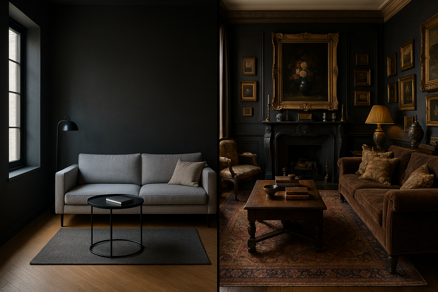
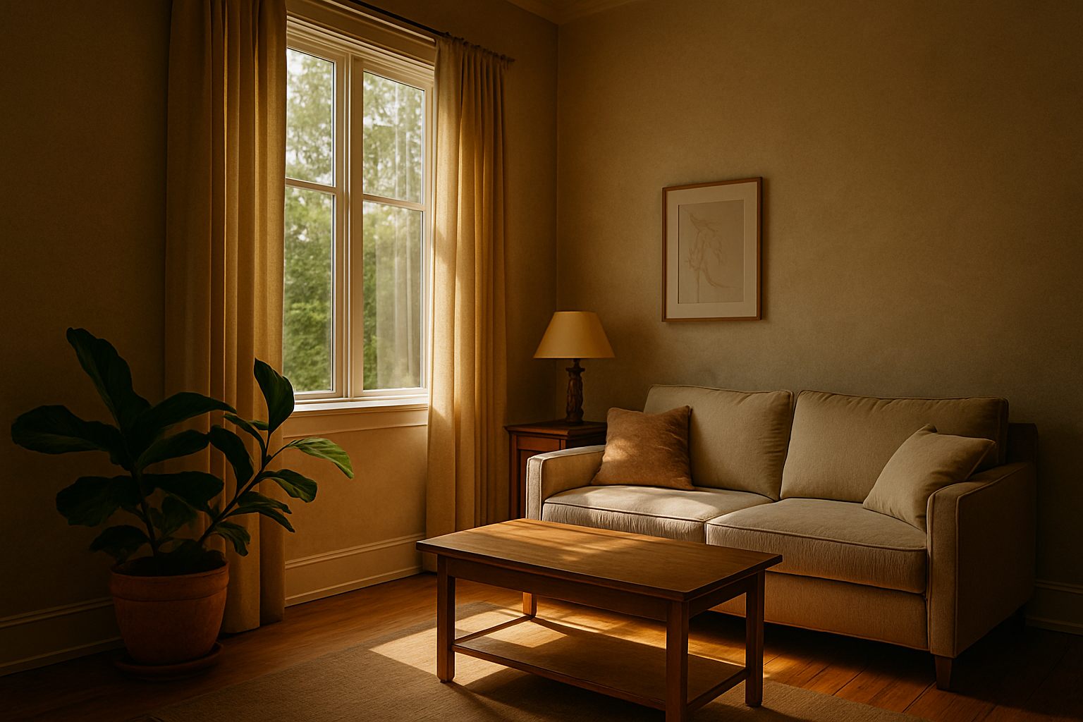
Light or Dark Tones? How to Choose a Style for Small Interiors
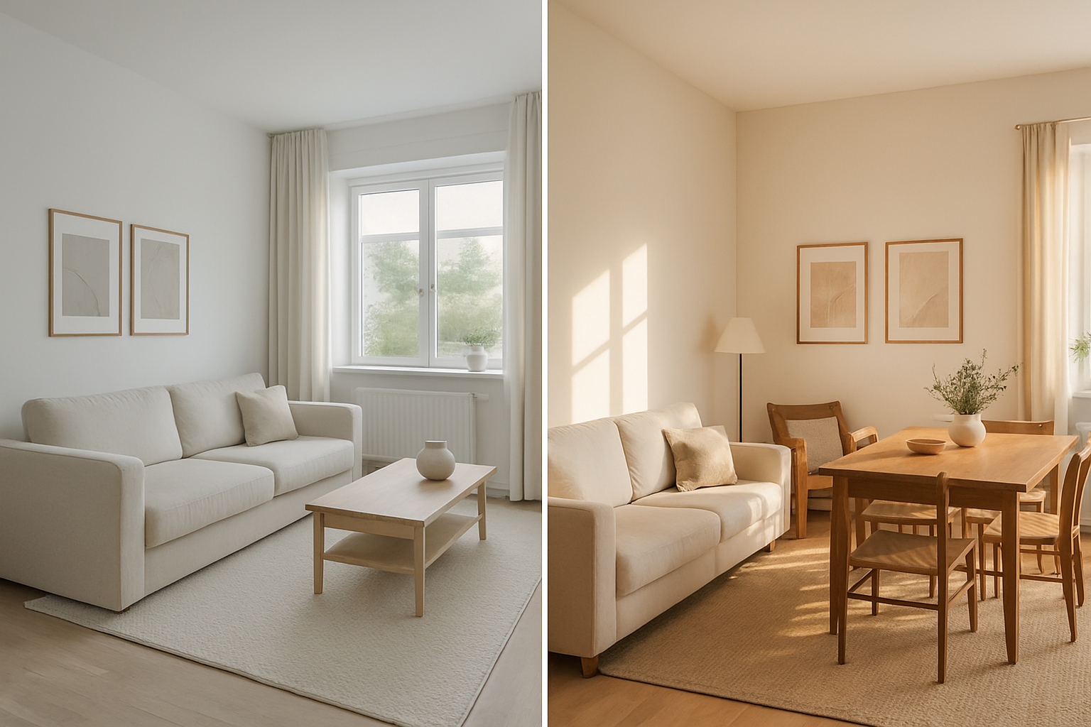
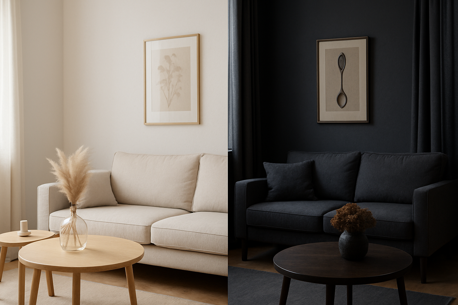
Photographing interiors requires sensitivity, technique, and a strong sense of aesthetic strategy. When dealing with small spaces, every visual choice becomes even more important. And one of the most crucial decisions is: should you use light or dark tones? Choosing between light or dark palettes goes far beyond personal taste. It directly affects the perception of space, lighting, depth, and visual identity in an image. In this article, we’ll explore how each approach behaves in compact environments, their visual, psychological, and practical effects — and how you, as a photographer or content creator, can make the best choice based on your visual goals. The Importance of Color in Interior Photography In interior photography, color is more than decoration — it’s visual language. Through color, you can: In small spaces, these functions are amplified. The intentional use of light or dark tones can transform how spacious, cozy, sophisticated, or vibrant an image feels. Light Tones: A Sense of Space and Lightness Key Characteristics: When to Use Light Tones: Typical Palette: White, off-white, beige, light gray, sand, pastel pink, light blue, mint green. Composition Tip: Add pops of color with plants, artwork, or books to break monotony. Avoid overly washed-out or sterile images. Dark Tones: Depth, Sophistication, and Drama Key Characteristics: When to Use Dark Tones: Typical Palette: Black, charcoal, slate gray, petrol green, wine, navy blue, dark brown. Composition Tip: Use accent lighting to highlight elements or create intentional contrast. Balance dark walls or furniture with lighter details or textures. How Color Affects Spatial Perception Color greatly influences how space is perceived in images — especially in tight rooms. Aspect Light Tones Dark Tones Light Reflection High (brighter environments) Low (absorbs light) Perceived Space Feels larger, more open Feels smaller, cozier Visual Sensation Lightness, calm Depth, sophistication Focus Distribution Balanced across the whole room Focused on select elements Emotional Tone Tranquility, cleanliness Mystery, intensity Emotional Influence of Color in Small Interiors Color has a direct emotional impact — especially in small interiors where visual stimuli are concentrated. Light Tones and Positive Emotions: Images dominated by light colors tend to: They echo nature in its softest forms — sky, mist, sand — fostering a soothing experience. Dark Tones and Deep Emotions: Darker interiors tend to inspire: They allow photographers to work with shadows, depth, and a heightened sense of emotion and intimacy. Design Trends and Color Use Understanding design trends helps align your style with what audiences expect — or consciously break those patterns to stand out. Trend: Clean, Airy Spaces Trend: Moody, Atmospheric Interiors Being aware of these trends helps you position your work more effectively. Composition Tips to Emphasize Each Style Shooting Light Interiors: Shooting Dark Interiors: Editing: Reinforcing Your Color Intent Post-production is where you refine your palette and visual voice. Editing Light Tones: Editing Dark Tones: Which Photographic Styles Match Each Palette? Minimalist Style Maximalist Style Editorial/Documentary Style Color and Your Visual Identity Color plays a huge role in defining your personal brand as a photographer. Ask yourself: When the answer is yes, you’re developing a strong, memorable visual identity — a huge asset in growing your brand and attracting clients. Test Both Styles Without Major Investment You don’t need elaborate setups to experiment. Try: Testing both styles will help define what feels authentic — and what resonates most with your audience. How Color Impacts Social Media Performance Color also influences how your work performs online: So yes — color is not just artistic; it’s also strategic. Practical Case Study: Same Room, Two Palettes Light Version: Dark Version: Both are valid. The difference is in the story you want to tell. Checklist: Choosing the Right Palette Before a photoshoot, ask yourself: ✅ What emotion should the image evoke?✅ Who is your target audience?✅ How much natural light is available?✅ What’s the space’s layout and ceiling height?✅ What brand/style are you aligning with?✅ Are you aiming for drama or simplicity? This checklist turns your color choice into a creative and strategic decision. Final Thoughts In small interiors, every detail matters. Choosing between light or dark tones isn’t just about preference — it’s about how you want your work to be perceived. Light tones expand, calm, and illuminate.Dark tones focus, captivate, and add depth.Used intentionally, both can elevate your images from simple photos to powerful visual stories. As a photographer, your job isn’t just to document — it’s to guide the viewer’s experience. And color is one of your most powerful tools to do that.
How Color Shapes Your Visual Identity in Interior Photography
In interior photography, light, composition, and ambiance are essential for creating attractive images. But there’s one element that’s often underestimated — yet it has the power to completely transform the perception of a photograph: color. More than just an aesthetic component, color is a strategic tool in building your visual identity. It communicates emotion, guides the viewer’s eye, creates harmony or contrast, and most importantly, helps photographers stand out. In this article, you’ll learn how color works in interior photography, how to use it intentionally to strengthen your visual brand, and what to keep in mind to ensure that your style is authentic and recognizable. Color as a Visual Language In photography, every color carries symbolic, emotional, and cultural meaning. Once you understand these meanings, you can begin using them intentionally — not just for aesthetics. Color Psychology in Interior Spaces Here are some common associations: These meanings aren’t rigid — you should always adapt your color choices based on the story you want your image to tell. Color as a Signature of Your Visual Identity A photographer’s visual identity includes elements like composition, lighting, directing scenes, and editing — but also recurring use of color. If you look at the portfolios of well-known photographers, you’ll often notice a dominant or consistent color palette. This helps create: You can shape your color palette either intuitively (by noticing which colors naturally attract you) or strategically (by consciously choosing tones that reflect your message or niche). Defining Your Palette: Where to Begin? If you want to use color as a visual signature, start with the following steps: 1. Review Your Portfolio Gather your favorite interior photos and observe: This analysis reveals unconscious patterns that may already define your visual language. 2. Choose a Direction Based on your findings, you can lean toward: The key is to stay consistent, even when natural variations occur between locations. 3. Use Palette Tools Platforms like Adobe Color, Coolors, or Canva Palette Generator allow you to create color palettes based on images or emotional concepts. These tools help you maintain editing coherence across projects. How Light Affects Color Color never exists in isolation. It’s deeply influenced by lighting conditions. Examples: So, when using color as part of your message, always consider the direction and temperature of natural light at the time of shooting. Using Color in Composition: Creating Balance Beyond symbolism, color is also a compositional tool. It directs the viewer’s gaze, defines depth, and creates visual hierarchy. Compositional Techniques with Color: These strategies help your work look intentional rather than accidental, giving your images a professional edge. Color in Post-Processing: Reinforcing Your Identity Editing is your chance to refine the presence of color and shape your photographic voice — but balance is essential. Tips for Effective Color Editing: The goal isn’t to change the space, but rather to enhance what’s already there and reinforce your visual narrative. Case Studies: How Color Reflects Style Scandinavian Style Boho Style Industrial Style Editorial / Lifestyle Style This type of style-color pairing helps you define your aesthetic direction more clearly. Developing Your Color Language with Purpose If you want to strengthen your visual identity, try these practical exercises: 1. Monochrome Project Choose one color (e.g., green) and shoot multiple interior scenes that include variations of that tone. This builds awareness of harmony and visual control. 2. Color Journal For one week, photograph indoor scenes that reflect a chosen emotion or theme (e.g., “calm” = blue). This helps you associate mood with color use. 3. Limited Palette Challenge Set a palette of 4–5 colors and stick to it across several photo sessions. Then assess how this affects your visual identity as a whole. Conclusion: Color Is Identity, Not Just Aesthetic In interior photography, color isn’t just a decorative layer — it’s a strategic tool of visual communication. When used intentionally, color is one of the strongest assets in building a professional, cohesive, and memorable photographic style. Understanding color — emotionally, symbolically, and compositionally — allows you to shoot with greater intentionality. And shooting with intention is what transforms good photos into unforgettable visual experiences. So don’t be afraid to experiment, make bold choices, and let color be your creative ally. It’s one of the most powerful elements in your journey as a photographer.
10 Style Inspirations for Interior Photography Using Natural Light
Photographing interiors goes far beyond capturing rooms — it’s about conveying atmosphere, highlighting personality, and evoking emotion. And when natural light becomes the main source of illumination, the results can be stunning — if you shoot with intention and an artistic eye. In this article, you’ll explore 10 style inspirations for shooting interior photography using natural light, covering visual approaches, emotional tone, and compositional techniques. Each style brings its own characteristics and can be a great foundation to develop your unique visual identity. 1. Scandinavian Minimalism Scandinavian style is known for its elegant simplicity, bright spaces, and smart use of natural light. It’s perfect for images that communicate: Visual Characteristics: How to Apply It: Use soft, diffused natural light for an even fill. Work with centered or symmetrical compositions and allow gentle shadows to subtly outline objects. 2. Cozy Boho Style Boho style is defined by layers, earthy colors, and a cozy, lived-in feel. Natural light enhances the texture and personality of the scene. Key Elements: How to Apply It: Let natural light come in from the side to highlight textures. Use shadows cast by plants or curtains to add interest and intimacy. 3. Industrial Style with a Natural Touch Industrial design celebrates raw materials like concrete, brick, and metal. Natural light helps soften this harshness and create contrast. Aesthetic: How to Apply It: Photograph during times of strong natural light to accentuate highlights and shadows. Use diagonal angles for more visual dynamism. 4. Romantic and Vintage This style evokes nostalgia and softness. Natural light is essential for creating a dreamy and emotional atmosphere. Common Features: How to Apply It: Shoot through sheer curtains during early morning or golden hour for soft, warm light. Use shallow depth of field to blur the background and reinforce the romantic aesthetic. 5. Clean Contemporary Ideal for those who seek modern, organized visuals with a touch of sophistication. Natural light helps highlight clean surfaces and geometry. Characteristics: How to Apply It: Use soft, even natural light from the side or front. Keep the composition clean and let shadows define form rather than dominate it. 6. Rustic and Naturalistic This style highlights organic materials and a connection to nature. Natural light enhances textures like wood grain, linen, and stone. Visual Elements: How to Apply It: Photograph during sunrise or sunset to get warm, soft lighting. Let sunlight filter through gaps for highlights and texture. Embrace the “imperfect” as part of the scene. 7. Artistic and Conceptual Rather than simply capturing a room, this style seeks to communicate emotion, idea, or mood. Light is used creatively, not realistically. Possibilities: How to Apply It: Break the rules. Shoot against the light. Let objects fall into shadow or highlight just a portion of the scene. Turn light into a narrative tool, not just illumination. 8. Tropical and Bright This style is vibrant, energetic, and ideal for regions with intense sun. Natural light here is abundant and helps celebrate color. Visual Elements: How to Apply It: Use light generously, but balance it. Avoid overexposure and use reflectors (like white walls) to soften harsh shadows. Focus on color harmony and natural brightness. 9. Dark and Moody Unlike the other styles, dark and moody photography embraces shadow, mystery, and contrast — but natural light still plays a central role. Aesthetic: How to Apply It: Use thick curtains or narrow windows to control light entry. Let light fall on just a small part of the room, leaving the rest in soft darkness. Master light-to-dark transitions (chiaroscuro). 10. Editorial Lifestyle Popular in magazines and branded content, this style reflects an “effortlessly styled” space — as if someone had just left the room. Core Elements: How to Apply It: Shoot during times of diffused light — cloudy days or early afternoon. Ensure every object contributes to the scene’s story. Keep things real, yet intentional. How to Choose a Style? With so many options, it can be overwhelming. Here’s how to find your visual voice: Style is a journey, not a destination. Natural Light as a Visual Identity Tool Natural light is more than illumination — it’s a visual language. Its direction, intensity, and quality shape the emotion of your photos. Mastering light is key to building a unique signature, especially in interior photography where every beam of light tells a story. Composition: The Silent Backbone of Style Even with great lighting and decor, composition makes or breaks an image. Use techniques like: These strategies transform simple rooms into compelling visual narratives. Editing: Consistency Seals the Style Post-production is where you refine your style — not by overprocessing, but by enhancing what’s already there. Great editing supports your vision without overpowering it. Practical Projects to Explore Each Style Want to practice? Try these: These exercises help you recognize what feels natural to you, revealing your own photographic voice. Final Thoughts: Style is Built, Light is Language Interior photography using natural light is about more than just showcasing a space — it’s about telling stories through shadow, texture, color, and light. These 10 styles offer rich visual paths. Explore them, blend them, or use them as stepping stones to create your own voice. The more you observe, shoot with intention, and edit consistently, the more your style will become a reflection of who you are — not just as a photographer, but as a visual storyteller.
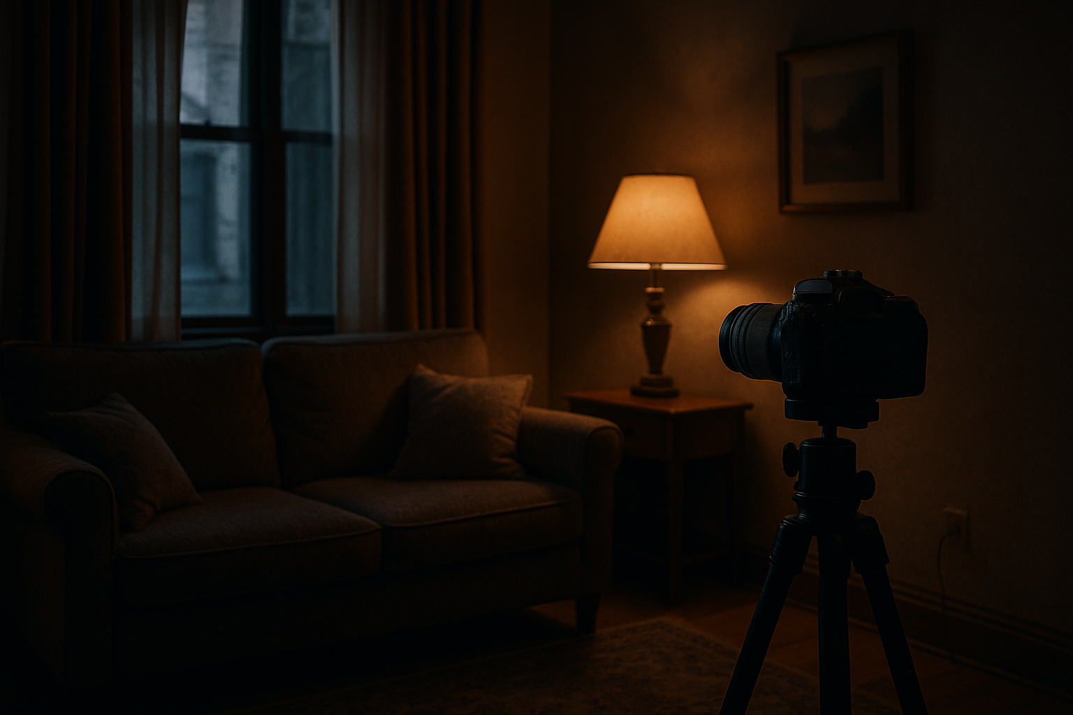
How to Develop Your Own Photography Style in Low-Light Interiors
Developing a unique photographic style is a major milestone for any photographer. It not only defines your visual identity, but also brings consistency and recognition to your work. But what happens when the challenge is shooting in low-light environments? Is it still possible to build your own aesthetic and evolve technically? The answer is yes. Shooting in dark or dimly lit interiors doesn’t have to limit your creativity — on the contrary, it might be just the push you need to shape a distinct and memorable photographic style. In this article, you’ll learn how to create an authorial visual identity even under lighting limitations by using available light sources, camera settings, composition techniques, and post-production — all aligned with your creative vision. What is a photography style and why does it matter? A photography style is a set of visual and conceptual choices that make your work instantly recognizable. It goes far beyond editing or filters — it includes composition, color palette, lighting choices, recurring themes, conveyed emotions, and even how you interact with the space. Developing a personal style is important because it: In low-light interiors, technical mastery combined with aesthetic intentionality can transform limitations into a creative signature. Understanding the challenges — and advantages — of low light Low-light environments present a number of technical challenges: But they also provide unique artistic opportunities, such as: When well-explored, these conditions become the foundation of a powerful personal style. Choose the emotion you want to convey Every image carries emotional weight. When working in low light, ask yourself: Your emotional intent will guide all creative decisions — from composition to how you use the available light. Master low-light camera settings To create consistent and intentional photos in low light, you need to control your gear effectively. ISO Aperture Shutter Speed Manual Focus Use existing light sources as compositional tools A major part of building a personal style in dark environments is learning to embrace available light as part of the story. Types of light you can use: Instead of correcting the light, try to compose around it. Let it guide the viewer’s eye and set the mood of the scene. Keep your editing consistent Editing is a powerful tool to refine and reinforce your visual identity. Here’s how to use it to your advantage: Color palette Contrast and shadows Grain and texture Compose with intention In low-light scenes, minimalism often works best. Every compositional element must be intentional: Your style is also defined by what you choose not to reveal. Create visual series and personal projects Repetition is key to building a recognizable style. A series of photos with similar lighting, colors, and themes will strengthen your aesthetic identity. Project ideas: These kinds of projects show intention and visual consistency, making your style stand out. Get inspired — but don’t copy Study other photographers and how they use light in dark settings. Look for: You’re not looking to imitate — you’re aiming to understand how light tells a story, and how you can shape your own way of doing it. Embrace the unpredictable Low-light environments are often unpredictable. A reflection, a sudden shadow, or a misplaced light source can ruin — or enrich — a composition. An authentic photographer embraces imperfections and sometimes even turns them into stylistic elements. Use gear as an extension of your creativity While style isn’t defined by gear, using the right tools helps you maintain consistency. Useful tools for low-light photography: That said, the best tool is always your understanding of the light you already have. Understand color psychology in low light Color matters — especially in dim settings: Choosing a color direction helps anchor your visual identity. Use post-production to reinforce your style Post-processing is where your emotional intent gets its finishing touch. Tools to explore: Your editing choices become a visual signature over time. Think like a storyteller Low light lends itself to quiet, emotional storytelling. Think beyond technical perfection and ask: Often, it’s the story, not the technique, that gives your work meaning — and builds your style. Develop your style using self-portraits and familiar spaces You don’t need exotic locations or models to define a style. Start with what you have: The more often you create, the more your natural visual preferences will become clear. Style is also what you leave out Mature style often stems from what you choose not to show: These choices define your creative fingerprint. Be patient — style takes time Don’t rush the process. Your visual identity will emerge through practice, reflection, and repetition. In time, you won’t need to define your style — your style will define you. Final Thoughts: Low Light as a Path to Creative Identity Developing your photographic style is a deeply personal journey. Low-light environments, far from being a limitation, can actually accelerate this process — by encouraging conscious decisions, removing distractions, and highlighting the essentials. Scarce light isn’t a problem. It’s a creative element. It shapes stories, reveals intimacy, and builds powerful emotional resonance. By mastering technique, trusting your vision, and repeating choices that align with your inner world, you’ll not only take better photos — you’ll photograph as your true self.


